8.5 Non-seasonal ARIMA models
If we combine differencing with autoregression and a moving average model, we obtain a non-seasonal ARIMA model. ARIMA is an acronym for AutoRegressive Integrated Moving Average model (in this context, “integration” is the reverse of differencing). The full model can be written as \[\begin{equation} y'_{t} = c + \phi_{1}y'_{t-1} + \cdots + \phi_{p}y'_{t-p} + \theta_{1}e_{t-1} + \cdots + \theta_{q}e_{t-q} + e_{t}, \tag{8.1} \end{equation}\] where \(y'_{t}\) is the differenced series (it may have been differenced more than once). The “predictors” on the right hand side include both lagged values of \(y_t\) and lagged errors. We call this an ARIMA(\(p, d, q\)) model, where
| \(p =\) | order of the autoregressive part; |
| \(d =\) | degree of first differencing involved; |
| \(q =\) | order of the moving average part. |
The same stationarity and invertibility conditions that are used for autoregressive and moving average models also apply to this ARIMA model.
Many of the models we have already discussed are special cases of the ARIMA model, as shown in the following table.
| White noise | ARIMA(0,0,0) |
| Random walk | ARIMA(0,1,0) with no constant |
| Random walk with drift | ARIMA(0,1,0) with a constant |
| Autoregression | ARIMA(\(p\),0,0) |
| Moving average | ARIMA(0,0,\(q\)) |
Once we start combining components in this way to form more complicated models, it is much easier to work with the backshift notation. Then equation (8.1) can be written as \[\begin{equation} \tag{8.2} \begin{array}{c c c c} (1-\phi_1B - \cdots - \phi_p B^p) & (1-B)^d y_{t} &= &c + (1 + \theta_1 B + \cdots + \theta_q B^q)e_t\\ {\uparrow} & {\uparrow} & &{\uparrow}\\ \text{AR($p$)} & \text{$d$ differences} & & \text{MA($q$)}\\ \end{array} \end{equation}\]
R uses a slightly different parameterization: \[\begin{equation} \tag{8.3} (1-\phi_1B - \cdots - \phi_p B^p)(y_t' - \mu) = (1 + \theta_1 B + \cdots + \theta_q B^q)e_t, \end{equation}\] where \(y_t' = (1-B)^d y_t\) and \(\mu\) is the mean of \(y_t'\). To convert to the form given by (8.2), set \(c = \mu(1-\phi_1 - \cdots - \phi_p )\).
Selecting appropriate values for \(p\), \(d\) and \(q\) can be difficult. However, the auto.arima() function in R will do it for you automatically. Later in this chapter, we will learn how the function works, and some methods for choosing these values yourself.
US consumption expenditure
autoplot(uschange[,"Consumption"]) +
  xlab("Year") + ylab("Quarterly percentage change")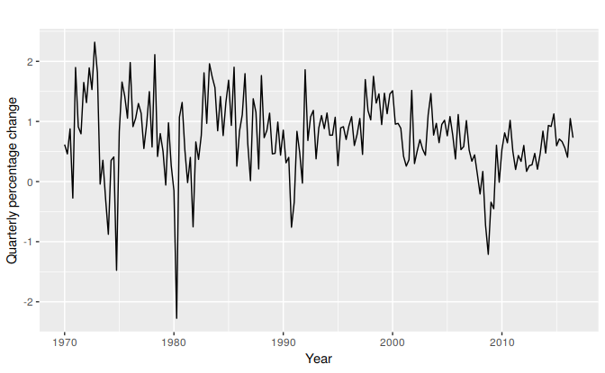
Figure 8.7: Quarterly percentage change in US consumption expenditure.
Figure 8.7 shows quarterly percentage changes in US consumption expenditure. Although it is a quarterly series, there does not appear to be a seasonal pattern, so we will fit a non-seasonal ARIMA model.
The following R code was used to select a model automatically. (We use the argument seasonal=FALSE for now, but we will consider seasonal ARIMA models in Section 8.9 )
(fit <- auto.arima(uschange[,"Consumption"], seasonal=FALSE))
#> Series: uschange[, "Consumption"]
#> ARIMA(1,0,3) with non-zero mean
#>
#> Coefficients:
#>         ar1     ma1    ma2    ma3   mean
#>       0.589  -0.353  0.085  0.174  0.745
#> s.e.  0.154   0.166  0.082  0.084  0.093
#>
#> sigma^2 estimated as 0.35:  log likelihood=-165
#> AIC=342   AICc=342   BIC=361
This is an ARIMA(2,0,2) model: \[ y_t = c + 0.589y_{t-1} NA y_{t-2} -0.353 e_{t-1} + 0.0846 e_{t-2} + e_{t}, \] where \(c= 0.745 \times (1 - 0.589 + NA) = NA\) and \(e_t\) is white noise with a standard deviation of \(0.592 = \sqrt{0.350}\). Forecasts from the model are shown in Figure 8.8.
fit %>% forecast(h=10) %>% autoplot(include=80)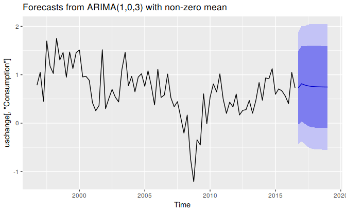
Figure 8.8: Forecasts of quarterly percentage changes in US consumption expenditure.
###Understanding ARIMA models {-}
The auto.arima() function is very useful, but anything automated can be a little dangerous, and it is worth understanding something of the behaviour of the models even when you rely on an automatic procedure to choose the model for you.
The constant \(c\) has an important effect on the long-term forecasts obtained from these models.
- If \(c=0\) and \(d=0\), the long-term forecasts will go to zero.
- If \(c=0\) and \(d=1\), the long-term forecasts will go to a non-zero constant.
- If \(c=0\) and \(d=2\), the long-term forecasts will follow a straight line.
- If \(c\ne0\) and \(d=0\), the long-term forecasts will go to the mean of the data.
- If \(c\ne0\) and \(d=1\), the long-term forecasts will follow a straight line.
- If \(c\ne0\) and \(d=2\), the long-term forecasts will follow a quadratic trend.
The value of \(d\) also has an effect on the prediction intervals — the higher the value of \(d\), the more rapidly the prediction intervals increase in size. For \(d=0\), the long-term forecast standard deviation will go to the standard deviation of the historical data, so the prediction intervals will all be essentially the same.
This behaviour is seen in Figure 8.8 where \(d=0\) and \(c\ne 0\). In this figure, the prediction intervals are almost the same for the last few forecast horizons, and the point forecasts are equal to the mean of the data.
The value of \(p\) is important if the data show cycles. To obtain cyclic forecasts, it is necessary to have \(p\ge2\), along with some additional conditions on the parameters. For an AR(2) model, cyclic behaviour occurs if \(\phi_1^2+4\phi_2<0\). In that case, the average period of the cycles is15 \[ \frac{2\pi}{\text{arc cos}(-\phi_1(1-\phi_2)/(4\phi_2))}. \]
ACF and PACF plots
It is usually not possible to tell, simply from a time plot, what values of \(p\) and \(q\) are appropriate for the data. However, it is sometimes possible to use the ACF plot, and the closely related PACF plot, to determine appropriate values for \(p\) and \(q\).
Recall that an ACF plot shows the autocorrelations which measure the relationship between \(y_t\) and \(y_{t-k}\) for different values of \(k\). Now if \(y_t\) and \(y_{t-1}\) are correlated, then \(y_{t-1}\) and \(y_{t-2}\) must also be correlated. However, then \(y_t\) and \(y_{t-2}\) might be correlated, simply because they are both connected to \(y_{t-1}\), rather than because of any new information contained in \(y_{t-2}\) that could be used in forecasting \(y_t\).
To overcome this problem, we can use partial autocorrelations. These measure the relationship between \(y_{t}\) and \(y_{t-k}\) after removing the effects of lags \(1, 2, 3, \dots, k - 1\). So the first partial autocorrelation is identical to the first autocorrelation, because there is nothing between them to remove. Each partial autocorrelation can be estimated as the last coefficient in an autoregressive model. Specifically, \(\alpha_k\), the \(k\)th partial autocorrelation coefficient, is equal to the estimate of \(\phi_k\) in an AR(\(k\)) model. In practice, there are more efficient algorithms for computing \(\alpha_k\) than fitting all of these autoregressions, but they give the same results.
Figures 8.9 and 8.10 shows the ACF and PACF plots for the US consumption data shown in Figure 8.7. The partial autocorrelations have the same critical values of \(\pm 1.96/\sqrt{T}\) as for ordinary autocorrelations, and these are typically shown on the plot as in Figure 8.9.
ggAcf(uschange[,"Consumption"],main="")
#> Warning: Ignoring unknown parameters: main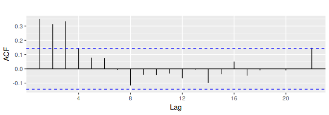
Figure 8.9: ACF of quarterly percentage change in US consumption. A convenient way to produce a time plot, ACF plot and PACF plot in one command is to use the ggtsdisplay function in R.
ggPacf(uschange[,"Consumption"],main="")
#> Warning: Ignoring unknown parameters: main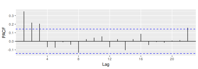
Figure 8.10: PACF of quarterly percentage change in US consumption.
If the data are from an ARIMA(\(p\),\(d\),0) or ARIMA(0,\(d\),\(q\)) model, then the ACF and PACF plots can be helpful in determining the value of \(p\) or \(q\). If \(p\) and \(q\) are both positive, then the plots do not help in finding suitable values of \(p\) and \(q\).
The data may follow an ARIMA(\(p\),\(d\),0) model if the ACF and PACF plots of the differenced data show the following patterns:
- the ACF is exponentially decaying or sinusoidal;
- there is a significant spike at lag \(p\) in the PACF, but none beyond lag \(p\).
The data may follow an ARIMA(0,\(d\),\(q\)) model if the ACF and PACF plots of the differenced data show the following patterns:
- the PACF is exponentially decaying or sinusoidal;
- there is a significant spike at lag \(q\) in the ACF, but none beyond lag \(q\).
In Figure 8.9, we see that there are three spikes in the ACF, followed by an almost significant spike at lag 4. In the PACF, there are three significant spikes, and then no significant spikes thereafter (apart from one just outside the bounds at lag 22). We can ignore one significant spike in each plot if it is just outside the limits, and not in the first few lags. After all, the probability of a spike being significant by chance is about one in twenty, and we are plotting 22 spikes in each plot. The pattern in the first three spikes is what we would expect from an ARIMA(3,0,0), as the PACF tends to decrease. So in this case, the ACF and PACF lead us to think an ARIMA(3,0,0) model might be appropriate.
(fit2 <- Arima(uschange[,"Consumption"], order=c(3,0,0)))
#> Series: uschange[, "Consumption"]
#> ARIMA(3,0,0) with non-zero mean
#>
#> Coefficients:
#>         ar1    ar2    ar3   mean
#>       0.227  0.160  0.203  0.745
#> s.e.  0.071  0.072  0.071  0.103
#>
#> sigma^2 estimated as 0.349:  log likelihood=-165
#> AIC=340   AICc=341   BIC=356
This model is actually slightly better than the model identified by auto.arima (with an AICc value of 340.67 compared to 342.08). The auto.arima function did not find this model because it does not consider all possible models in its search. You can make it work harder by using the arguments stepwise=FALSE and approximation=FALSE:
(fit3 <- auto.arima(uschange[,"Consumption"], seasonal=FALSE,
  stepwise=FALSE, approximation=FALSE))
#> Series: uschange[, "Consumption"]
#> ARIMA(3,0,0) with non-zero mean
#>
#> Coefficients:
#>         ar1    ar2    ar3   mean
#>       0.227  0.160  0.203  0.745
#> s.e.  0.071  0.072  0.071  0.103
#>
#> sigma^2 estimated as 0.349:  log likelihood=-165
#> AIC=340   AICc=341   BIC=356
This time, auto.arima has found the same model that we guessed from the ACF and PACF plots. The forecasts from this ARIMA(3,0,0) model are almost identical to those shown in Figure 8.8 for the ARIMA(2,0,2) model, so we do not produce the plot here.
arc cos is the inverse cosine function. You should be able to find it on your calculator. It may be labelled acos or cos\(^{-1}\).↩