2.10 Exercises
Use the help menu to explore what the series
gold,woolyrnqandgasrepresent. These are available in theforecastpackage.- Use
autoplotto plot each of these in separate plots. - What is the frequency of each commodity series? Hint: apply the
frequency()function. - Use
which.max()to spot the outlier in thegoldseries. Which observation was it?
- Use
Download some data from OTexts.org/fpp2/extrafiles/tute1.csv. Open the file
tute1.csvin Excel (or some other spreadsheet application) and review its contents. You should find four columns of information. Columns B through D each contain a quarterly series, labelled Sales, AdBudget and GDP. Sales contains the quarterly sales for a small company over the period 1981-2005. AdBudget is the advertising budget and GDP is the gross domestic product. All series have been adjusted for inflation.You can read the data into R with the following script:
tute1 <- read.csv("tute1.csv", header=TRUE)
View(tute1)
Convert the data to time series
mytimeseries <- ts(tute1[,-1], start=1981, frequency=4)(The
[,-1]removes the first column which contains the quarters as we don’t need them now.)Construct time series plots of each of the three series
autoplot(mytimeseries, facets=TRUE)Check what happens when you don’t include
facets=TRUE.
Download some monthly Australian retail data from OTexts.org/fpp2/extrafiles/retail.xlsx. These represent retail sales in various categories for different Australian states, and are stored in a MS-Excel file.
You can read the data into R with the following script:
retaildata <- readxl::read_excel("retail.xlsx", skip=1)You may need to first install the
readxlpackage. The second argument (skip=1) is required because the Excel sheet has two header rows.Select one of the time series as follows (but replace the column name with your own chosen column):
myts <- ts(retaildata[,"A3349873A"], frequency=12, start=c(1982,4))Explore your chosen retail time series using the following functions:
autoplot,ggseasonplot,ggsubseriesplot,gglagplot,ggAcfCan you spot any seasonality, cyclicity and trend? What do you learn about the series?
Repeat for the following series:
bicoal,chicken,dole,usdeaths,bricksq,lynx,ibmclose,sunspotarea,hsales,hyndsightandgasoline.Use the help files to find out what the series are.
The
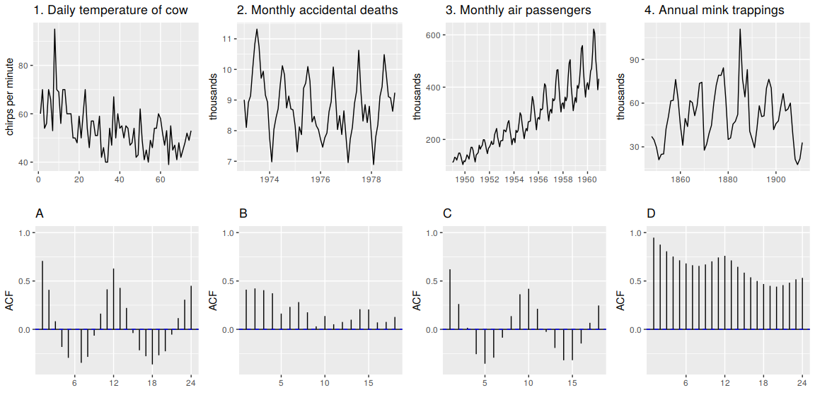
arrivalsdata set comprises quarterly international arrivals (in thousands) to Australia from Japan, New Zealand, UK and the US. Useautoplotandggseasonplotto compare the differences between the arrivals from these four countries. Can you identify any unusual observations?The following time plots and ACF plots correspond to four different time series. Your task is to match each time plot in the first row with one of the ACF plots in the second row.
The
pigsdata shows the monthly total number of pigs slaughtered in Victoria, Australia, from Jan 1980 to Aug 1995. Usemypigs <- window(pigs, start=1990)to select the data starting from 1990. UseautoplotandggAcfformypigsseries and compare these to white noise plots from Figures 2.13 and 2.14.