2.7 Lag plots
Figure 2.9 displays scatterplots of quarterly Australian beer production, where the horizontal axis shows lagged values of the time series. Each graph shows \(y_{t}\) plotted against \(y_{t-k}\) for different values of \(k\).
beer2 <- window(ausbeer, start=1992)
gglagplot(beer2)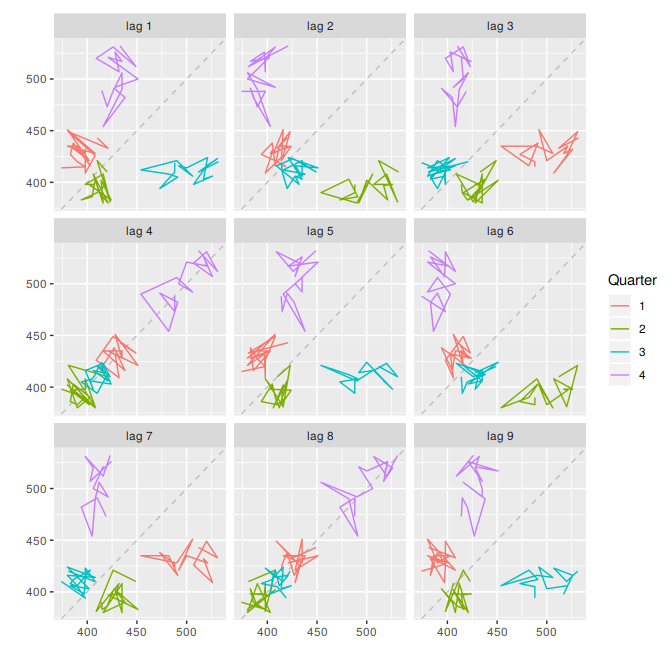
Figure 2.9: Lagged scatterplots for quarterly beer production.
Here the colours indicate the quarter of the variable on the vertical axis. The relationship is strongly positive at lags 4 and 8, reflecting the strong quarterly seasonality in the data. The negative relationship seen for lags 2 and 6 occurs because peaks (in Q4) are plotted against troughs (in Q2)
The window function used here is very useful when extracting a portion of a time series. In this case, we have extracted the data from ausbeer, beginning in 1992.