5.4 Evaluating the regression model
The differences between the observed \(y\) values and the corresponding fitted \(\hat{y}\) values are the training-set errors or “residuals” defined as, \[\begin{align*} e_t &= y_t - \hat{y}_t \\ &= y_t - \hat\beta_{0} - \hat\beta_{1} x_{1,t} - \hat\beta_{2} x_{2,t} - \cdots - \hat\beta_{k} x_{k,t} \end{align*}\] for \(t=1,\ldots,T\). Each residual is the unpredictable component of the associated observation.
The residuals have some useful properties including the following two: \[ \sum_{t=1}^{T}{e_t}=0 \quad\text{and}\quad \sum_{t=1}^{T}{x_{k,t}e_t}=0\qquad\text{for all $k$}. \] As a result of these properties, it is clear that the average of the residuals is zero, and that the correlation between the residuals and the observations for the predictor variable is also zero. (This is not necessarily true when the intercept is omitted from the model.)
After selecting the regression variables and fitting a regression model, it is necessary to plot the residuals to check that the assumptions of the model have been satisfied. There are a series of plots that should be produced in order to check different aspects of the fitted model and the underlying assumptions.
ACF plot of residuals
With time series data, it is highly likely that the value of a variable observed in the current time period will be similar to its value in the previous period, or even the period before that, and so on. Therefore when fitting a regression model to time series data, it is very common to find autocorrelation in the residuals. In this case, the estimated model violates the assumption of no autocorrelation in the errors, and our forecasts may be inefficient — there is some information left over which should be accounted for in the model in order to obtain better forecasts. The forecasts from a model with autocorrelated errors are still unbiased, and so are not “wrong”, but they will usually have larger prediction intervals than they need to. Therefore we should always look at an ACF plot of the residuals.
Another useful test of autocorrelation in the residuals designed to take account for the regression model is the Breusch-Godfrey test, also referred to as the LM (Lagrange Multiplier) test for serial correlation. It is used to test the joint hypothesis that there is no autocorrelation in the residuals up to a certain specified order. A small p-value indicates there is significant autocorrelation remaining in the residuals.
The Breusch-Godfrey test is similar to the Ljung-Box test, but it is specifically designed for use with regression models.
Histogram of residuals
It is always a good idea to check if the residuals are normally distributed. As explained earlier, this is not essential for forecasting, but it does make the calculation of prediction intervals much easier.
Example
Using the checkresiduals function introduced in Section 3.3, we can obtain all the useful residual diagnostics mentioned above. Figure 5.11 shows a time plot, the ACF and the histogram of the residuals from the model fitted to the beer production data as well as the Breusch-Godfrey test for testing up to 8th order autocorrelation. (The checkresiduals function will use the Breusch-Godfrey test for regression models, but the Ljung-Box test otherwise.)
The time plot shows a large negative value in the residuals at 2004 Q4, which suggests that something unusual may have happened in that quarter. It would be worth investigating to see if there were any unusual circumstances or events which may have significantly reduced beer production for that quarter.
The remaining residuals show that the model has captured the patterns in the data quite well. However, there is a small amount of autocorrelation left in the residuals, seen in the significant spike in the ACF plot but not detected to be significant by the Breusch-Godfrey test. This suggests that there may be some information remaining in the residuals and the model can be slightly improved to capture this. However, it is unlikely that it will make much difference to the resulting forecasts. The forecasts from the current model are still unbiased, but will have larger prediction intervals than they need to. In Chapter 9 we discuss dynamic regression models used for better capturing information left in the residuals.
The histogram shows that the residuals from modelling the beer data seem to be slightly negatively skewed, although that is due to the large negative value in 2004 Q4.
checkresiduals(fit.beer)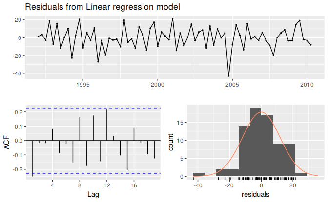
Figure 5.11: Analysing the residuals from a regression model for beer production.
#>
#>  Breusch-Godfrey test for serial correlation of order up to 8
#>
#> data:  Residuals from Linear regression model
#> LM test = 9, df = 8, p-value = 0.3
Residual plots against predictors
We would expect the residuals to be randomly scattered without showing any systematic patterns. A simple and quick way to check this is to examine a scatterplot of the residuals against each of the predictor variables. If these scatterplots show a pattern, then the relationship may be nonlinear and the model will need to be modified accordingly. See Section 5.8 for a discussion of nonlinear regression.
It is also necessary to plot the residuals against any predictors not in the model. If these show a pattern, then the predictor may need to be added to the model (possibly in a nonlinear form).
Example
The residuals from the multiple regression model for forecasting US consumption plotted against each predictor in Figure 5.12 seem to be randomly scattered and therefore we are satisfied with these in this case.
df <- as.data.frame(uschange)
df[,"Residuals"]  <- as.numeric(residuals(fit.consMR))
p1 <- ggplot(df, aes(x=Income, y=Residuals)) + geom_point()
p2 <- ggplot(df, aes(x=Production, y=Residuals)) + geom_point()
p3 <- ggplot(df, aes(x=Savings, y=Residuals)) + geom_point()
p4 <- ggplot(df, aes(x=Unemployment, y=Residuals)) + geom_point()
gridExtra::grid.arrange(p1, p2, p3, p4, nrow=2)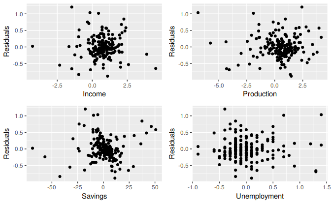
Figure 5.12: Scatterplots of residuals versus each predictor.
Residual plots against fitted values
A plot of the residuals against the fitted values should also show no pattern. If a pattern is observed, there may be “heteroscedasticity” in the errors which means that the variance of the residuals may not be constant. If this problem occurs, a transformation of the forecast variable (such as a logarithm or square root) may be required.
Example
Figure 5.13 shows the residuals against the fitted values from fitting a linear trend and seasonal dummies to the electricity data we first encountered in Section 3.2. The plot shows that the trend in the data is nonlinear and that the forecast variable requires a transformation as we observe a heteroscedastic pattern with variation increasing along the x-axis.
fit <- tslm(elec ~ trend + season)
cbind(Fitted=fitted(fit), Residuals=residuals(fit)) %>%
  as.data.frame() %>%
  ggplot(aes(x=Fitted, y=Residuals)) + geom_point()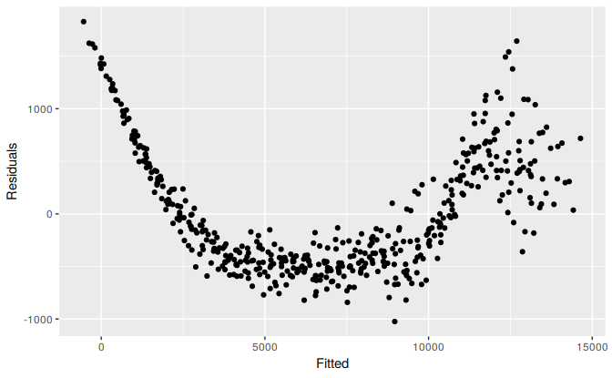
Figure 5.13: Scatterplot of residuals versus fitted.
##TODO
## A little too obvious. Can we find something more subtle?
## George: Will try to
Outliers and influential observations
Observations that take on extreme values compared to the majority of the data are called “outliers”. Observations that have a large influence on the estimation results of a regression model are called “influential observations”. Usually, influential observations are also outliers that are extreme in the \(x\) direction.
There are formal methods for detecting outliers and influential observations that are beyond the scope of this textbook. As we suggested at the beginning of Chapter 2, getting familiar with your data prior to performing any analysis is of vital importance. A scatter plot of \(y\) against each \(x\) is always a useful starting point in regression analysis and often helps to identify unusual observations.
One source for an outlier occurring is an incorrect data entry. Simple descriptive statistics of your data can identify minima and maxima that are not sensible. If such an observation is identified, and it has been incorrectly recorded, it should be immediately corrected or removed from the sample.
Outliers also occur when some observations are simply different. In this case it may not be wise for these observations to be removed. If an observation has been identified as a likely outlier, it is important to study it and analyze the possible reasons behind it. The decision of removing or retaining such an observation can be a challenging one (especially when outliers are influential observations). It is wise to report results both with and without the removal of such observations.
Example
Figure 5.14 highlights the effect of a single outlier when regressing US consumption on income (the example introduced in Section 5.1). In the left panel the outlier is only extreme in the direction of \(y\) as the percentage change in consumption has been incorrectly recorded as -4%. The red line is the regression line fitted to the data which includes the outlier, compared to the black line which is the line fitted to the data without the outlier. In the right panel the outlier now is also extreme in the direction of \(x\) with the 4% decrease in consumption corresponding to a 6% increase in income. In this case the outlier is very influential as the red line now deviates substantially from the black line.
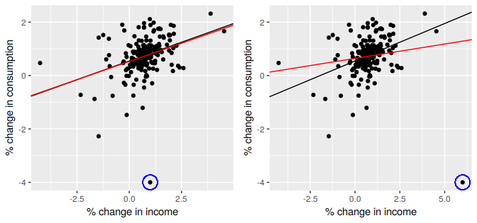
Figure 5.14: The effect of outliers and influential observations on regression
Goodness-of-fit
A common way to summarise how well a linear regression model fits the data is via the coefficient of determination or \(R^2\). This can be calculated as the square of the correlation between the observed \(y\) values and the predicted \(\hat{y}\) values. Alternatively, it can also be calculated as, \[ R^2 = \frac{\sum(\hat{y}_{t} - \bar{y})^2}{\sum(y_{t}-\bar{y})^2}, \] where the summations are over all observations. Thus, it reflects the proportion of variation in the forecast variable that is accounted for (or explained) by the regression model.
In simple linear regression, the value of \(R^2\) is also equal to the square of the correlation between \(y\) and \(x\) (provided an intercept has been included).
If the predictions are close to the actual values, we would expect \(R^2\) to be close to 1. On the other hand, if the predictions are unrelated to the actual values, then \(R^2=0\) (again, assuming there is an intercept). In all cases, \(R^2\) lies between 0 and 1.
The \(R^2\) value is commonly used, often incorrectly, in forecasting. \(R^2\) will never decrease when adding an extra predictor to the model and this can lead to over-fitting. There are no set rules for what is a good \(R^2\) value, and typical values of \(R^2\) depend on the type of data used. Validating a model’s forecasting performance on the test data is much better than measuring the \(R^2\) value on the training data.
Example
Recall the example of US consumption data discussed in Section 5.2. The output for the estimated model is reproduced here for convenience:
fit.consMR <- tslm(Consumption ~ Income + Production + Unemployment + Savings,
  data=uschange)
summary(fit.consMR)
#>
#> Call:
#> tslm(formula = Consumption ~ Income + Production + Unemployment +
#>     Savings, data = uschange)
#>
#> Residuals:
#>     Min      1Q  Median      3Q     Max
#> -0.8830 -0.1764 -0.0368  0.1525  1.2055
#>
#> Coefficients:
#>              Estimate Std. Error t value Pr(>|t|)
#> (Intercept)   0.26729    0.03721    7.18  1.7e-11 ***
#> Income        0.71448    0.04219   16.93  < 2e-16 ***
#> Production    0.04589    0.02588    1.77    0.078 .
#> Unemployment -0.20477    0.10550   -1.94    0.054 .
#> Savings      -0.04527    0.00278  -16.29  < 2e-16 ***
#> ---
#> Signif. codes:  0 '***' 0.001 '**' 0.01 '*' 0.05 '.' 0.1 ' ' 1
#>
#> Residual standard error: 0.329 on 182 degrees of freedom
#> Multiple R-squared:  0.754,  Adjusted R-squared:  0.749
#> F-statistic:  139 on 4 and 182 DF,  p-value: <2e-16
Figure 5.7 plots the actual consumption expenditure values versus the fitted values. The correlation between these variables is \(r=0.868\) hence \(R^2= 75.4\)% (shown in the output above). In this case model does an excellent job as it explains most of the variation in the consumption data. Compare that to the \(R^2\) value of 16% obtained from the simple regression with the same data set in Section 5.1. Adding the three extra predictors has allowed a lot more of the variance in the consumption data to be explained.
Standard error of the regression
Another measure of how well the model has fitted the data is the standard deviation of the residuals, which is often known as the “residual standard error”. This is shown in the above output with the value 0.329.
It is calculated by \[\begin{equation} \hat{\sigma}_e=\sqrt{\frac{1}{T-k-1}\sum_{t=1}^{T}{e_t^2}}. \tag{5.3} \end{equation}\] Notice that here we divide by \(T-k-1\) in order to account for the number of estimated parameters in computing the residuals. Normally, we only estimate the mean (i.e., one parameter) when computing a standard deviation. The divisor is always \(T\) minus the number of parameters estimated in the calculation. Here, we divide by \(T−k−1\) because we have estimated \(k+1\) parameters (the intercept and a coefficient for each predictor variable) in computing the residuals.
The standard error is related to the size of the average error that the model produces. We can compare this error to the sample mean of \(y\) or with the standard deviation of \(y\) to gain some perspective on the accuracy of the model.
We should warn here that the evaluation of the standard error can be highly subjective as it is scale dependent. The main reason we introduce it here is that it is required when generating prediction intervals, discussed in Section 5.6.
Spurious regression
More often than not, time series data are “non-stationary”; that is, the values of the time series do not fluctuate around a constant mean or with a constant variance. We will deal with time series stationarity in more detail in Chapter 8, but here we need to address the effect that non-stationary data can have on regression models.
For example consider the two variables plotted below in Figure 5.15. These appear to be related simply because they both trend upwards in the same manner. However, air passenger traffic in Australia has nothing to do with rice production in Guinea.
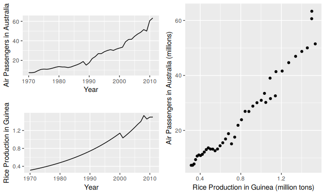
Figure 5.15: Trending time series data can appear to be related as shown in this example in which air passengers in Australia are regressed against rice production in Guinea.
Regressing non-stationary time series can lead to spurious regressions. The output of regressing Australian air passengers on rice production in Guinea is shown below. High \(R^2\) and high residual autocorrelation can be signs of spurious regression. We discuss the issues surrounding non-stationary data and spurious regressions in more detail in Chapter 9.
Cases of spurious regression might appear to give reasonable short-term forecasts, but they will generally not continue to work into the future.
fit <- tslm(aussies ~ guinearice)
summary(fit)
#>
#> Call:
#> tslm(formula = aussies ~ guinearice)
#>
#> Residuals:
#>    Min     1Q Median     3Q    Max
#> -5.945 -1.892 -0.327  1.862 10.421
#>
#> Coefficients:
#>             Estimate Std. Error t value Pr(>|t|)
#> (Intercept)    -7.49       1.20   -6.23  2.3e-07 ***
#> guinearice     40.29       1.34   30.13  < 2e-16 ***
#> ---
#> Signif. codes:  0 '***' 0.001 '**' 0.01 '*' 0.05 '.' 0.1 ' ' 1
#>
#> Residual standard error: 3.24 on 40 degrees of freedom
#> Multiple R-squared:  0.958,  Adjusted R-squared:  0.957
#> F-statistic:  908 on 1 and 40 DF,  p-value: <2e-16
checkresiduals(fit)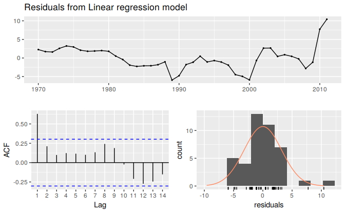
Figure 5.16: Residuals from a spurious regression.
#>
#>  Breusch-Godfrey test for serial correlation of order up to 8
#>
#> data:  Residuals from Linear regression model
#> LM test = 29, df = 8, p-value = 3e-04