2.6 Scatterplots
The graphs discussed so far are useful for visualizing individual time series. It is also useful to explore relationships between time series.
Figure 2.7 shows two time series: half-hourly electricity demand (in GigaWatts) and temperature (in degrees Celsius), for 2014 in Victoria, Australia. The temperatures are for Melbourne, the largest city in Victoria, while the demand values are for the entire state.
month.breaks <- cumsum(c(0,31,28,31,30,31,30,31,31,30,31,30,31)*48)
autoplot(elecdemand[,c(1,3)], facet=TRUE) +
  xlab("Year: 2014") + ylab("") +
  ggtitle("Half-hourly electricity demand: Victoria, Australia") +
  scale_x_continuous(breaks=2014+month.breaks/max(month.breaks),
    minor_breaks=NULL, labels=c(month.abb,month.abb[1]))
#> Warning: Ignoring unknown parameters: series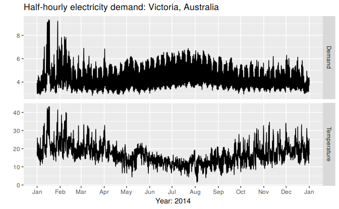
Figure 2.7: Half hourly electricity demand and temperatures in Victoria, Australia, for 2014.
We can study the relationship between demand and temperature by plotting one series against the other.
qplot(Temperature, Demand, data=as.data.frame(elecdemand)) +
  ylab("Demand (GW)") + xlab("Temperature (Celsius)")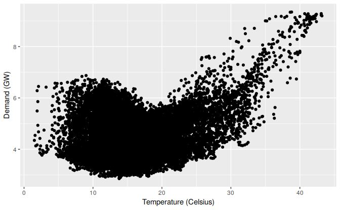
Figure 2.8: Half-hourly electricity demand plotted against temperature for 2014 in Victoria, Australia.
This scatterplot helps us to visualize the relationship between the variables. It is clear that high demand occurs when temperatures are high due to the effect of air-conditioning. But there is also a heating effect, where demand increases for very low temperatures.
Scatterplot matrices
When there are several potential predictor variables, it is useful to plot each variable against each other variable. Consider the eight time series shown in Figure ??.
# autoplot(vn, facets=TRUE) +
#   ylab("Number of visitor nights each quarter")
To see the relationships between these eight time series, we can plot each time series against the others. These plots can be arranged in a scatterplot matrix, as shown in Figure ??.
# vn %>% as.data.frame() %>% GGally::ggpairs()For each panel, the variable on the vertical axis is given by the variable name in that row, and the variable on the horizontal axis is given by the variable name in that column. There are many options available to produce different plots within each panel. In the default version, the correlations are shown in the upper right half of the plot, while the scatterplots are shown in the lower half. On the diagonal are shown density plots.
The value of the scatterplot matrix is that it enables a quick view of the relationships between all pairs of variables. Outliers can also be seen. In this example, there is one unusually high quarter for Sydney, corresponding to the 2000 Sydney Olympics.