2.8 Autocorrelation
Just as correlation measures the extent of a linear relationship between two variables, autocorrelation measures the linear relationship between lagged values of a time series.
There are several autocorrelation coefficients, corresponding to each panel in the lag plot. For example, \(r_{1}\) measures the relationship between \(y_{t}\) and \(y_{t-1}\), \(r_{2}\) measures the relationship between \(y_{t}\) and \(y_{t-2}\), and so on.
The value of \(r_{k}\) can be written as \[ r_{k} = \frac{\sum\limits_{t=k+1}^T (y_{t}-\bar{y})(y_{t-k}-\bar{y})} {\sum\limits_{t=1}^T (y_{t}-\bar{y})^2}, \] where \(T\) is the length of the time series.
The first nine autocorrelation coefficients for the beer production data are given in the following table.
| \(r_1\) | \(r_2\) | \(r_3\) | \(r_4\) | \(r_5\) | \(r_6\) | \(r_7\) | \(r_8\) | \(r_9\) |
|---|---|---|---|---|---|---|---|---|
| -0.102 | -0.657 | -0.060 | 0.869 | -0.089 | -0.635 | -0.054 | 0.832 | -0.108 |
These correspond to the nine scatterplots in Figure 2.9. The autocorrelation coefficients are normally plotted to form the autocorrelation function or ACF. The plot is also known as a correlogram.
ggAcf(beer2)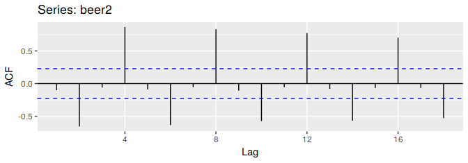
Figure 2.10: Autocorrelation function of quarterly beer production.
In this graph:
- \(r_{4}\) is higher than for the other lags. This is due to the seasonal pattern in the data: the peaks tend to be four quarters apart and the troughs tend to be two quarters apart.
- \(r_{2}\) is more negative than for the other lags because troughs tend to be two quarters behind peaks.
- The dashed blue lines indicate whether the correlations are significantly different from zero. These are explained in Section 2.9.
Trend and seasonality in ACF plots
When data have a trend, the autocorrelations for small lags tend to be large and positive because observations nearby in time are also nearby in size. So the ACF of trended time series tend to have positive values that slowly decrease as the lags increase.
When data are seasonal, the autocorrelations will be larger for the seasonal lags (at multiples of the seasonal frequency) than for other lags.
When data are both trended and seasonal, you see a combination of these effects, as illustrated in Figure 2.12.
aelec <- window(elec, start=1980)
autoplot(aelec) + xlab("Year") + ylab("GWh")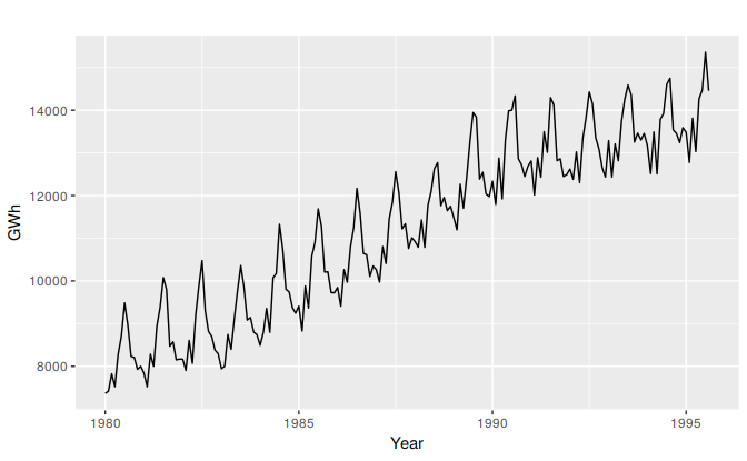
Figure 2.11: Monthly Australian electricity demand from 1980–1995.
ggAcf(aelec, lag=48)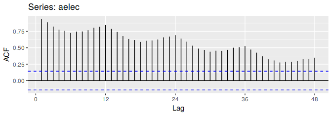
Figure 2.12: ACF of monthly Australian electricity demand.
The slow decrease in the ACF as the lags increase is due to the trend, while the “scalloped” shape is due the seasonality.