5.8 Nonlinear regression
Although the linear relationship assumed so far in this chapter is often adequate, there are many cases for which a nonlinear functional form is more suitable. To keep things simple in this section we assume that we only have one predictor \(x\).
Simply transforming the forecast variable \(y\) and/or the predictor variable \(x\) and then estimating a regression model using the transformed variables is the simplest way of obtaining a nonlinear specification. We should note that these specifications and the specification that follow are still linear in the parameters. The most commonly used transformation is the (natural) logarithmic (see Section 3.2).
A log-log functional form is specified as \[ \log y=\beta_0+\beta_1 \log x +\varepsilon. \] In this model, the slope \(\beta_1\) is interpreted as an elasticity, \(\beta_1\) is the average percentage change in \(y\) resulting from a \(1\%\) increase in \(x\). Other useful forms can also be specified. The log-linear form is specified by only transforming the forecast variable and the linear-log form is obtained by transforming the predictor.
Recall that in order to perform a logarithmic transformation to a variable, all its observed values must be greater than zero. In the case that variable \(x\) contains zeros we use the transformation \(\log(x+1)\), i.e., we add one to the value of the variable and then take logarithms. This has a similar effect to taking logarithms but avoids the problem of zeros. It also has the neat side-effect of zeros on the original scale remaining zeros on the transformed scale.
There are cases for which simply transforming the data will not be adequate and a more general specification may be required. Then the model we use is \[y=f(x) +\varepsilon\] where \(f\) is a nonlinear function. In standard (linear) regression, \(f(x)=\beta_{0} + \beta_{1} x\). In the specification of nonlinear regression that follows, we allow \(f\) to be a more flexible nonlinear function of \(x\), compared to simply a logarithmic or other transformation.
One of the simplest specifications is to make \(f\) piecewise linear. That is, we introduce points where the slope of \(f\) can change. These points are called “knots”. This can be achieved by letting \(x_{1,t}=x\) and introducing variable \(x_{2,t}\) such that \[\begin{align*} x_{2,t} = (x-c)_+ &= \left\{ \begin{array}{ll} 0 & x < c\\ (x-c) & x \ge c \end{array}\right. \end{align*}\] The notation \((x-c)_+\) means the value \(x-c\), if it is positive and 0 otherwise. This forces the slope to bend at point \(c\). Additional bends can be included in the relationship by adding further variables of the above form.
An example of this follows by considering \(x=t\) and fitting a piecewise linear trend to a times series.
Piecewise linear relationships constructed in this way are a special case of regression splines. In general, a linear regression spline is obtained using \[ x_{1}= x \quad x_{2} = (x-c_{1})_+ \quad\dots\quad x_{k} = (x-c_{k-1})_+\] where \(c_{1},\dots,c_{k-1}\) are the knots (the points at which the line can bend). Selecting the number of knots (\(k-1\)) and where they should be positioned can be difficult and somewhat arbitrary. Some automatic knot selection algorithms are available in some software, but are not yet widely used.
A smoother result is obtained using piecewise cubics rather than piecewise lines. These are constrained so they are continuous (they join up) and they are smooth (so there are no sudden changes of direction as we see with piecewise linear splines). In general, a cubic regression spline is written as \[ x_{1}= x \quad x_{2}=x^2 \quad x_3=x^3 \quad x_4 = (x-c_{1})_+ \quad\dots\quad x_{k} = (x-c_{k-3})_+.\] Cubic splines usually give a better fit to the data. However, forecasting values of \(y\) when \(x\) is outside the range of the historical data becomes very unreliable.
Forecasting with a nonlinear trend
In Section 5.3 fitting a linear trend to a time series by setting \(x=t\) was introduced. The simplest way of fitting a nonlinear trend is using quadratic or higher order trends obtained by specifying \[ x_{1,t} =t,\quad x_{2,t}=t^2,\quad \ldots. \] However, it is not recommended that quadratic or higher order trends are used in forecasting. When they are extrapolated, the resulting forecasts are often very unrealistic.
A better approach is to use the piecewise specification introduced above and fit a piecwise linear trend which bends at some point in time. We can think of this as a nonlinear trend constructed of linear pieces. If the trend bends at time \(\tau\), then it can be specified by simply replacing \(x=t\) and \(c=\tau\) above such that we include the predictors, \[\begin{align*} x_{1,t} & = t \\ x_{2,t} = (t-\tau)_+ &= \left\{ \begin{array}{ll} 0 & t < \tau\\ (t-\tau) & t \ge \tau \end{array}\right. \end{align*}\] in the model. If the associated coefficients of \(x_{1,t}\) and \(x_{2,t}\) are \(\beta_1\) and \(\beta_2\), then \(\beta_1\) gives the slope of the trend before time \(\tau\), while the slope of the line after time \(\tau\) is given by \(\beta_1+\beta_2\). Additional bends can be included in the relationship by adding further variables of the form \((t-\tau)_+\) where \(\tau\) is the “knot” or point in time at which the line should bend.
Example: Boston marathon winning times
Figure 5.18 below in the left panel shows the Boston marathon winning times (in minutes) since it started in 1897. The time series shows a general downward trend as the winning times have been improving over the years. The panel on the right shows the residuals from fitting a linear trend to the data. The plot shows an obvious nonlinear pattern which has not been captured by the linear trend.
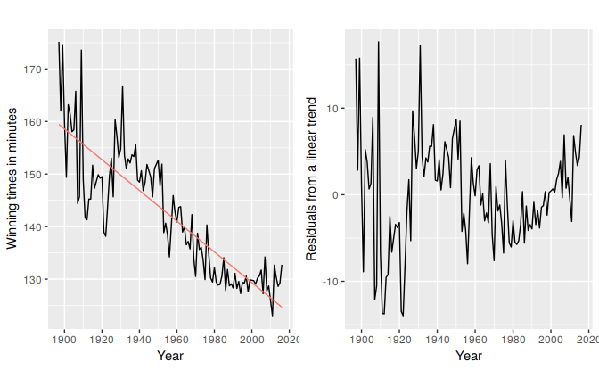
Figure 5.18: Fitting a linear trend to the Boston marathon winning times is inadequate
Fitting an exponential trend to the data can be achieved by transforming the \(y\) variable so that the model to be fitted is, \[\log y_t=\beta_0+\beta_1 t +\varepsilon_t.\] The fitted exponential trend and forecasts are shown in Figure ?? below. Although the exponential trend does not seem to fit the data much better than the linear trend, it gives a more sensible projection in that the winning times will decrease in the future but at a decaying rate rather than a linear non-changing rate.
Simply eyeballing the winning times reveals three very different periods. There is a lot of volatility in the winning times from the beginning up to about 1940 with the winning times decreasing overall but with significant increases in the decade of the 1920s. The almost linear decrease in times after 1940 is then followed by a flattening out after the 1980s with almost an upturn towards the end of the sample. Following these observations we specify as knots the years 1940 and 1980. We should warn here that subjectively identifying suitable knots in the data can lead to overfitting which can be detrimental to the forecast performance of a model and should be performed with caution.
h <- 10

fit.lin <- tslm(marathon ~ trend)
fcasts.lin <- forecast(fit.lin, h=h)

fit.exp <- tslm(marathon ~ trend, lambda = 0)
fcasts.exp <- forecast(fit.exp, h=h)

t.break1 <- 1940
t.break2 <- 1980

t <- time(marathon)
t1 <- ts(pmax(0,t-t.break1), start=1897)
t2 <- ts(pmax(0,t-t.break2), start=1897)

fit.pw <- tslm(marathon ~ t + t1 + t2)
  t.new <- t[length(t)]+seq(h)
  t1.new <- t1[length(t1)]+seq(h)
  t2.new <- t2[length(t2)]+seq(h)

newdata <- cbind(t=t.new,t1=t1.new,t2=t2.new)%>%as.data.frame()
fcasts.pw <- forecast(fit.pw,newdata = newdata)

# autoplot(marathon) +
#   forecast::autolayer(fitted(fit.lin), series = "Linear") +
#   forecast::autolayer(fitted(fit.exp), series="Exponential") +
#   forecast::autolayer(fitted(fit.pw), series = "Piecewise") +
#   forecast::autolayer(fcasts.pw, series="Piecewise") +
#   forecast::autolayer(fcasts.lin$mean, series = "Linear") +
#   forecast::autolayer(fcasts.exp$mean, series="Exponential") +
#   xlab("Year") +  ylab("Winning times in minutes") +
#   ggtitle("Boston Marathon") +
#   guides(colour=guide_legend(title=" "))

  ## TODO: Add cubic spline
Figure ?? above shows the fitted lines and forecasts from linear, exponential and piecewise linear trends. The piecewise linear trend fits the data better than both the exponential and linear trends and seems to return sensible forecasts. The residuals plotted in the Figure 5.19 below show that the model has mostly captured the trend well although there is some autocorrelation remaining (we will deal with this in Chapter 11). We should however again warn here that the projection forward from the piecewise linear trend can be very sensitive to the choice of location of the knots, especially the ones located towards the end of the sample. For example moving the knot placed at 1980 even five years forward will reveal very different forecasts. The wide prediction interval associated with the forecasts form the piecewise linear trend reflects the volatility observed in the historical winning times.
checkresiduals(fit.pw)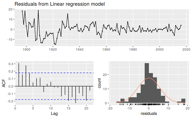
Figure 5.19: Residuals from the piecewise trend.
#>
#>  Breusch-Godfrey test for serial correlation of order up to 10
#>
#> data:  Residuals from Linear regression model
#> LM test = 22, df = 10, p-value = 0.02