D Visualizing residuals
Source: https://www.r-bloggers.com/visualising-residuals/
fit <- lm(mpg ~ hp, data = mtcars)  # Fit the model
summary(fit)  # Report the results
#>
#> Call:
#> lm(formula = mpg ~ hp, data = mtcars)
#>
#> Residuals:
#>    Min     1Q Median     3Q    Max
#> -5.712 -2.112 -0.885  1.582  8.236
#>
#> Coefficients:
#>             Estimate Std. Error t value Pr(>|t|)
#> (Intercept)  30.0989     1.6339   18.42  < 2e-16 ***
#> hp           -0.0682     0.0101   -6.74  1.8e-07 ***
#> ---
#> Signif. codes:  0 '***' 0.001 '**' 0.01 '*' 0.05 '.' 0.1 ' ' 1
#>
#> Residual standard error: 3.86 on 30 degrees of freedom
#> Multiple R-squared:  0.602,  Adjusted R-squared:  0.589
#> F-statistic: 45.5 on 1 and 30 DF,  p-value: 1.79e-07
par(mfrow = c(2, 2))  # Split the plotting panel into a 2 x 2 grid
plot(fit)  # Plot the model information

par(mfrow = c(1, 1))  # Return plotting panel to 1 section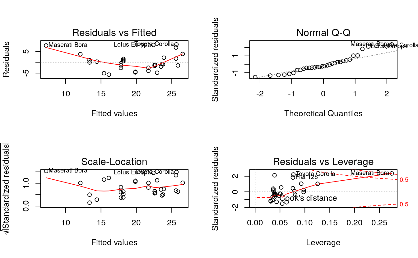
D.1 Simple Linear Regression
d <- mtcars
fit <- lm(mpg ~ hp, data = d)
d$predicted <- predict(fit)   # Save the predicted values
d$residuals <- residuals(fit) # Save the residual values

# Quick look at the actual, predicted, and residual values
library(dplyr)
#>
#> Attaching package: 'dplyr'
#> The following objects are masked from 'package:stats':
#>
#>     filter, lag
#> The following objects are masked from 'package:base':
#>
#>     intersect, setdiff, setequal, union
d %>% select(mpg, predicted, residuals) %>% head()
#>                    mpg predicted residuals
#> Mazda RX4         21.0      22.6    -1.594
#> Mazda RX4 Wag     21.0      22.6    -1.594
#> Datsun 710        22.8      23.8    -0.954
#> Hornet 4 Drive    21.4      22.6    -1.194
#> Hornet Sportabout 18.7      18.2     0.541
#> Valiant           18.1      22.9    -4.835
D.1.1 Step 3: plot the actual and predicted values
plot first the actual data
library(ggplot2)
ggplot(d, aes(x = hp, y = mpg)) +  # Set up canvas with outcome variable on y-axis
  geom_point()  # Plot the actual points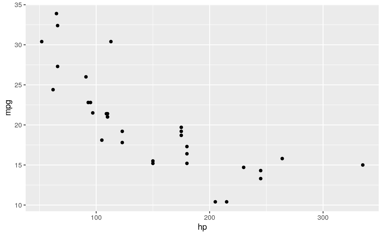
Next, we plot the predicted values in a way that they’re distinguishable from the actual values. For example, let’s change their shape:
ggplot(d, aes(x = hp, y = mpg)) +
  geom_point() +
  geom_point(aes(y = predicted), shape = 1)  # Add the predicted values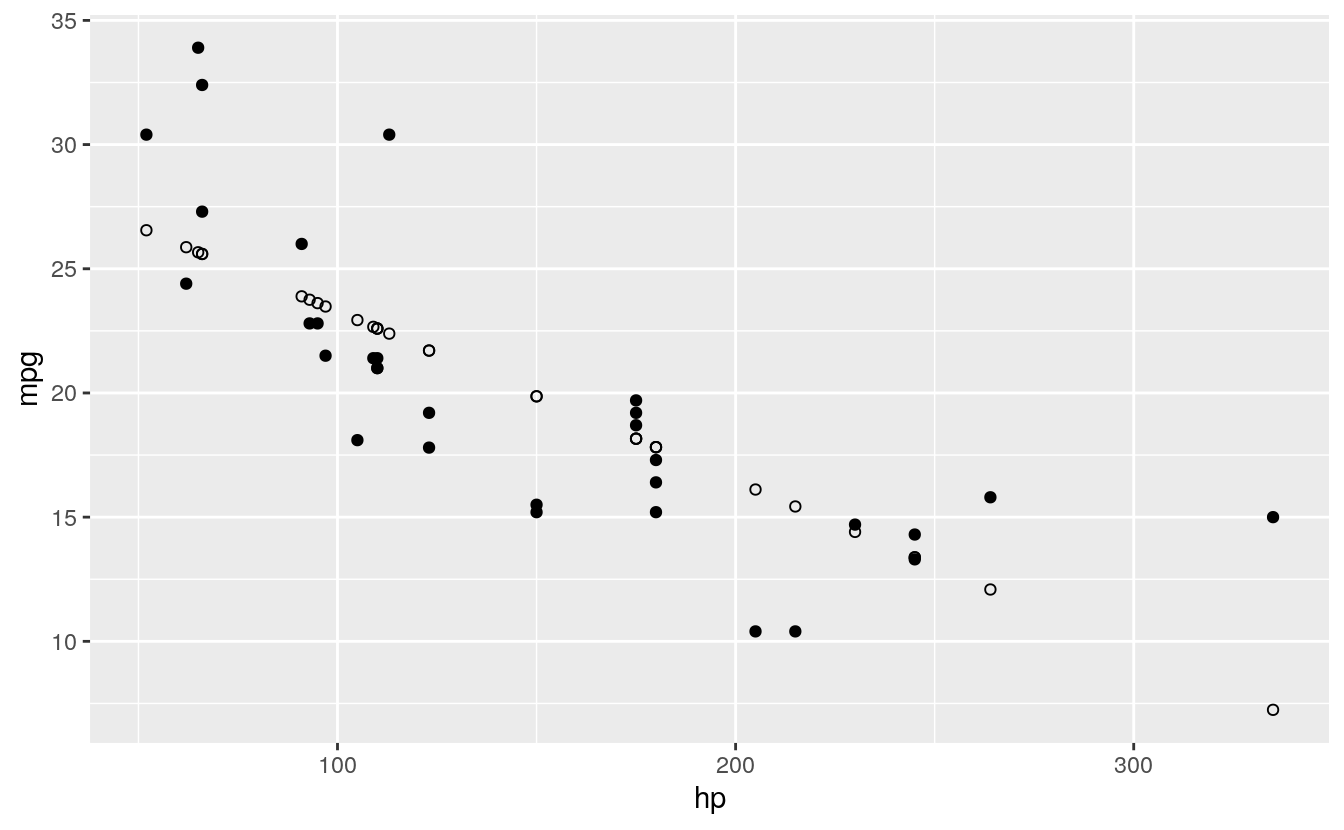
This is on track, but it’s difficult to see how our actual and predicted values are related. Let’s connect the actual data points with their corresponding predicted value using geom_segment():
ggplot(d, aes(x = hp, y = mpg)) +
  geom_segment(aes(xend = hp, yend = predicted)) +
  geom_point() +
  geom_point(aes(y = predicted), shape = 1)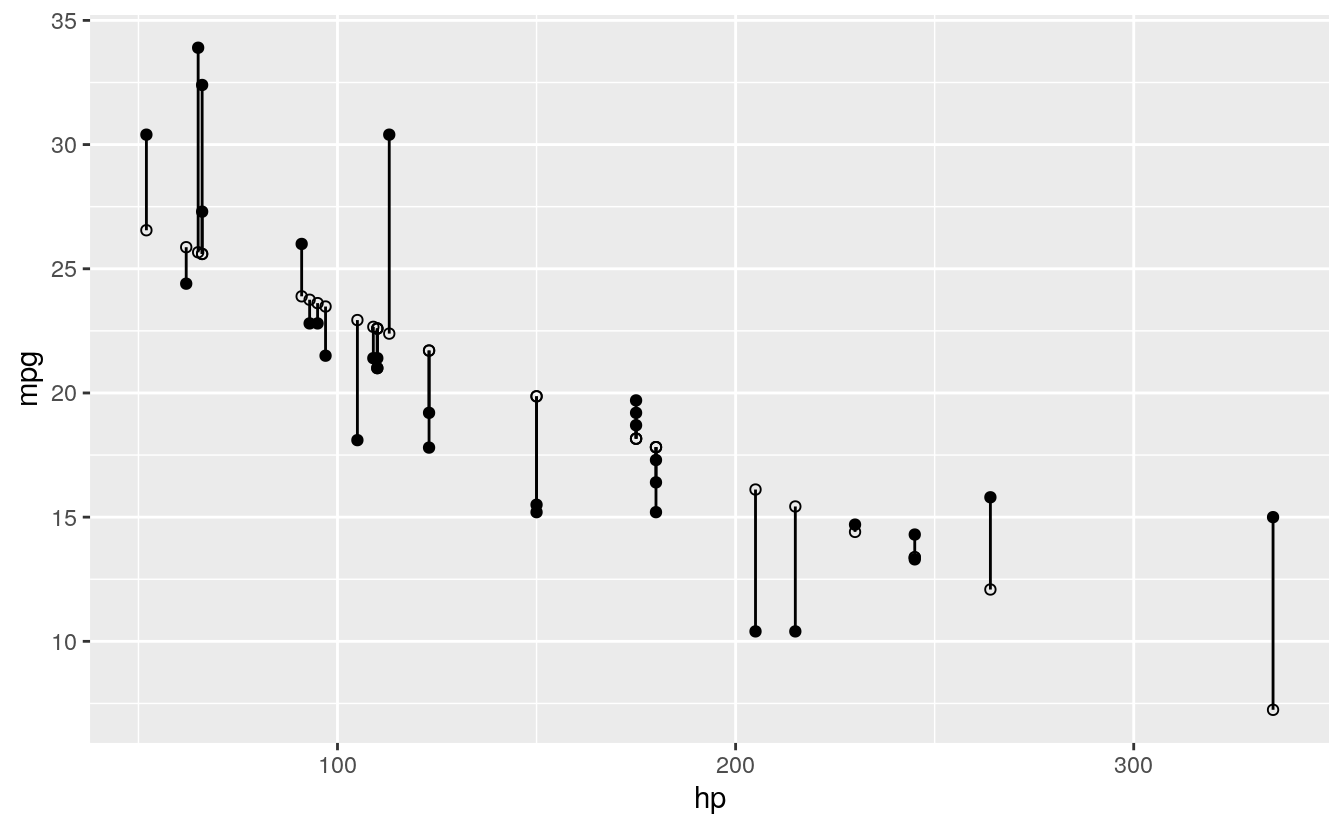
We’ll make a few final adjustments: * Clean up the overall look with theme_bw(). * Fade out connection lines by adjusting their alpha. * Add the regression slope with geom_smooth():
library(ggplot2)
ggplot(d, aes(x = hp, y = mpg)) +
  geom_smooth(method = "lm", se = FALSE, color = "lightgrey") +  # Plot regression slope
  geom_segment(aes(xend = hp, yend = predicted), alpha = .2) +  # alpha to fade lines
  geom_point() +
  geom_point(aes(y = predicted), shape = 1) +
  theme_bw()  # Add theme for cleaner look
#> `geom_smooth()` using formula 'y ~ x'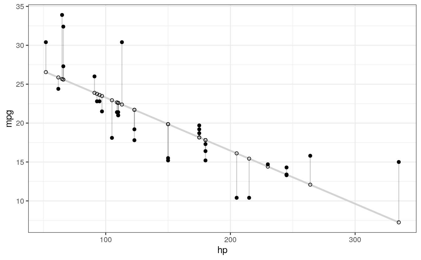
D.2 Step 4: use residuals to adjust
Finally, we want to make an adjustment to highlight the size of the residual. There are MANY options. To make comparisons easy, I’ll make adjustments to the actual values, but you could just as easily apply these, or other changes, to the predicted values. Here are a few examples building on the previous plot:
# ALPHA
# Changing alpha of actual values based on absolute value of residuals
ggplot(d, aes(x = hp, y = mpg)) +
  geom_smooth(method = "lm", se = FALSE, color = "lightgrey") +
  geom_segment(aes(xend = hp, yend = predicted), alpha = .2) +

  # > Alpha adjustments made here...
  geom_point(aes(alpha = abs(residuals))) +  # Alpha mapped to abs(residuals)
  guides(alpha = FALSE) +  # Alpha legend removed
  # <

  geom_point(aes(y = predicted), shape = 1) +
  theme_bw()
#> `geom_smooth()` using formula 'y ~ x'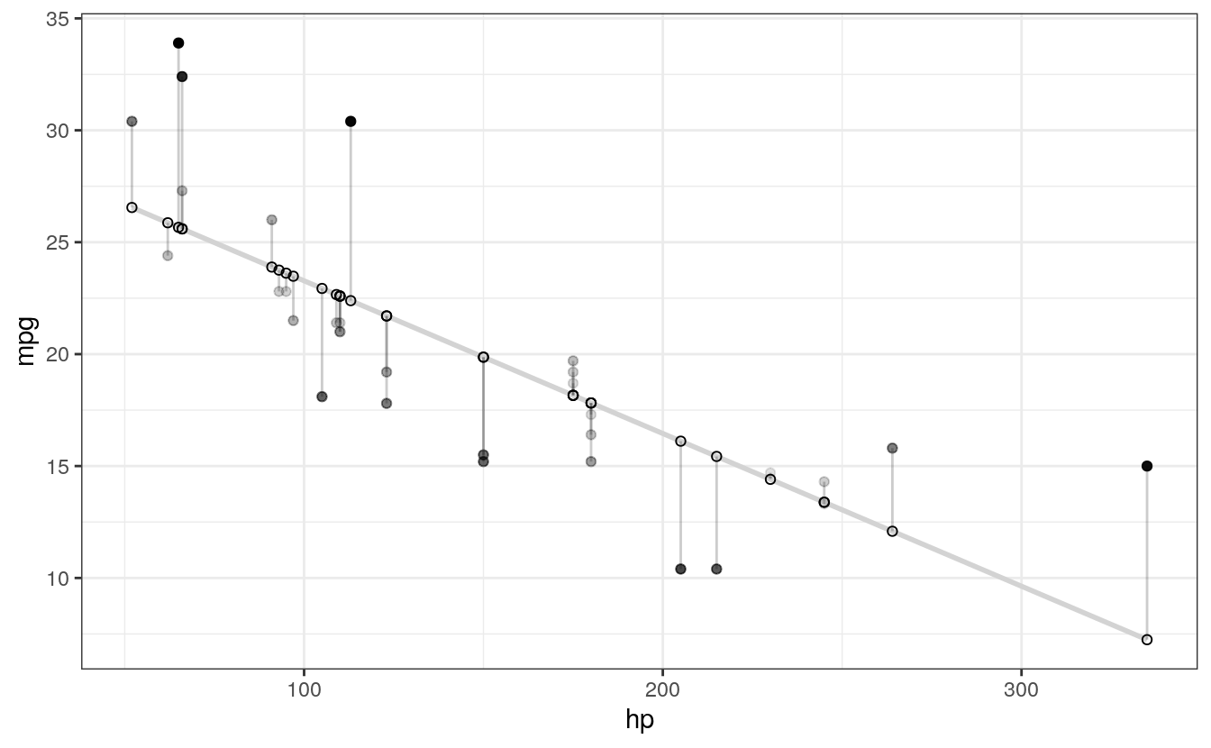
# COLOR
# High residuals (in abolsute terms) made more red on actual values.
ggplot(d, aes(x = hp, y = mpg)) +
  geom_smooth(method = "lm", se = FALSE, color = "lightgrey") +
  geom_segment(aes(xend = hp, yend = predicted), alpha = .2) +

  # > Color adjustments made here...
  geom_point(aes(color = abs(residuals))) + # Color mapped to abs(residuals)
  scale_color_continuous(low = "black", high = "red") +  # Colors to use here
  guides(color = FALSE) +  # Color legend removed
  # <

  geom_point(aes(y = predicted), shape = 1) +
  theme_bw()
#> `geom_smooth()` using formula 'y ~ x'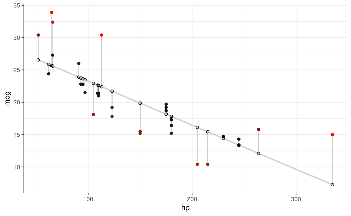
# SIZE AND COLOR
# Same coloring as above, size corresponding as well
ggplot(d, aes(x = hp, y = mpg)) +
  geom_smooth(method = "lm", se = FALSE, color = "lightgrey") +
  geom_segment(aes(xend = hp, yend = predicted), alpha = .2) +

  # > Color AND size adjustments made here...
  geom_point(aes(color = abs(residuals), size = abs(residuals))) + # size also mapped
  scale_color_continuous(low = "black", high = "red") +
  guides(color = FALSE, size = FALSE) +  # Size legend also removed
  # <

  geom_point(aes(y = predicted), shape = 1) +
  theme_bw()
#> `geom_smooth()` using formula 'y ~ x'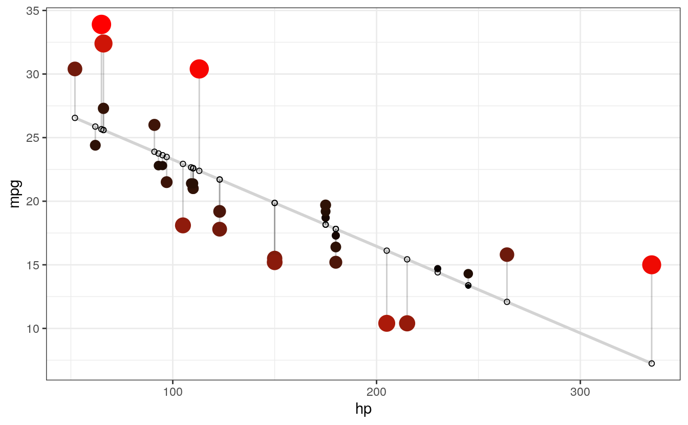
# COLOR UNDER/OVER
# Color mapped to residual with sign taken into account.
# i.e., whether actual value is greater or less than predicted
ggplot(d, aes(x = hp, y = mpg)) +
  geom_smooth(method = "lm", se = FALSE, color = "lightgrey") +
  geom_segment(aes(xend = hp, yend = predicted), alpha = .2) +

  # > Color adjustments made here...
  geom_point(aes(color = residuals)) +  # Color mapped here
  scale_color_gradient2(low = "blue", mid = "white", high = "red") +  # Colors to use here
  guides(color = FALSE) +
  # <

  geom_point(aes(y = predicted), shape = 1) +
  theme_bw()
#> `geom_smooth()` using formula 'y ~ x'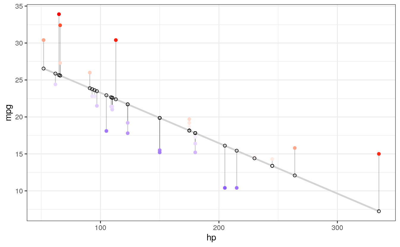
I particularly like this last example, because the colours nicely help to identify non-linearity in the data. For example, we can see that there is more red for extreme values of hp where the actual values are greater than what is being predicted. There is more blue in the centre, however, indicating that the actual values are less than what is being predicted. Together, this suggests that the relationship between the variables is non-linear, and might be better modelled by including a quadratic term in the regression equation.