C QQ and PP Plots
https://homepage.divms.uiowa.edu/~luke/classes/STAT4580/qqpp.html
C.1 QQ Plot
One way to assess how well a particular theoretical model describes a data distribution is to plot data quantiles against theoretical quantiles.
Base graphics provides qqnorm, lattice has qqmath, and ggplot2 has geom_qq.
The default theoretical distribution used in these is a standard normal, but, except for qqnorm, these allow you to specify an alternative.
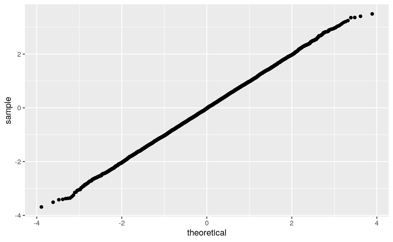
For a large sample from the theoretical distribution the plot should be a straight line through the origin with slope 1:
If the plot is a straight line with a different slope or intercept, then the data distribution corresponds to a location-scale transformation of the theoretical distribution.
The slope is the scale and the intercept is the location:
ggplot() +
    geom_qq(aes(sample = rnorm(n, 10, 4))) +
    geom_abline(intercept = 10, slope = 4,
                color = "red", size = 1.5, alpha = 0.8)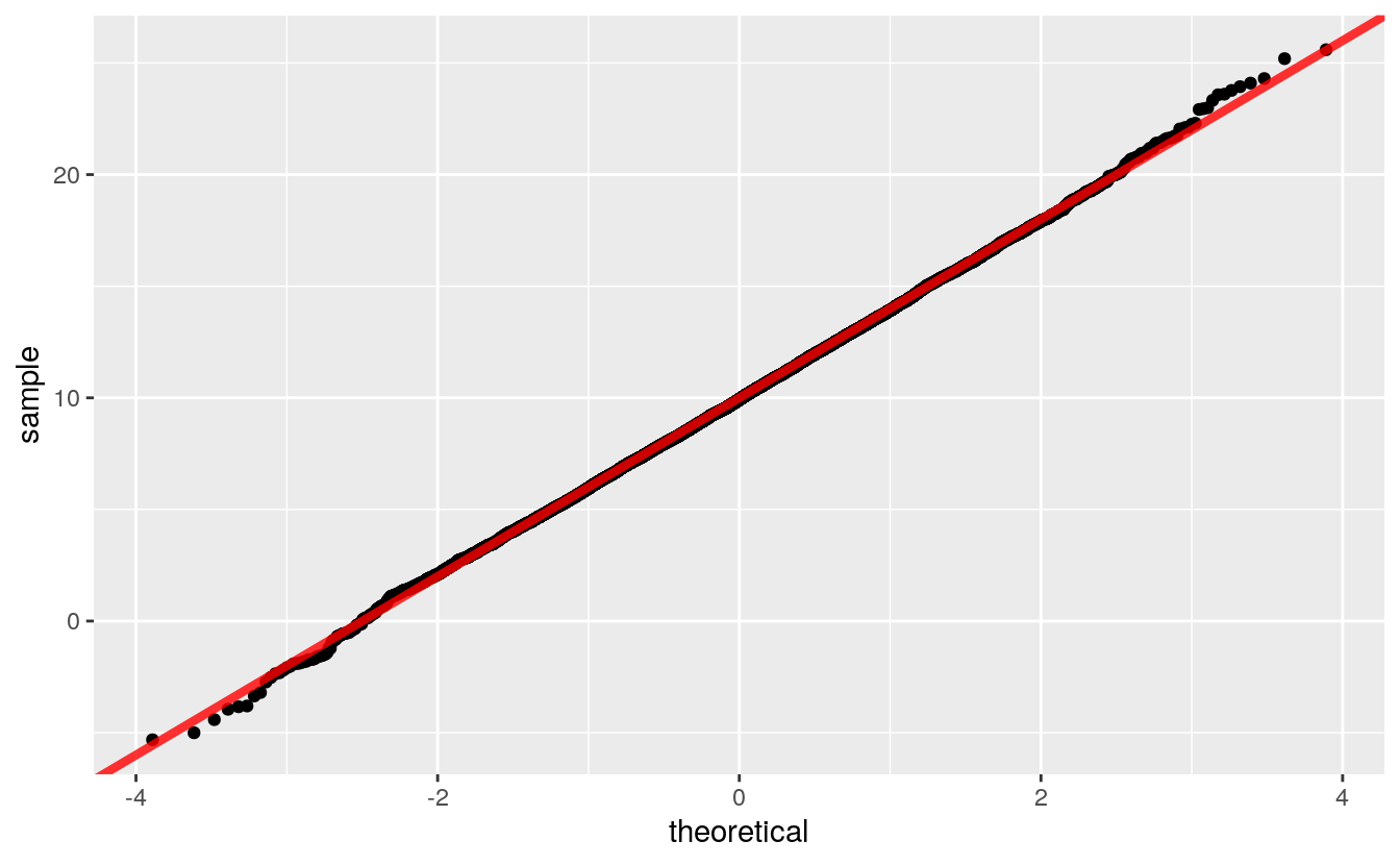
The QQ plot can be constructed directly as a scatterplot of the sorted sample \(i = 1, \dots, n\) against quantiles for
\[p_i = \frac{i}{n} - \frac{1}{2n}\]
p <- (1 : n) / n - 0.5 / n
y <- rnorm(n, 10, 4)
ggplot() + geom_point(aes(x = qnorm(p), y = sort(y)))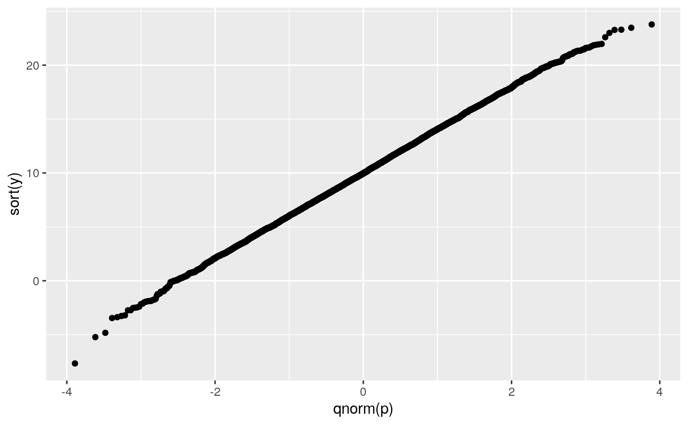
C.2 Some Examples
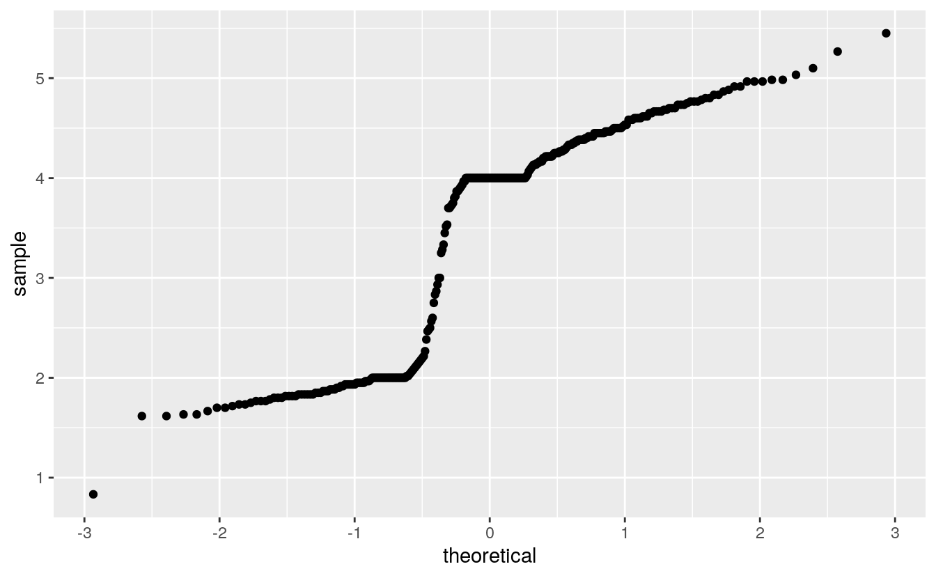
The histograms and density estimates for the duration variable in the geyser data set showed that the distribution is far from a normal distribution, and the normal QQ plot shows this as well:
Except for rounding the parent heights in the Galton data seemed not too fat from normally distributed:
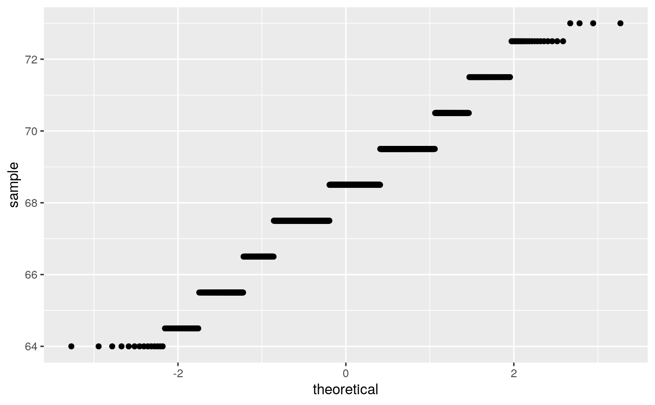
Rounding interferes more with this visualization than with a histogram or a density plot.
Rounding is more visible with this visualization than with a histogram or a density plot.
Another Gatlton dataset available in the UsingR package with less rounding is father.son:
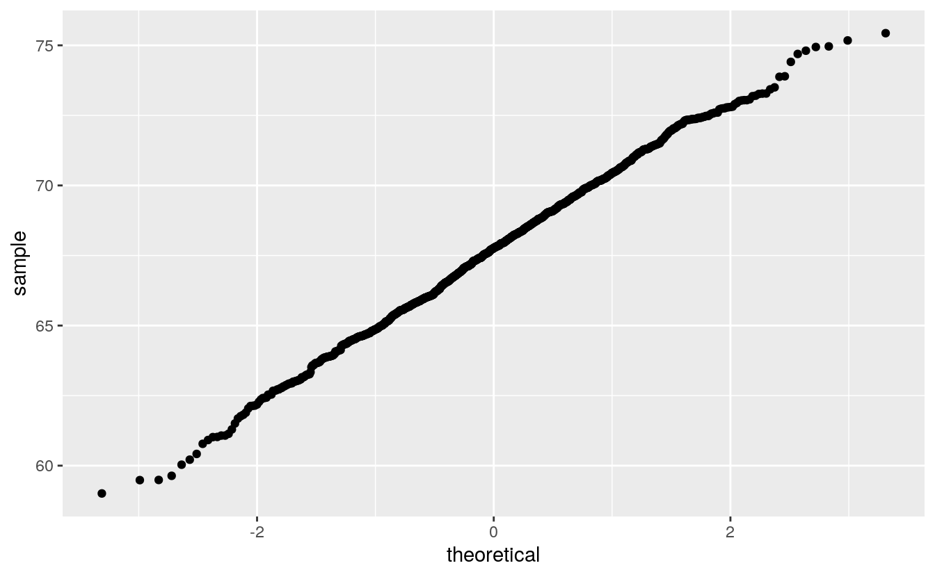
The middle seems to be fairly straight, but the ends are somewhat wiggly.
How can you calibrate your judgment?
C.3 Calibrating the Variability
One approach is to use simulation, sometimes called a graphical bootstrap.
The nboot function will simulate R samples from a normal distribution that match a variable x on sample size, sample mean, and sample SD.
The result is returned in a dataframe suitable for plotting:
nsim <- function(n, m = 0, s = 1) {
    z <- rnorm(n)
    m + s * ((z - mean(z)) / sd(z))
}

nboot <- function(x, R) {
    n <- length(x)
    m <- mean(x)
    s <- sd(x)
    do.call(rbind,
            lapply(1 : R,
                   function(i) {
                       xx <- sort(nsim(n, m, s))
                       p <- seq_along(x) / n - 0.5 / n
                       data.frame(x = xx, p = p, sim = i)
    }))
}
Plotting these as lines shows the variability in shapes we can expect when sampling from the theoretical normal distribution:
gb <- nboot(father.son$fheight, 50)
tibble::as_tibble(gb)
#> # A tibble: 53,900 x 3
#>       x        p   sim
#>   <dbl>    <dbl> <int>
#> 1  59.8 0.000464     1
#> 2  59.9 0.00139      1
#> 3  59.9 0.00232      1
#> 4  60.8 0.00325      1
#> 5  60.8 0.00417      1
#> 6  60.9 0.00510      1
#> # … with 53,894 more rows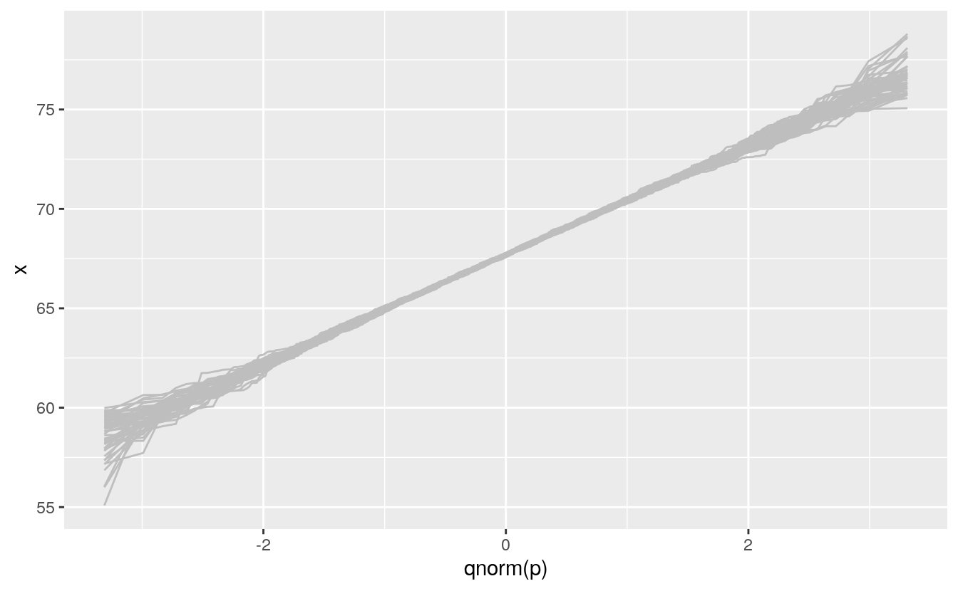
We can then insert this simulation behind our data to help calibrate the visualization:
ggplot(father.son) +
    geom_line(aes(x = qnorm(p), y = x, group = sim),
              color = "gray", data = gb) +
    geom_qq(aes(sample = fheight))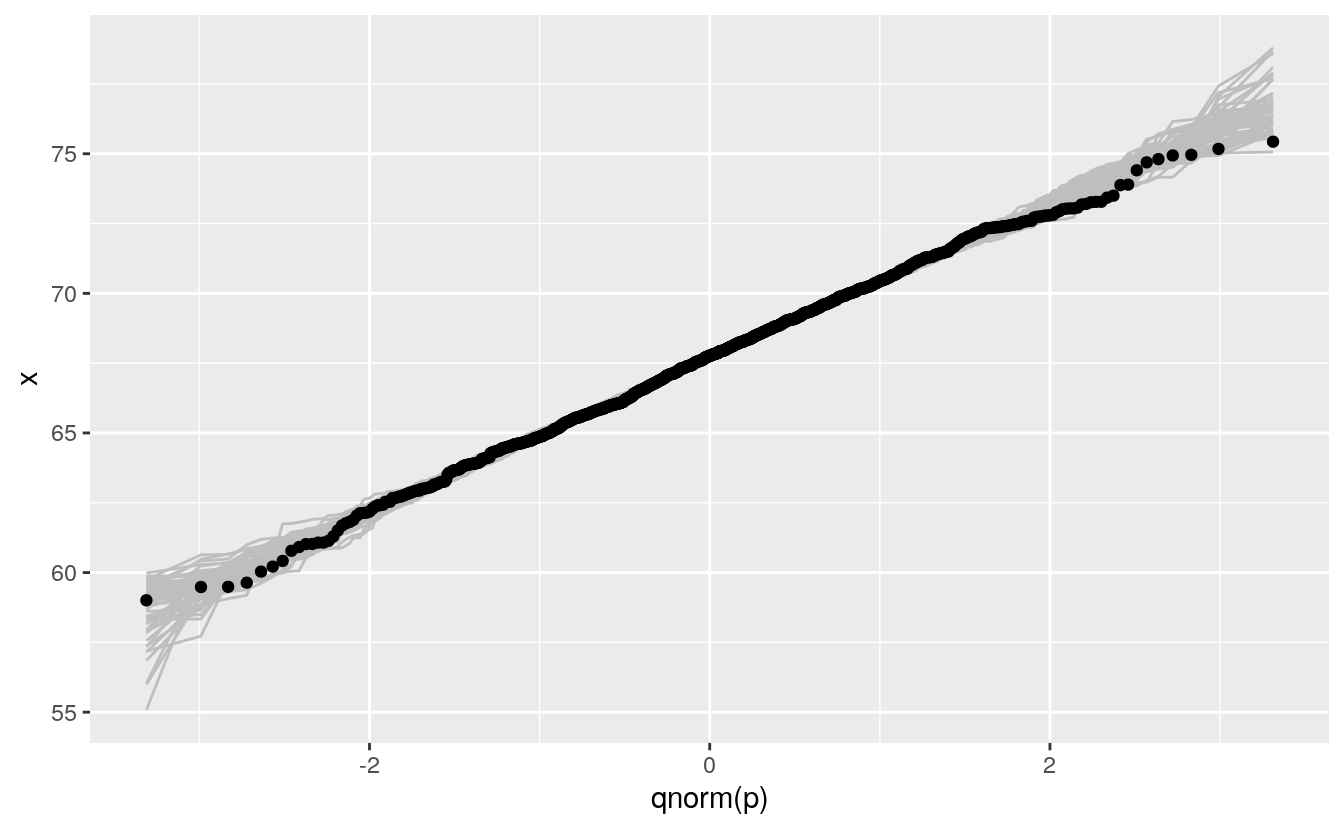
C.4 Scalability
For large sample sizes overplotting will occur:
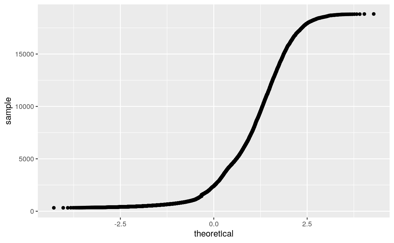
This can be alleviated by using a grid of quantiles:
nq <- 100
p <- (1 : nq) / nq - 0.5 / nq
ggplot() + geom_point(aes(x = qnorm(p), y = quantile(diamonds$price, p)))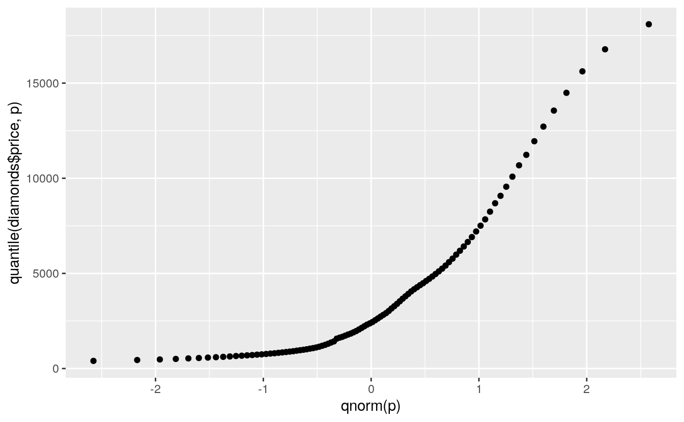
A more reasonable model might be an exponential distribution:
ggplot() + geom_point(aes(x = qexp(p), y = quantile(diamonds$price, p)))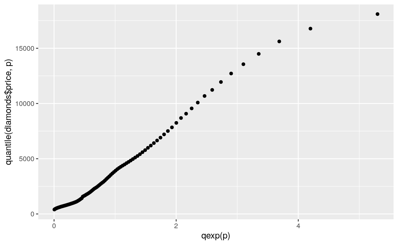
C.5 Comparing Two Distributions
The QQ plot can also be used to compare two distributions based on a sample from each.
If the samples are the same size then this is just a plot of the ordered sample values against each other.
Choosing a fixed set of quantiles allows samples of unequal size to be compared.
Using a small set of quantiles we can compare the distributions of waiting times between eruptions of Old Faithful from the two different data sets we have looked at:
nq <- 31  # user defined
nq <- min(length(geyser$waiting), length(faithful$waiting)) # or take the minimum
p <- (1 : nq) / nq - 0.5 / nq

wg <- geyser$waiting
wf <- faithful$waiting

ggplot() + geom_point(aes(x = quantile(wg, p), y = quantile(wf, p)))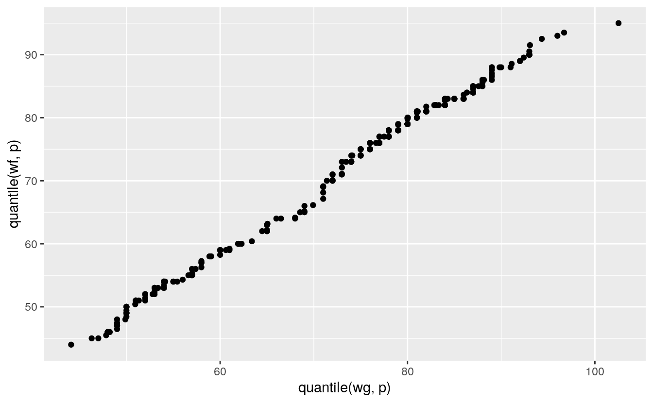
C.6 PP Plots
The PP plot for comparing a sample to a theoretical model plots the theoretical proportion less than or equal to each observed value against the actual proportion.
For a theoretical cumulative distribution function F this means plotting
\[F(x(i))∼pi\]
For the fheight variable in the father.son data:
m <- mean(father.son$fheight)
s <- sd(father.son$fheight)
n <- nrow(father.son)
p <- (1 : n) / n - 0.5 / n
ggplot(father.son) + geom_point(aes(x = p, y = sort(pnorm(fheight, m, s))))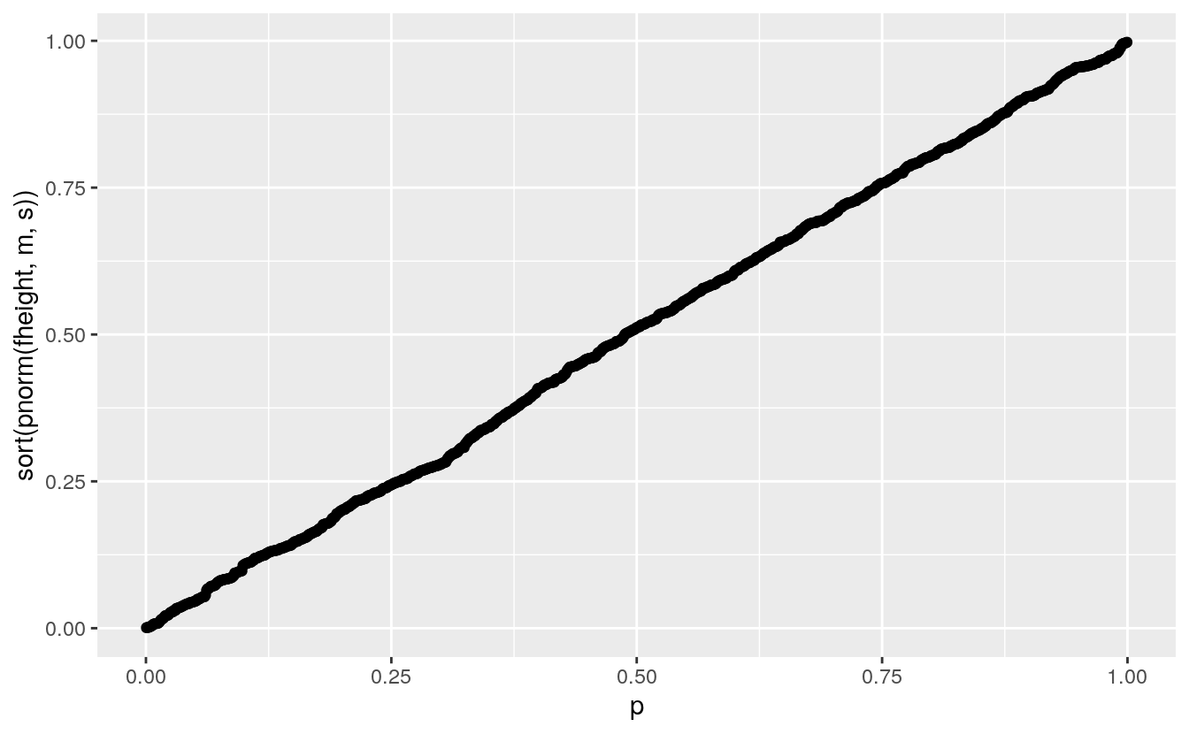
The values on the vertical axis are the probability integral transform of the data for the theoretical distribution.
If the data are a sample from the theoretical distribution then these transforms would be uniformly distributed on [0,1].
The PP plot is a QQ plot of these transformed values against a uniform distribution.
The PP plot goes through the points (0,0) and (1,1) and so is much less variable in the tails:
pp <- ggplot() +
geom_line(aes(x = p, y = pnorm(x, m, s), group = sim),
          color = "gray", data = gb)
pp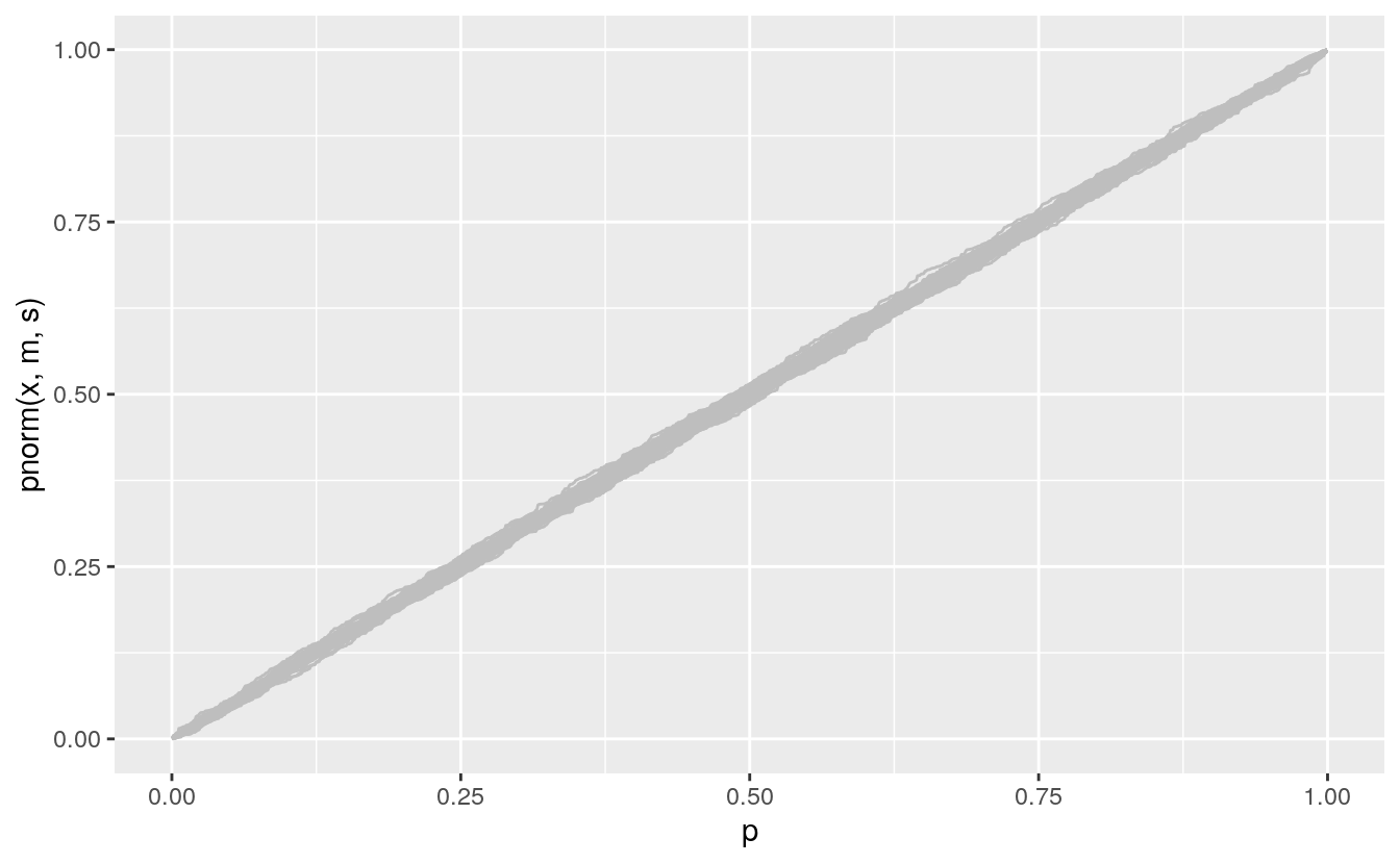
Adding the data:
pp +
geom_point(aes(x = p, y = sort(pnorm(fheight, m, s))), data = (father.son))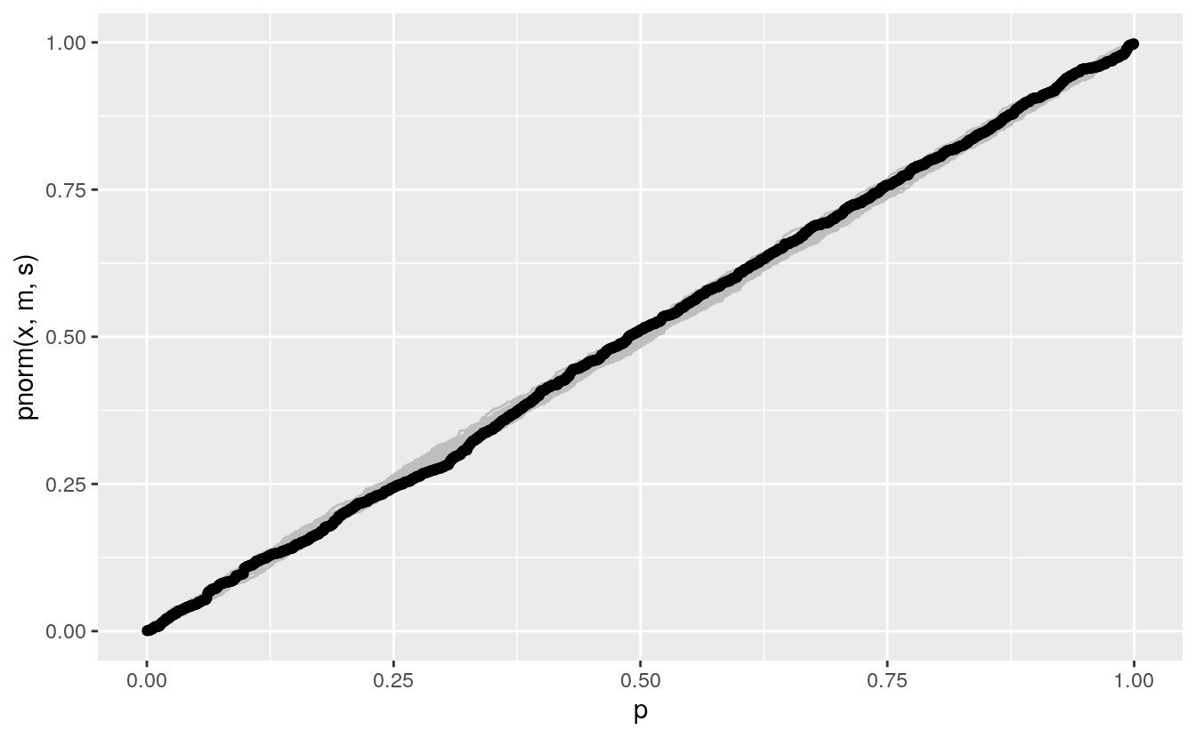
The PP plot is also less sensitive to deviations in the tails.
A compromise between the QQ and PP plots uses the arcsine square root variance-stabilizing transformation, which makes the variability approximately constant across the range of the plot:
vpp <- ggplot() +
geom_line(aes(x = asin(sqrt(p)), y = asin(sqrt(pnorm(x, m, s))), group = sim),
          color = "gray", data = gb)
vpp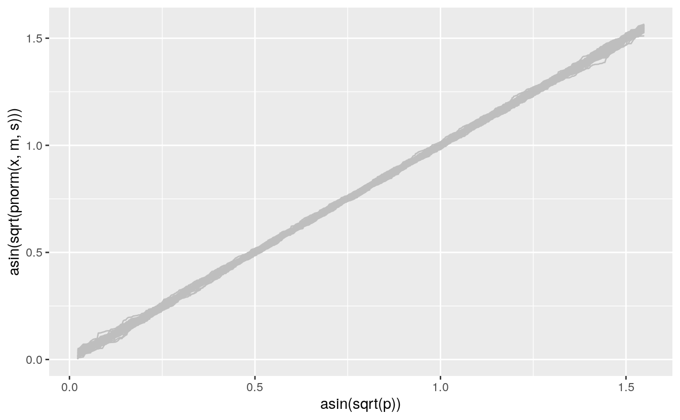
Adding the data:
vpp +
geom_point(aes(x = asin(sqrt(p)), y = sort(asin(sqrt(pnorm(fheight, m, s))))),
           data = (father.son))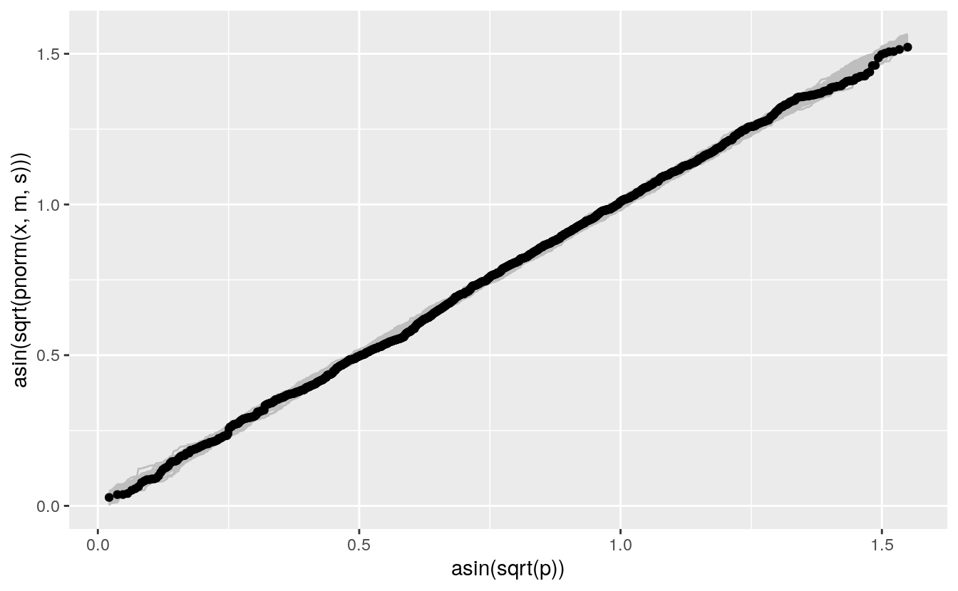
C.7 Plots For Assessing Model Fit
Both QQ and PP plots can be used to asses how well a theoretical family of models fits your data, or your residuals.
To use a PP plot you have to estimate the parameters first.
For a location-scale family, like the normal distribution family, you can use a QQ plot with a standard member of the family.
Some other families can use other transformations that lead to straight lines for family members:
The Weibull family is widely used in reliability modeling; its CDF is \[F(t) = 1 - \exp\left\{-\left(\frac{t}{b}\right)^a\right\}\]
The logarithms of Weibull random variables form a location-scale family.
Special paper used to be available for Weibull probability plots.
A Weibull QQ plot for price in the diamonds data:
n <- nrow(diamonds)
p <- (1 : n) / n - 0.5 / n
ggplot(diamonds) +
    geom_point(aes(x = log10(qweibull(p, 1, 1)), y = log10(sort(price))))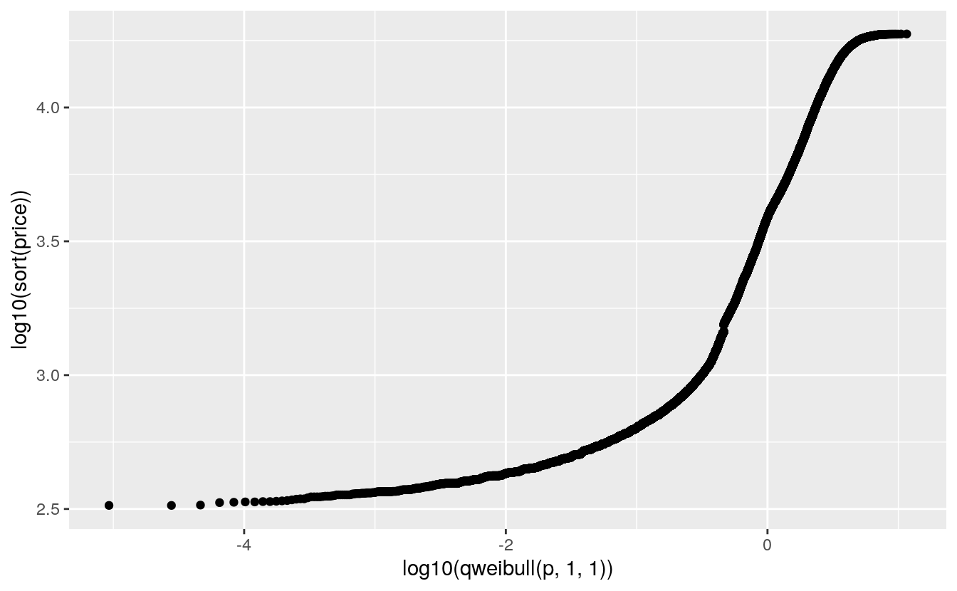
The lower tail does not match a Weibull distribution.
Is this important?
In engineering applications it often is.
In selecting a reasonable model to capture the shape of this distribution it may not be.
QQ plots are helpful for understanding departures from a theoretical model.
No data will fit a theoretical model perfectly.
Case-specific judgment is needed to decide whether departures are important.
George Box: All models are wrong but some are useful.