Ch. 7 Seaborn
Last update: Thu Nov 5 19:22:01 2020 -0600 (5124cef)
R
library(reticulate)
use_condaenv("r-python", required = TRUE)
7.1 Error bands
Python
# https://seaborn.pydata.org/examples/errorband_lineplots.html
import matplotlib.pyplot as plt
import seaborn as sns

sns.set_theme(style="darkgrid")

# Load an example dataset with long-form data
fmri = sns.load_dataset("fmri")

# Plot the responses for different events and regions
sns.lineplot(x="timepoint", y="signal",
             hue="region", style="event",
             data=fmri)
plt.show()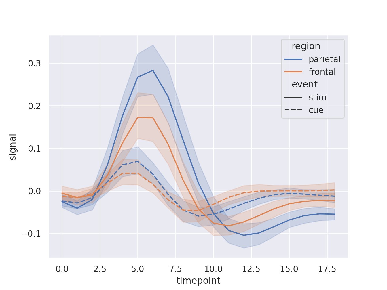
7.2 Boxplots
Python
# https://seaborn.pydata.org/examples/horizontal_boxplot.html
import seaborn as sns
import matplotlib.pyplot as plt

sns.set_theme(style="ticks")

# Initialize the figure with a logarithmic x axis
f, ax = plt.subplots(figsize=(7, 6))
ax.set_xscale("log")

# Load the example planets dataset
planets = sns.load_dataset("planets")
# Plot the orbital period with horizontal boxes
sns.boxplot(x="distance", y="method", data=planets,
            whis=[0, 100], width=.6, palette="vlag")
# Add in points to show each observation
sns.stripplot(x="distance", y="method", data=planets,
              size=4, color=".3", linewidth=0)
# Tweak the visual presentation
ax.xaxis.grid(True)
ax.set(ylabel="")
sns.despine(trim=True, left=True)

plt.show()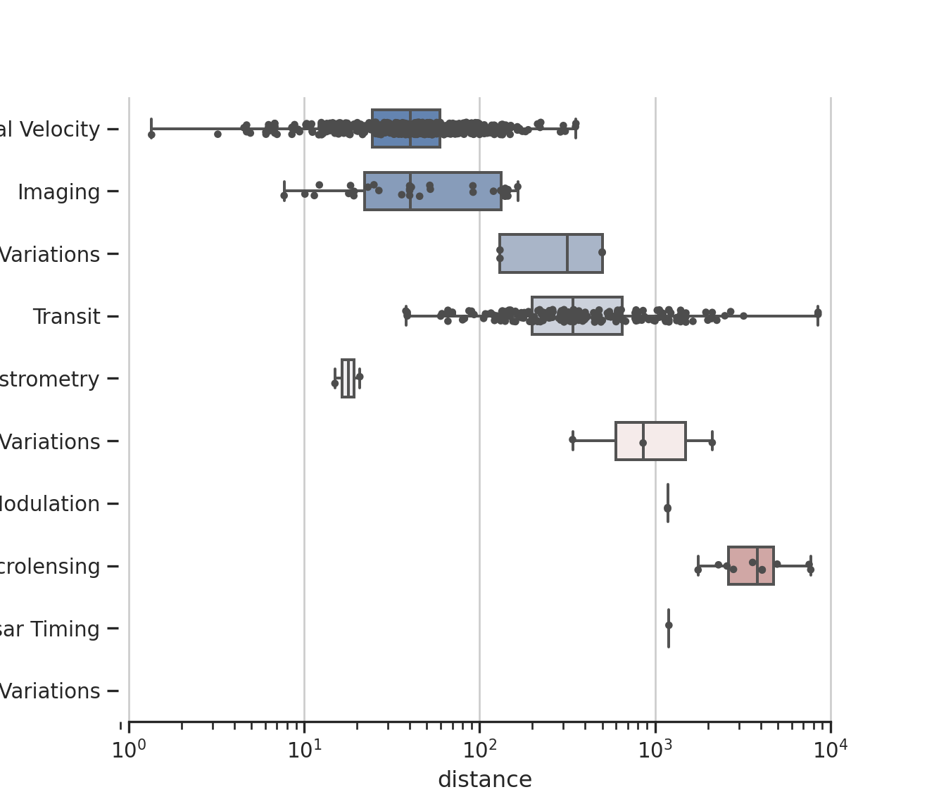
7.3 Facets
Python
# https://seaborn.pydata.org/examples/timeseries_facets.html
import matplotlib.pyplot as plt
import seaborn as sns

sns.set_theme(style="dark")
flights = sns.load_dataset("flights")

# Plot each year's time series in its own facet
g = sns.relplot(
    data=flights,
    x="month", y="passengers", col="year", hue="year",
    kind="line", palette="crest", linewidth=4, zorder=5,
    col_wrap=3, height=2, aspect=1.5, legend=False,
)

# Iterate over each subplot to customize further
for year, ax in g.axes_dict.items():

    # Add the title as an annotation within the plot
    ax.text(.8, .85, year, transform=ax.transAxes, fontweight="bold")

    # Plot every year's time series in the background
    sns.lineplot(
        data=flights, x="month", y="passengers", units="year",
        estimator=None, color=".7", linewidth=1, ax=ax,
    )
# Reduce the frequency of the x axis ticks
ax.set_xticks(ax.get_xticks()[::2])
# Tweak the supporting aspects of the plot
g.set_titles("")
g.set_axis_labels("", "Passengers")
g.tight_layout()

plt.show()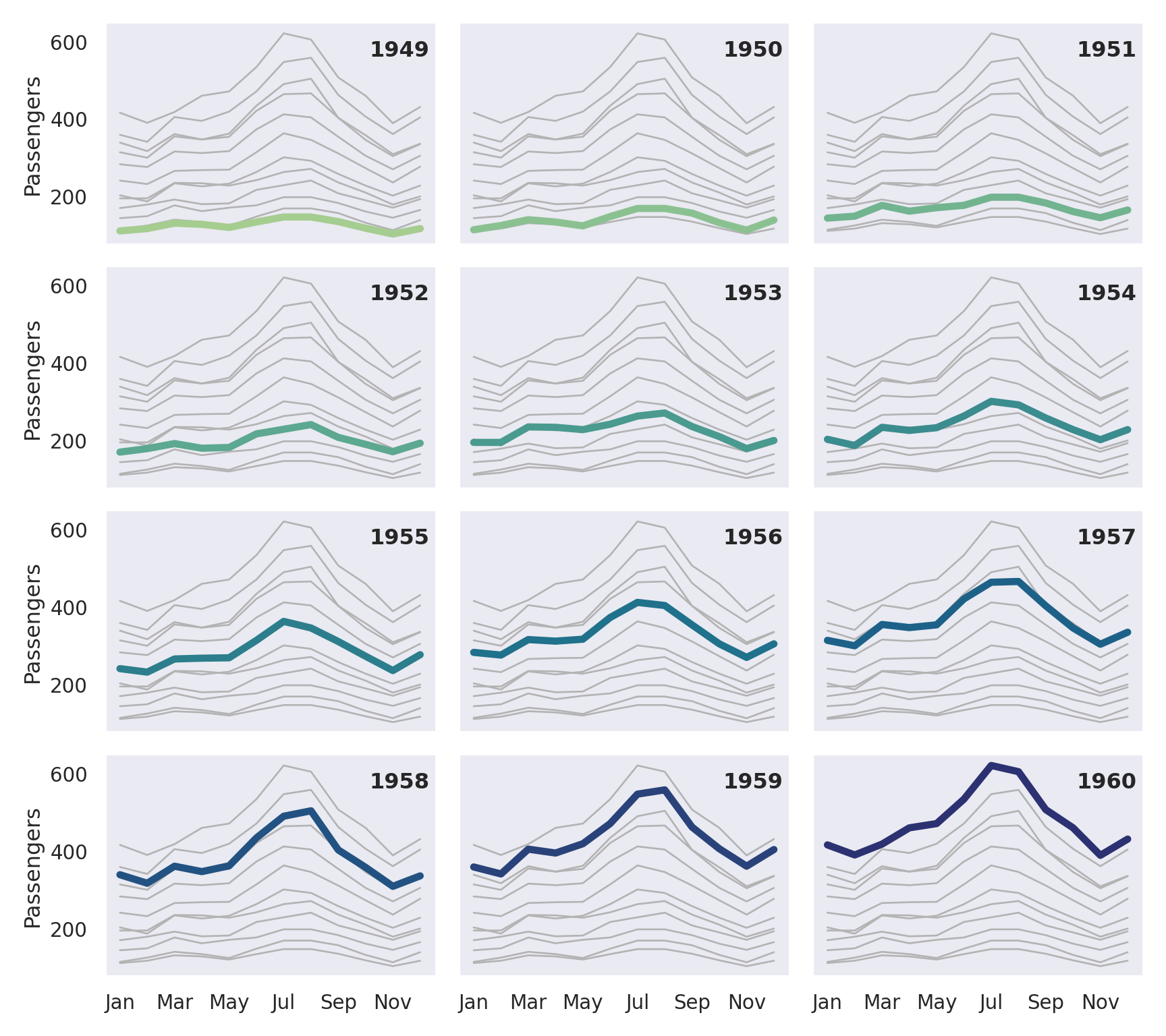
Python
import numpy as np
import pandas as pd
import matplotlib.pyplot as plt
import seaborn as sns
sns.set_theme(style="darkgrid")
tips = sns.load_dataset("tips")
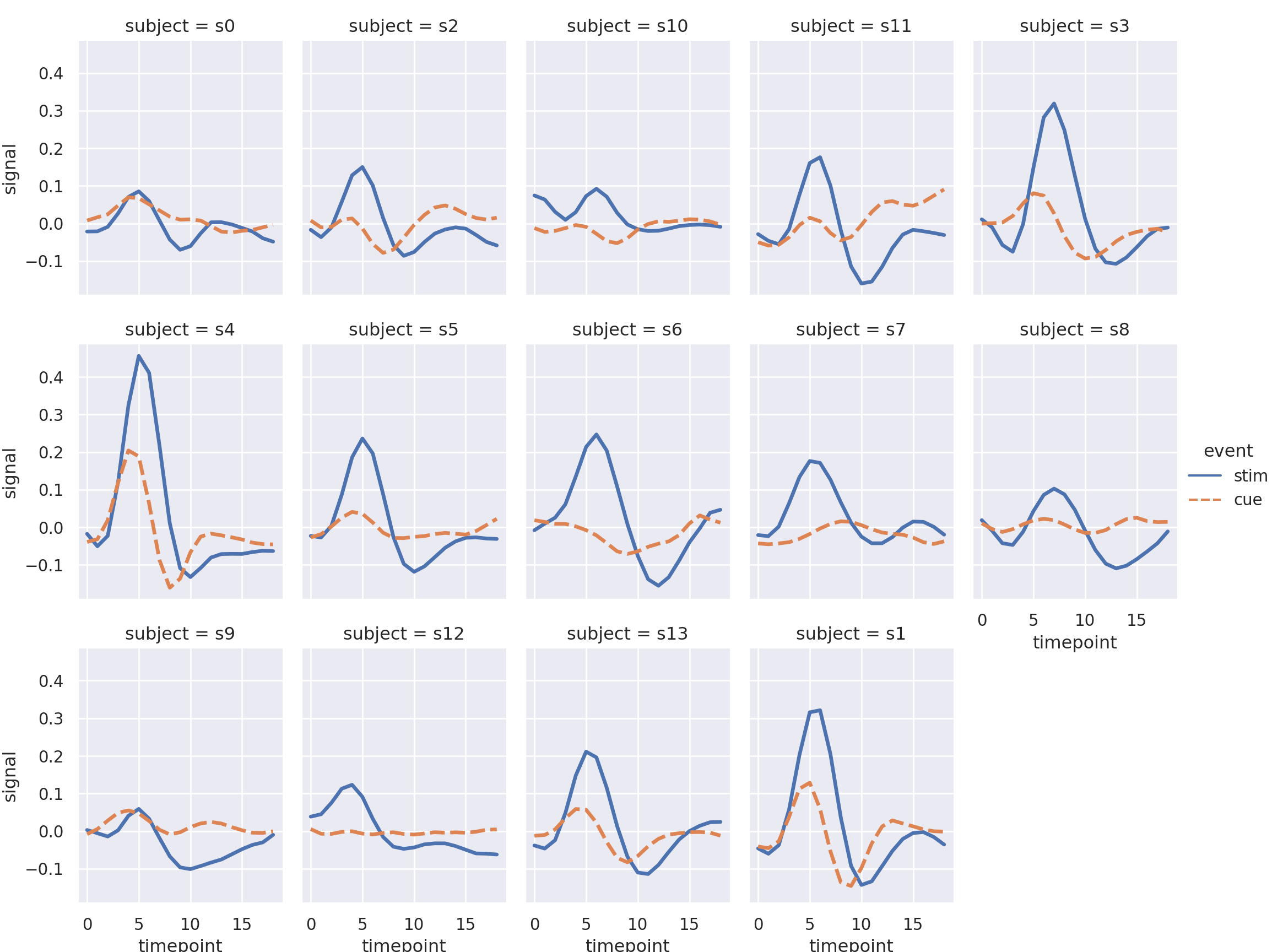
fmri = sns.load_dataset("fmri")
sns.relplot(x="timepoint", y="signal", hue="event", style="event",
col="subject", col_wrap=5,
height=3, aspect=.75, linewidth=2.5,
kind="line", data=fmri.query("region == 'frontal'"));
plt.show()