Ch. 1 Introduction
Last update: Thu Nov 19 17:20:43 2020 -0600 (49b93b1)
Remember that in the previous chapter we said that the best way of obtaining reproducible results writing Python code in Rmarkdown is creating stand-alone Python environments. The next code block is written in R and what is doing with reticulate::use_condaenv("r-python"), is activating the Python environment r-python to be used by Python to build the notebooks written in Rmarkdown . Later we will see how to create these environments.
R
library(reticulate)
reticulate::use_condaenv("r-python")
1.1 “Hello world”
The environment r-python already has the basic Python libraries, among them numpy and matplotlib. This is one of the simplest of examples: plotting the sine of a random numpy array.
Python
import matplotlib.pyplot as plt
import numpy as np

t = np.arange(0.0, 2.0, 0.01)
s = 1 + np.sin(2*np.pi*t)
plt.plot(t, s)

plt.xlabel('time (s)')
plt.ylabel('voltage (mV)')
plt.title('About as simple as it gets, folks')
plt.grid(True)
plt.savefig("test.png")
plt.show()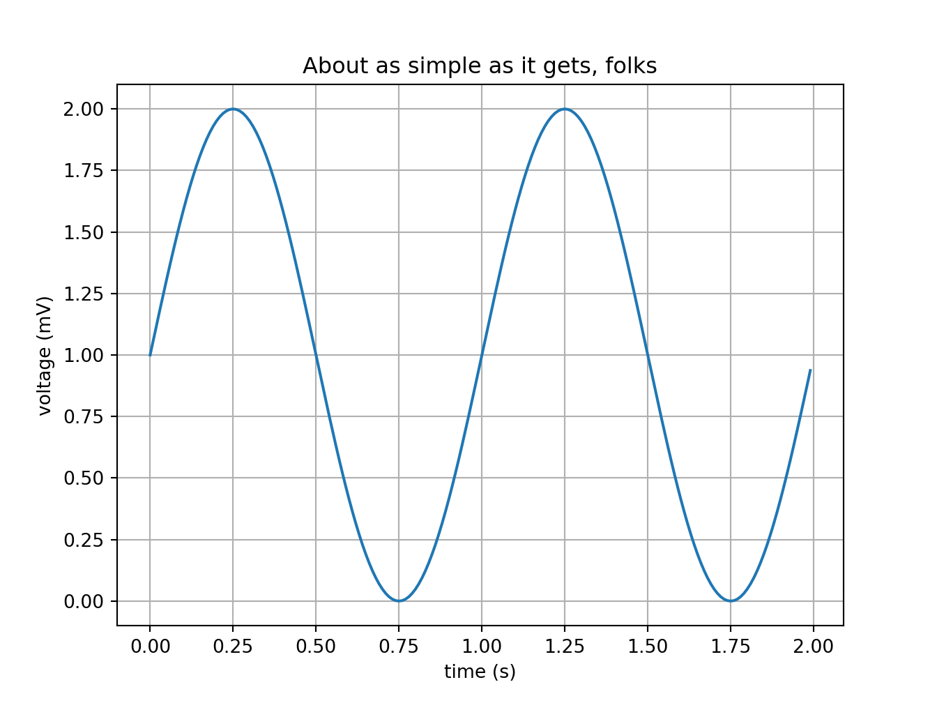
1.2 The parts of a plot
I love this plot because it helps to formulate the right question when you are looking for online assistance. Sooner of later, you will be in need to customize the \(x\) or \(y\) axis ticks in such a way that present specific data points and skip the defaults. Or, get rid of so many $x$ axis labels that are superimposing one over each other.
Python
# https://matplotlib.org/gallery/showcase/anatomy.html#sphx-glr-gallery-showcase-anatomy-py
import numpy as np
import matplotlib.pyplot as plt
from matplotlib.ticker import AutoMinorLocator, MultipleLocator, FuncFormatter

np.random.seed(19680801)

X = np.linspace(0.5, 3.5, 100)
Y1 = 3+np.cos(X)
Y2 = 1+np.cos(1+X/0.75)/2
Y3 = np.random.uniform(Y1, Y2, len(X))

fig = plt.figure(figsize=(8, 8))
ax = fig.add_subplot(1, 1, 1, aspect=1)


def minor_tick(x, pos):
    if not x % 1.0:
        return ""
    return "%.2f" % x

ax.xaxis.set_major_locator(MultipleLocator(1.000))
ax.xaxis.set_minor_locator(AutoMinorLocator(4))
ax.yaxis.set_major_locator(MultipleLocator(1.000))
ax.yaxis.set_minor_locator(AutoMinorLocator(4))
ax.xaxis.set_minor_formatter(FuncFormatter(minor_tick))

ax.set_xlim(0, 4)
#:> (0.0, 4.0)
ax.set_ylim(0, 4)
#:> (0.0, 4.0)
ax.tick_params(which='major', width=1.0)
ax.tick_params(which='major', length=10)
ax.tick_params(which='minor', width=1.0, labelsize=10)
ax.tick_params(which='minor', length=5, labelsize=10, labelcolor='0.25')

ax.grid(linestyle="--", linewidth=0.5, color='.25', zorder=-10)

ax.plot(X, Y1, c=(0.25, 0.25, 1.00), lw=2, label="Blue signal", zorder=10)
ax.plot(X, Y2, c=(1.00, 0.25, 0.25), lw=2, label="Red signal")
ax.plot(X, Y3, linewidth=0,
        marker='o', markerfacecolor='w', markeredgecolor='k')

ax.set_title("Anatomy of a figure", fontsize=20, verticalalignment='bottom')
ax.set_xlabel("X axis label")
ax.set_ylabel("Y axis label")
ax.legend()


def circle(x, y, radius=0.15):
    from matplotlib.patches import Circle
    from matplotlib.patheffects import withStroke
    circle = Circle((x, y), radius, clip_on=False, zorder=10, linewidth=1,
                    edgecolor='black', facecolor=(0, 0, 0, .0125),
                    path_effects=[withStroke(linewidth=5, foreground='w')])
    ax.add_artist(circle)


def text(x, y, text):
    ax.text(x, y, text, backgroundcolor="white",
            ha='center', va='top', weight='bold', color='blue')

# Minor tick
circle(0.50, -0.10)
text(0.50, -0.32, "Minor tick label")

# Major tick
circle(-0.03, 4.00)
text(0.03, 3.80, "Major tick")

# Minor tick
circle(0.00, 3.50)
text(0.00, 3.30, "Minor tick")

# Major tick label
circle(-0.15, 3.00)
text(-0.15, 2.80, "Major tick label")

# X Label
circle(1.80, -0.27)
text(1.80, -0.45, "X axis label")

# Y Label
circle(-0.27, 1.80)
text(-0.27, 1.6, "Y axis label")

# Title
circle(1.60, 4.13)
text(1.60, 3.93, "Title")

# Blue plot
circle(1.75, 2.80)
text(1.75, 2.60, "Line\n(line plot)")

# Red plot
circle(1.20, 0.60)
text(1.20, 0.40, "Line\n(line plot)")

# Scatter plot
circle(3.20, 1.75)
text(3.20, 1.55, "Markers\n(scatter plot)")

# Grid
circle(3.00, 3.00)
text(3.00, 2.80, "Grid")

# Legend
circle(3.70, 3.80)
text(3.70, 3.60, "Legend")

# Axes
circle(0.5, 0.5)
text(0.5, 0.3, "Axes")

# Figure
circle(-0.3, 0.65)
text(-0.3, 0.45, "Figure")

color = 'blue'
ax.annotate('Spines', xy=(4.0, 0.35), xycoords='data',
            xytext=(3.3, 0.5), textcoords='data',
            weight='bold', color=color,
            arrowprops=dict(arrowstyle='->',
                            connectionstyle="arc3",
                            color=color))

ax.annotate('', xy=(3.15, 0.0), xycoords='data',
            xytext=(3.45, 0.45), textcoords='data',
            weight='bold', color=color,
            arrowprops=dict(arrowstyle='->',
                            connectionstyle="arc3",
                            color=color))

ax.text(4.0, -0.4, "Made with http://matplotlib.org",
        fontsize=10, ha="right", color='.5')

plt.show()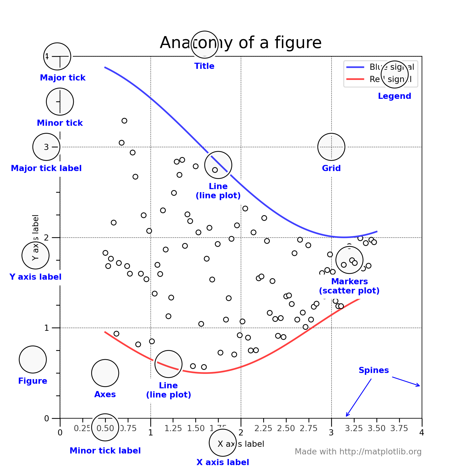
1.3 Can do business plots too …
Not precisely the kind of plots I am interested in right now, all the kinds of business plots are available in matplotlib, including the infamous pie chart.
Python
import numpy as np
import matplotlib.pyplot as plt

plt.style.use('ggplot')

fig, axes = plt.subplots(ncols=2, nrows=2)
ax1, ax2, ax3, ax4 = axes.ravel()

# scatter plot (Note: `plt.scatter` doesn't use default colors)
x, y = np.random.normal(size=(2, 200))
ax1.plot(x, y, 'o')

# sinusoidal lines with colors from default color cycle
L = 2*np.pi
x = np.linspace(0, L)
ncolors = len(plt.rcParams['axes.prop_cycle'])
shift = np.linspace(0, L, ncolors, endpoint=False)
for s in shift:
    ax2.plot(x, np.sin(x + s), '-')
ax2.margins(0)

# bar graphs
x = np.arange(5)
y1, y2 = np.random.randint(1, 25, size=(2, 5))
width = 0.25
ax3.bar(x, y1, width)
ax3.bar(x + width, y2, width,
        color=list(plt.rcParams['axes.prop_cycle'])[2]['color'])
ax3.set_xticks(x + width)
ax3.set_xticklabels(['a', 'b', 'c', 'd', 'e'])

# circles with colors from default color cycle
for i, color in enumerate(plt.rcParams['axes.prop_cycle']):
    xy = np.random.normal(size=2)
    ax4.add_patch(plt.Circle(xy, radius=0.3, color=color['color']))
ax4.axis('equal')
ax4.margins(0)
plt.show()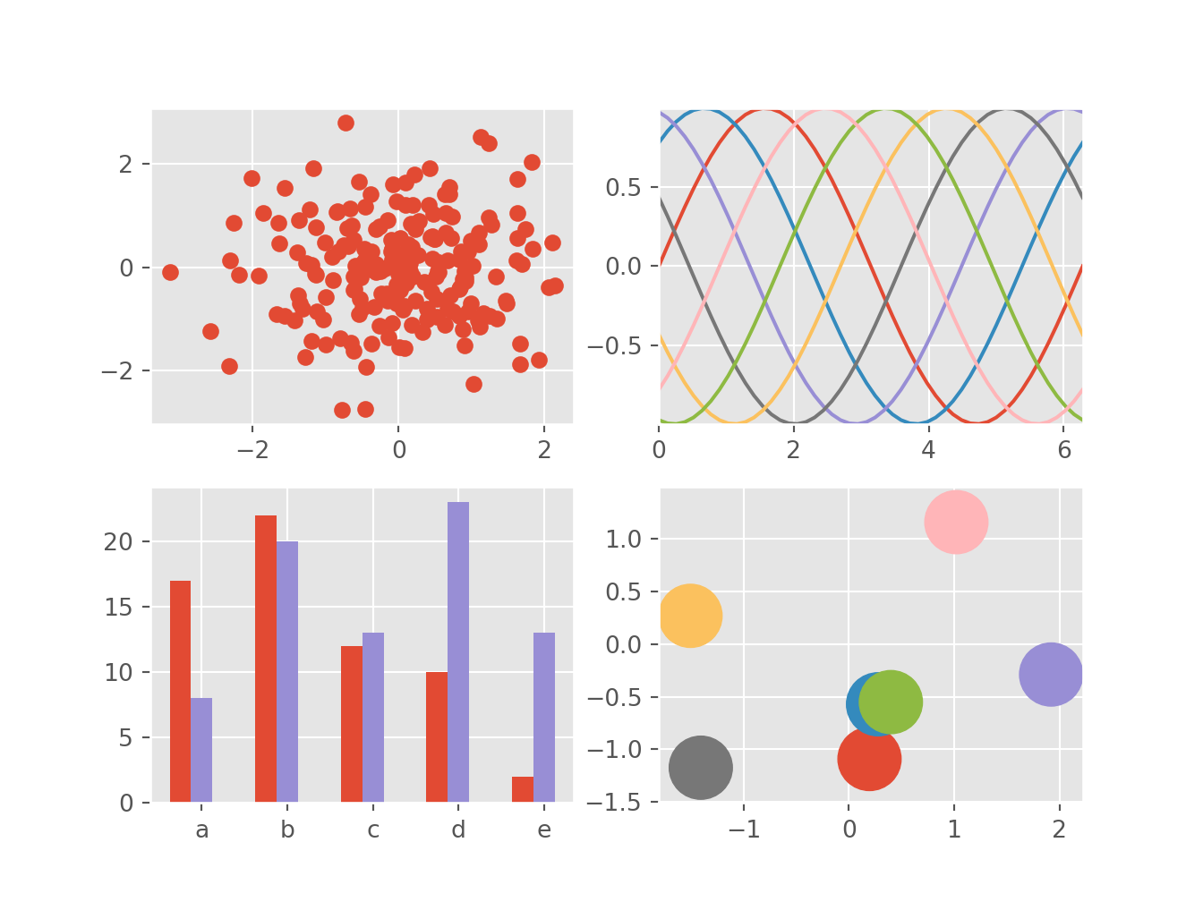
1.4 And real time …
Strip charts are the favorites for plotting real time data, from sensors, or from any other internet source.
Python
# https://matplotlib.org/gallery/lines_bars_and_markers/cohere.html#sphx-glr-gallery-lines-bars-and-markers-cohere-py
import numpy as np
import matplotlib.pyplot as plt

# Fixing random state for reproducibility
np.random.seed(19680801)

dt = 0.01
t = np.arange(0, 30, dt)
nse1 = np.random.randn(len(t))                 # white noise 1
nse2 = np.random.randn(len(t))                 # white noise 2

# Two signals with a coherent part at 10Hz and a random part
s1 = np.sin(2 * np.pi * 10 * t) + nse1
s2 = np.sin(2 * np.pi * 10 * t) + nse2

fig, axs = plt.subplots(2, 1)
axs[0].plot(t, s1, t, s2)
axs[0].set_xlim(0, 2)
axs[0].set_xlabel('time')
axs[0].set_ylabel('s1 and s2')
axs[0].grid(True)

cxy, f = axs[1].cohere(s1, s2, 256, 1. / dt)
axs[1].set_ylabel('coherence')

fig.tight_layout()
plt.show()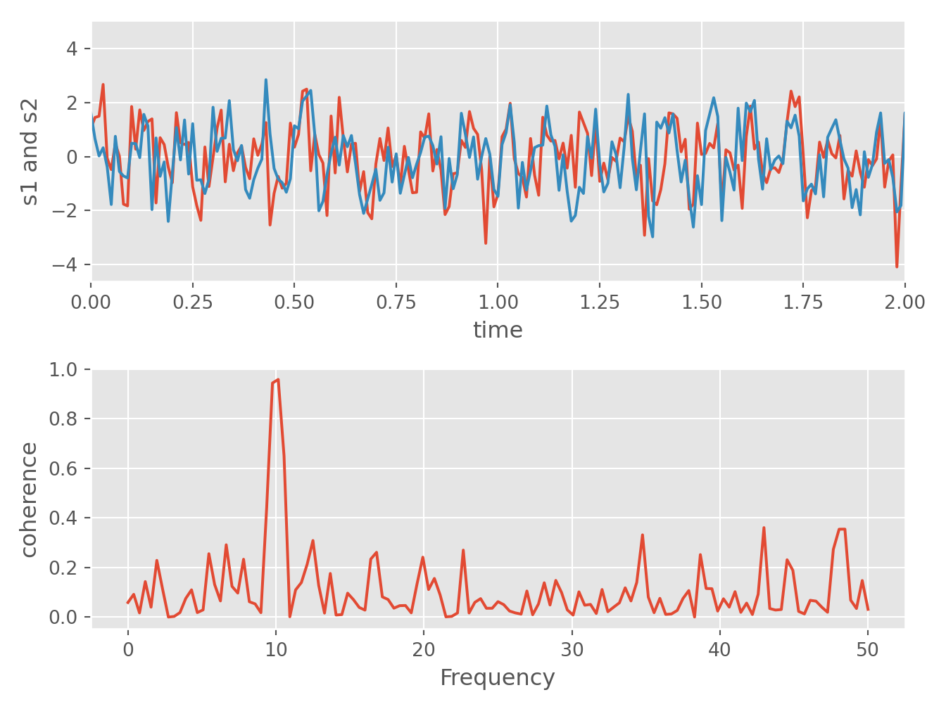
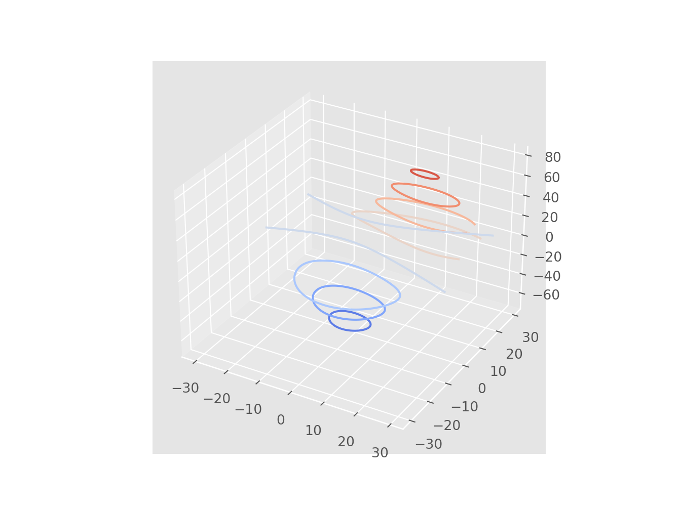
1.5 And also 3D …
Although in data science 3D plots are not recommended, if there is a compelling case where a 3D plot explains a discovery better than a 2D plot, then, it should be okay and justified. But the rule is not abusing of 3D. What you are trying to convey is information per square centimeter of graphics.
Python
# https://matplotlib.org/2.0.2/examples/mplot3d/contour3d_demo.html

from mpl_toolkits.mplot3d import axes3d
import matplotlib.pyplot as plt
from matplotlib import cm

fig = plt.figure()
ax = fig.add_subplot(111, projection='3d')
X, Y, Z = axes3d.get_test_data(0.05)
cset = ax.contour(X, Y, Z, cmap=cm.coolwarm)
ax.clabel(cset, fontsize=9, inline=1)

plt.show()