Ch. 9 Beyond matplotlib
Last update: Thu Nov 19 17:20:43 2020 -0600 (49b93b1)
R
library(reticulate)
reticulate::use_condaenv("r-python")
9.1 brokenaxis
9.1.1 Usage
Python
# https://github.com/bendichter/brokenaxes/blob/master/examples/plot_usage.py
import matplotlib.pyplot as plt
from brokenaxes import brokenaxes
import numpy as np

fig = plt.figure(figsize=(5,2))
bax = brokenaxes(xlims=((0, .1), (.4, .7)), ylims=((-1, .7), (.79, 1)), hspace=.05)
x = np.linspace(0, 1, 100)
bax.plot(x, np.sin(10 * x), label='sin')
bax.plot(x, np.cos(10 * x), label='cos')
bax.legend(loc=3)
bax.set_xlabel('time')
bax.set_ylabel('value')
plt.show()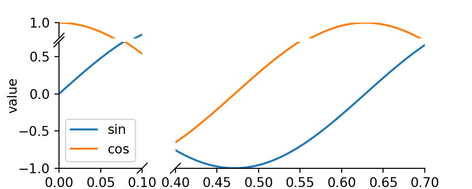
9.1.2 Subplots
Python
# https://github.com/bendichter/brokenaxes/blob/master/examples/plot_subplots.py
from brokenaxes import brokenaxes
from matplotlib.gridspec import GridSpec
import numpy as np

sps1, sps2 = GridSpec(2,1)

bax = brokenaxes(xlims=((.1, .3),(.7, .8)), subplot_spec=sps1)
x = np.linspace(0, 1, 100)
bax.plot(x, np.sin(x*30), ls=':', color='m')
x = np.random.poisson(3, 1000)
bax = brokenaxes(xlims=((0, 2.5), (3, 6)), subplot_spec=sps2)
bax.hist(x, histtype='bar')
plt.show()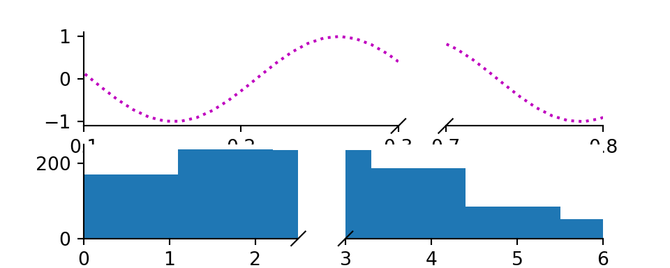
9.1.3 Log scales
Python
# https://github.com/bendichter/brokenaxes/blob/master/examples/plot_logscales.py
# Log scales
# ==========
# Brokenaxe compute automatically the correct layout for a 1:1 scale. However, for
# logarithmic scales, the 1:1 scale has to be adapted. This is done via the
# `yscale` or `xscale` arguments.
import matplotlib.pyplot as plt
from brokenaxes import brokenaxes
import numpy as np

fig = plt.figure(figsize=(5,5))
bax = brokenaxes(xlims=((1, 500), (600, 10000)),
         ylims=((1, 500), (600, 10000)),
         hspace=.15, xscale='log', yscale='log')

x = np.logspace(0.0, 4, 100)
bax.loglog(x, x, label='$y=x=10^{0}$ to $10^{4}$')
bax.legend(loc='best')
bax.grid(axis='both', which='major', ls='-')
bax.grid(axis='both', which='minor', ls='--', alpha=0.4)
bax.set_xlabel('x')
bax.set_ylabel('y')
plt.show()
9.1.4 Different scales
Python
# https://github.com/bendichter/brokenaxes/blob/master/examples/plot_different_scales.py
# Different scales with brokenaxes
# ================================
# This example shows how to customize the scales and the ticks of each broken
# axes.
#############################################################################
# brokenaxes lets you choose the aspect ratio of each sub-axes thanks to the
# `height_ratios` and `width_ratios` to over-pass the default 1:1 scale for all
# axes. However, by default the ticks spacing are still identical for all axes.
# In this example, we present how to customize the ticks of your brokenaxes.
import numpy as np
import matplotlib.pyplot as plt
from brokenaxes import brokenaxes
import matplotlib.ticker as ticker

def make_plot():
    x = np.linspace(0, 5*2*np.pi, 300)
    y1 = np.sin(x)*100
    y2 = np.sin(x+np.pi)*5 + 90
    y3 = 30*np.exp(-x) - 50
    y4 = 90 + (1-np.exp(6/x))

    bax = brokenaxes(
        ylims=[(-100, 0), (80, 100)],
        xlims=[(0, 5), (10, 30)],
        height_ratios=[1, 3],
        width_ratios=[3, 5]
    )

    bax.plot(x, y1, label="Big sin")
    bax.plot(x, y2, label="Small sin")
    bax.plot(x, y3, label="Exponential 1")
    bax.plot(x, y4, '--', label="Exponential 2")

    bax.legend(loc="lower right")
    bax.set_title("Example for different scales for the x and y axis")

    return bax

#############################################################################
# Use the AutoLocator() ticker
# ----------------------------
plt.figure()
bax = make_plot()

# Then, we get the different axes created and set the ticks according to the
# axe x and y limits.
for i, ax in enumerate(bax.last_row):
    ax.xaxis.set_major_locator(ticker.AutoLocator())
    ax.set_xlabel('xscale {i}'.format(i=i))
for i, ax in enumerate(bax.first_col):
    ax.yaxis.set_major_locator(ticker.AutoLocator())
    ax.set_ylabel('yscale {i}'.format(i=i))

##############################################################################
# .. note:: It is not necessary to loop through all the axes since they all
#      share the same x and y limits in a given column or row.


##############################################################################
# Manually set the ticks
# ----------------------
# Since brokenaxes return normal matplotlib axes, you could also set them
# manually.
fig2 = plt.figure()
bax = make_plot()
bax.first_col[0].set_yticks([80, 85, 90, 95, 100])
bax.first_col[1].set_yticks([-100, -50, 0])
bax.last_row[0].set_xticks([0, 1, 2, 3, 4, 5])
bax.last_row[1].set_xticks([10, 20, 30])
plt.show()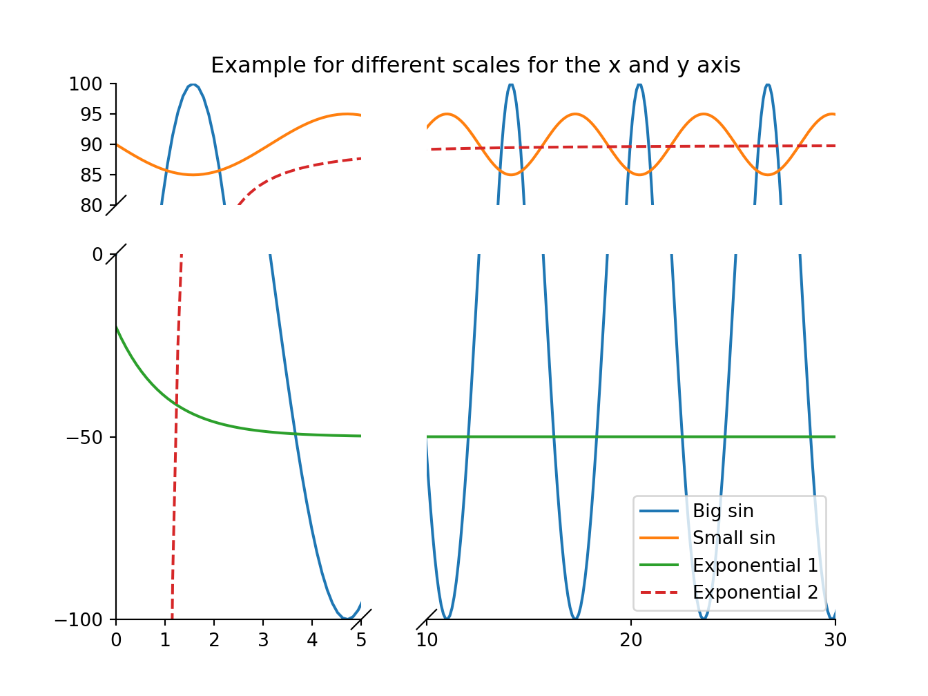
9.2 yellowbrick
9.2.1 Pearson correlation
Python
# https://www.scikit-yb.org/en/latest/quickstart.html
import pandas as pd
from yellowbrick.datasets import load_bikeshare
X, y = load_bikeshare()
print(X.head())
#:> season year month hour holiday weekday workingday weather temp feelslike humidity windspeed
#:> 0 1 0 1 0 0 6 0 1 0.24 0.2879 0.81 0.0
#:> 1 1 0 1 1 0 6 0 1 0.22 0.2727 0.80 0.0
#:> 2 1 0 1 2 0 6 0 1 0.22 0.2727 0.80 0.0
#:> 3 1 0 1 3 0 6 0 1 0.24 0.2879 0.75 0.0
#:> 4 1 0 1 4 0 6 0 1 0.24 0.2879 0.75 0.0Python
from yellowbrick.features import Rank2D
visualizer = Rank2D(algorithm="pearson")
visualizer.fit_transform(X)
visualizer.show()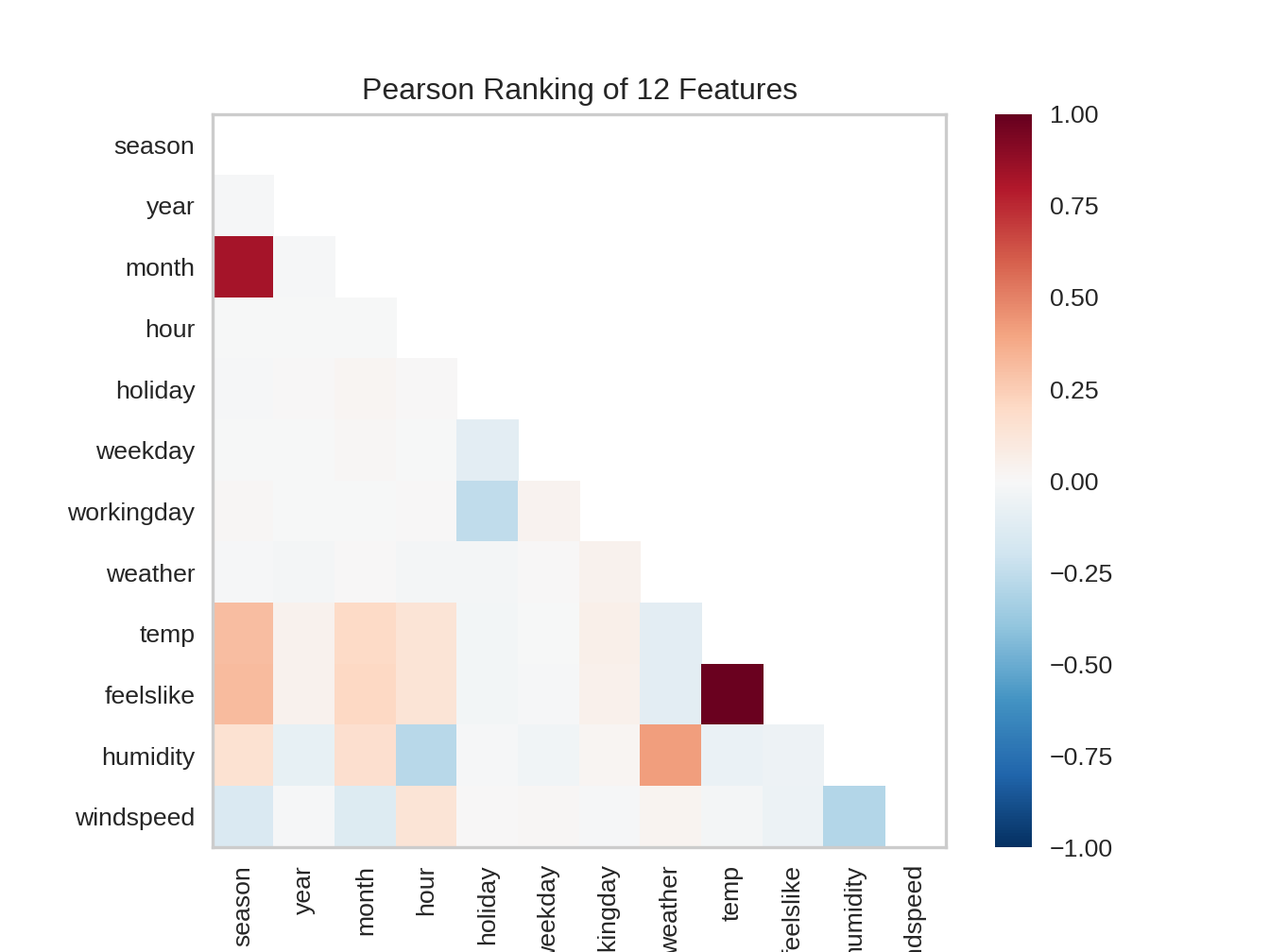

9.2.2 Scatter diagram
Python
# https://www.scikit-yb.org/en/latest//quickstart-2.py
from yellowbrick.features import JointPlotVisualizer
visualizer = JointPlotVisualizer(columns=['temp', 'feelslike'])
visualizer.fit_transform(X, y)
visualizer.show()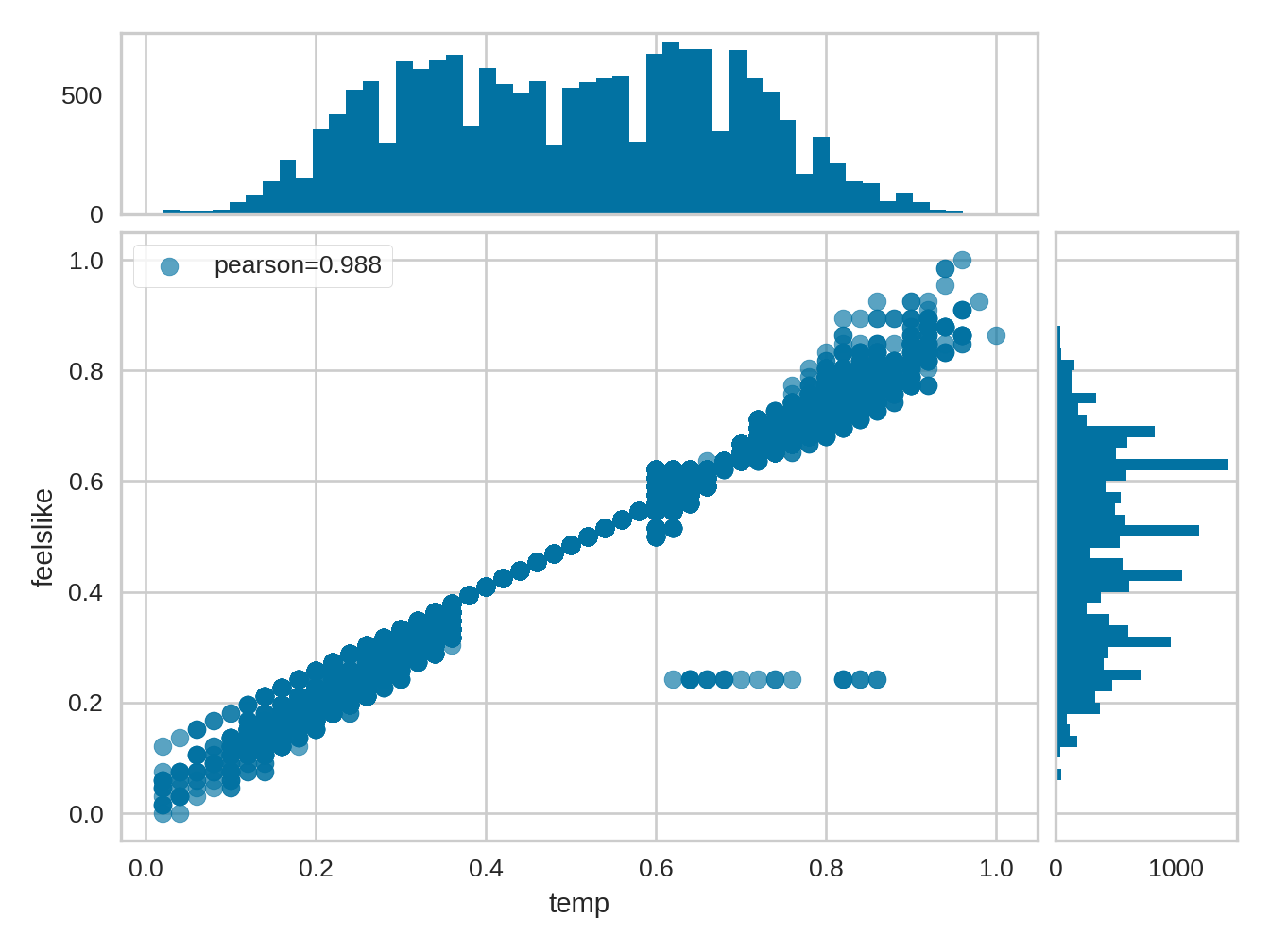

9.2.3 Residuals plot
Python
# https://www.scikit-yb.org/en/latest//quickstart-3.py
from yellowbrick.regressor import ResidualsPlot
from sklearn.linear_model import LinearRegression
from sklearn.model_selection import train_test_split

# Create training and test sets
X_train, X_test, y_train, y_test = train_test_split(
    X, y, test_size=0.1
)
visualizer = ResidualsPlot(LinearRegression())
visualizer.fit(X_train, y_train)
visualizer.score(X_test, y_test)
visualizer.show()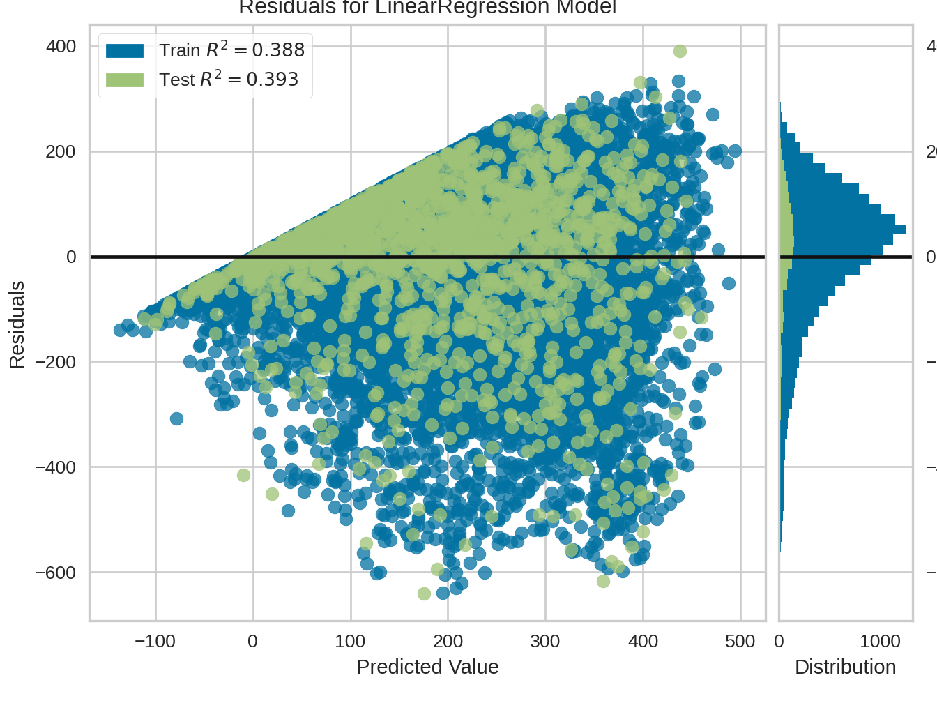

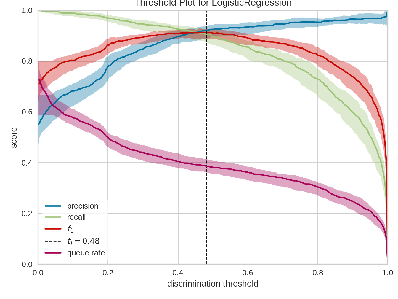
9.2.4 Discrimination threshold
Python
from yellowbrick.classifier import discrimination_threshold
from sklearn.linear_model import LogisticRegression
from yellowbrick.datasets import load_spam

X, y = load_spam()
visualizer = discrimination_threshold(
    LogisticRegression(multi_class="auto", solver="liblinear"), X, y
)
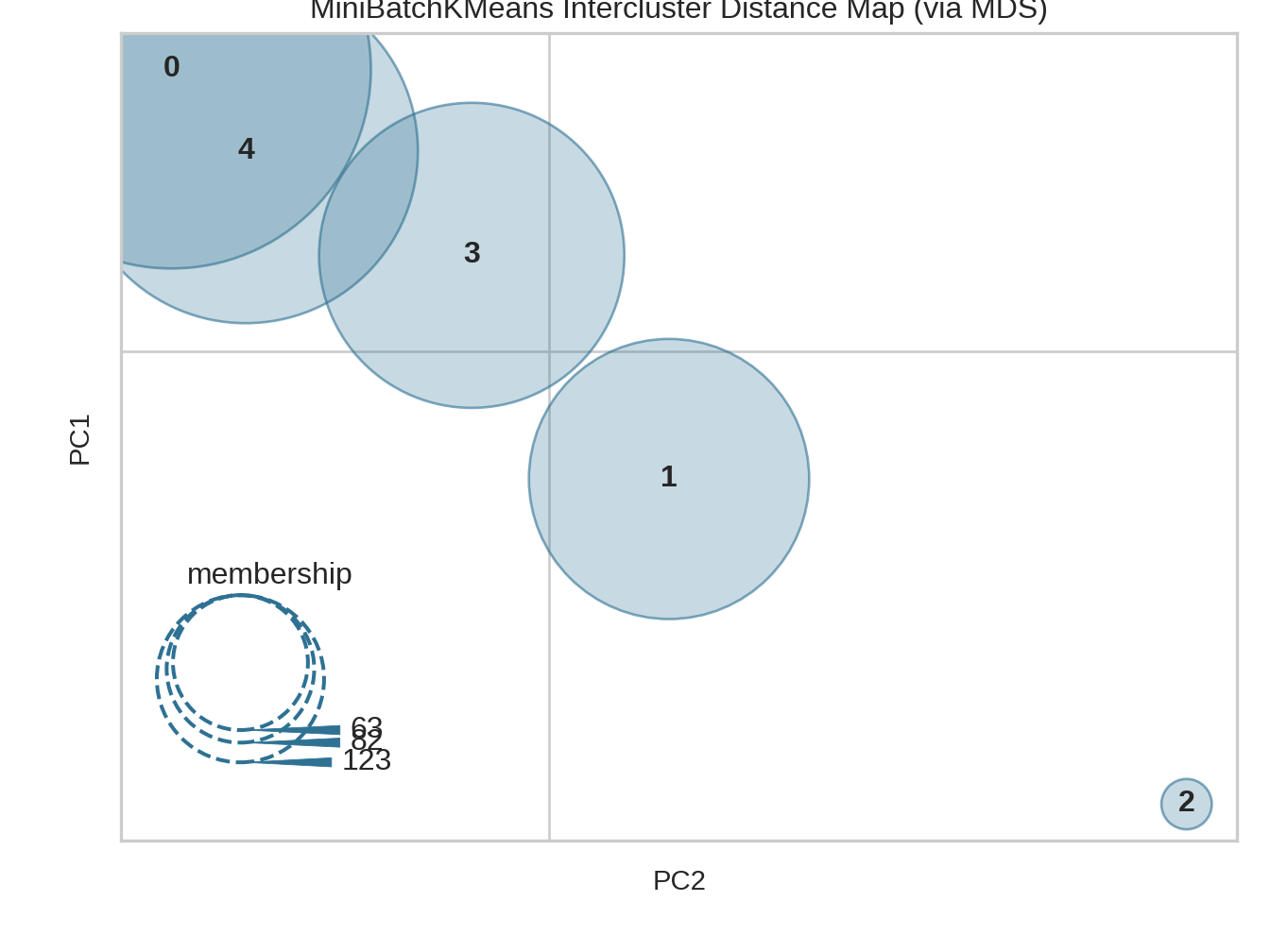
9.2.5 Intercluster distance
Python
# https://www.scikit-yb.org/en/latest//oneliners-17.py
from yellowbrick.datasets import load_nfl
from sklearn.cluster import MiniBatchKMeans
from yellowbrick.cluster import intercluster_distance

X, y = load_nfl()
visualizer = intercluster_distance(MiniBatchKMeans(5, random_state=777), X)