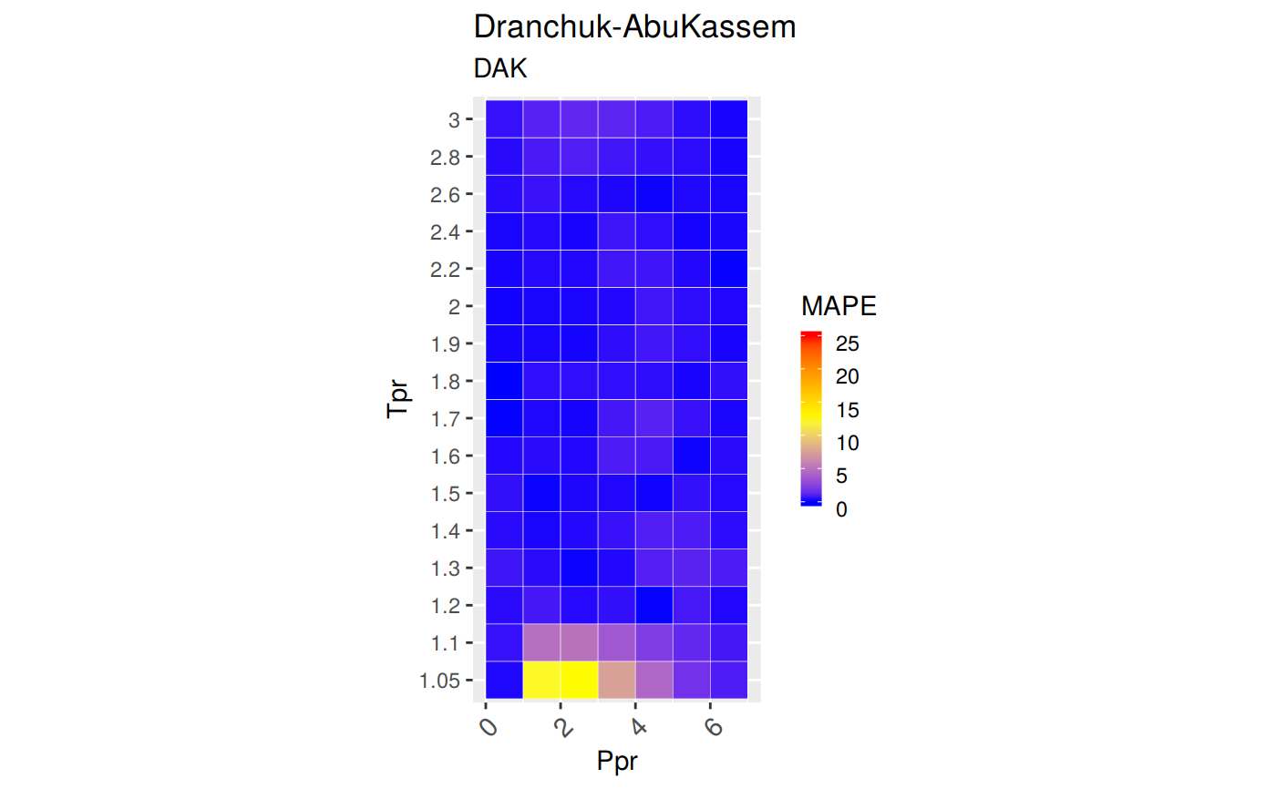
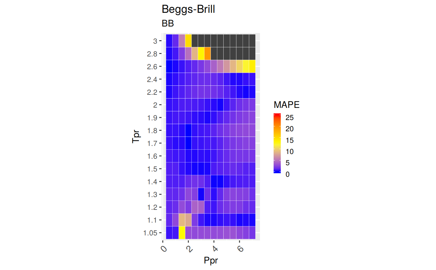
Plot will show blue areas with the lowest errors and redish with very high error or close to MAPE=25. Pink is much greater than 25.
z.plot.range(correlation = "DAK", stat = "MAPE", pprRange = "lp",
  ...)
Arguments
| correlation | identifier. Can be "HY", "DAK", "DPR" "N10", "SH" |
|---|---|
| stat | Any of the statistical variables in z.stats: |
| pprRange | low (lp) or high (hp) chart area of the Standing-Katz chart |
| ... | any other parameter |
Examples
# plot Dranchuk-AbouKassem z.plot.range("DAK")# plot Beggs-Brill correlation with fine grid on Ppr z.plot.range("BB", interval = "fine")