15 seaborn
15.1 Seaborn and Matplotlib
- seaborn returns a matplotlib object that can be modified by the options in the pyplot module
- Often, these options are wrapped by seaborn and .plot() in pandas and available as arguments
15.2 Sample Data
n = 100
comp = ['C' + i for i in np.random.randint( 1,4, size  = n).astype(str)] # 3x Company
dept = ['D' + i for i in np.random.randint( 1,4, size  = n).astype(str)] # 5x Department
grp =  ['G' + i for i in np.random.randint( 1,4, size  = n).astype(str)] # 2x Groups
value1 = np.random.normal( loc=50 , scale=5 , size = n)
value2 = np.random.normal( loc=20 , scale=3 , size = n)
value3 = np.random.normal( loc=5 , scale=30 , size = n)

mydf = pd.DataFrame({
    'comp':comp,
    'dept':dept,
    'grp': grp,
    'value1':value1,
    'value2':value2,
    'value3':value3
})
mydf.head()
#:> comp dept grp value1 value2 value3
#:> 0 C3 D2 G3 44.629447 16.439507 48.582119
#:> 1 C2 D2 G2 50.110557 21.988054 34.931015
#:> 2 C3 D2 G1 46.722299 22.605435 -22.025500
#:> 3 C2 D1 G3 58.506386 21.534852 33.198709
#:> 4 C2 D3 G3 40.798755 22.435606 -26.25534515.3 Scatter Plot
15.3.1 2x Numeric
sns.lmplot(x='value1', y='value2', data=mydf)plt.show()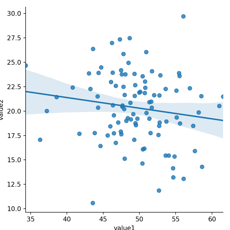
sns.lmplot(x='value1', y='value2', fit_reg=False, data=mydf); #hide regresion lineplt.show()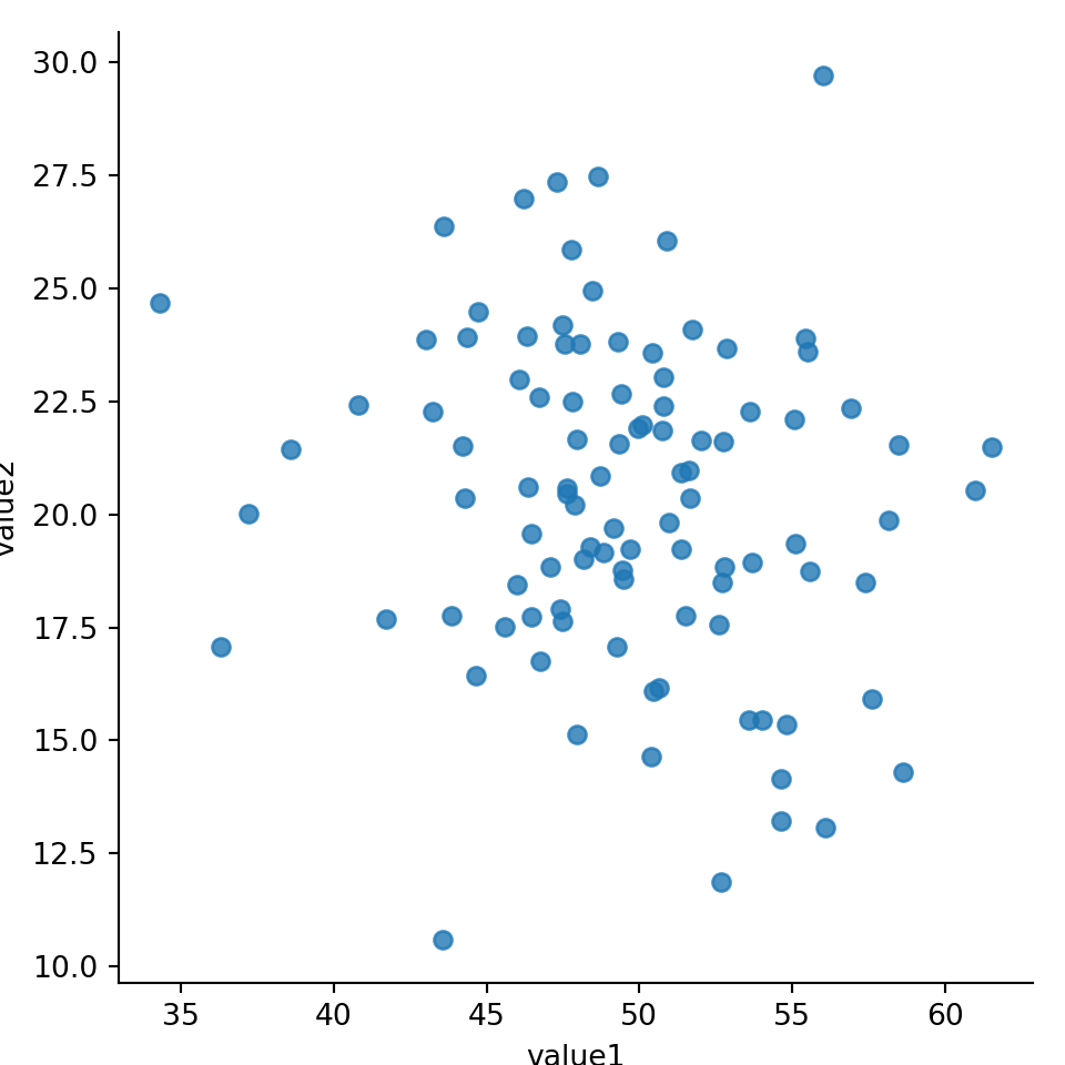
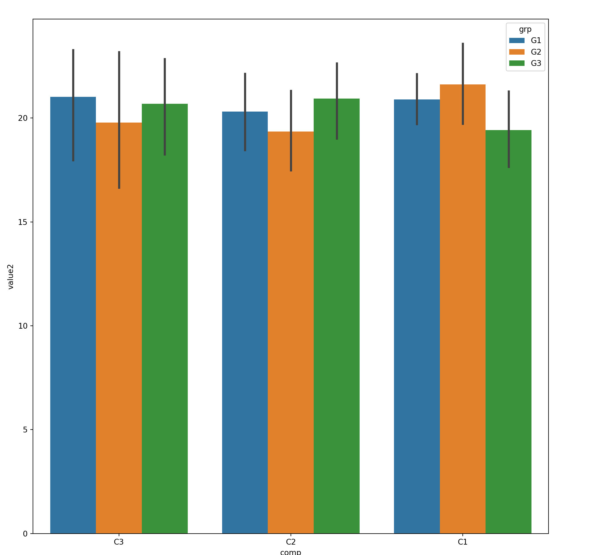
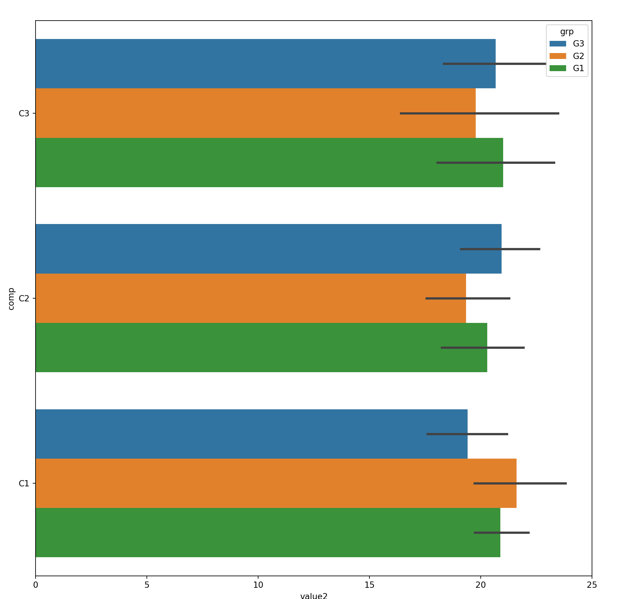
15.3.2 2xNumeric + 1x Categorical
Use hue to represent additional categorical feature
sns.lmplot(x='value1', y='value2', data=mydf, hue='comp', fit_reg=False);
plt.show()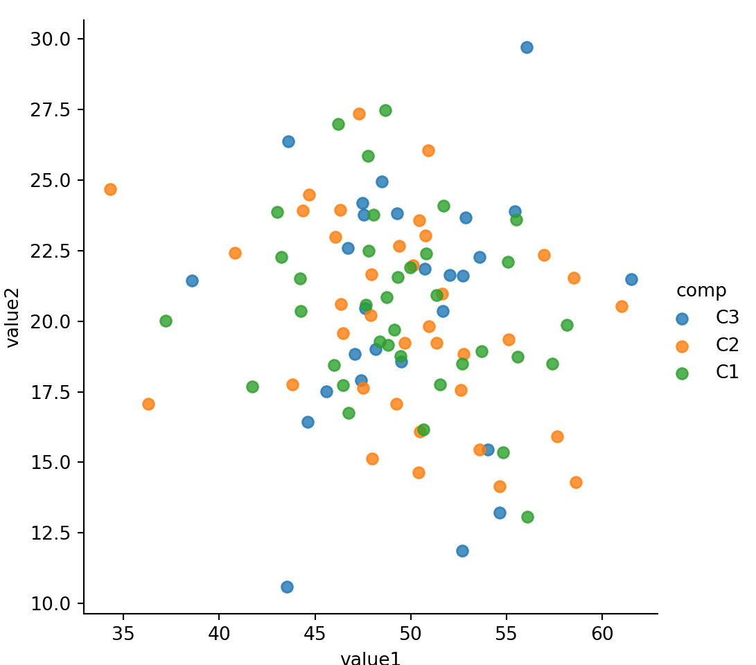
15.3.3 2xNumeric + 2x Categorical
Use col and hue to represent two categorical features
sns.lmplot(x='value1', y='value2', col='comp',hue='grp', fit_reg=False, data=mydf);
plt.show()
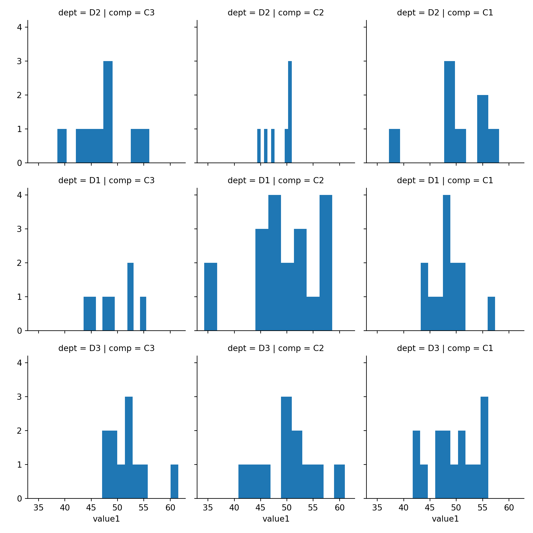
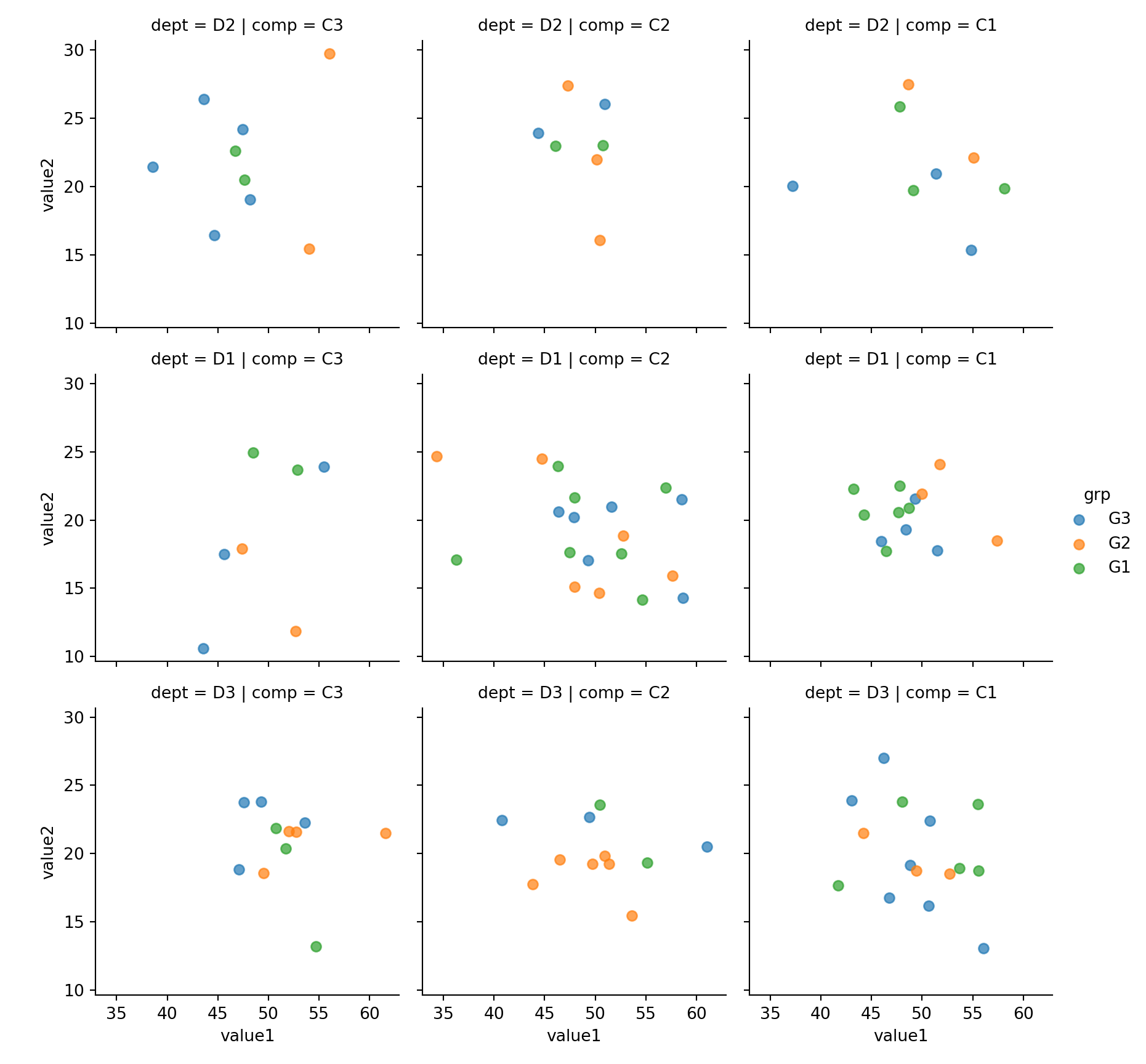
15.3.4 2xNumeric + 3x Categorical
Use row, col and hue to represent three categorical features
sns.lmplot(x='value1', y='value2', row='dept',col='comp', hue='grp', fit_reg=False, data=mydf);plt.show()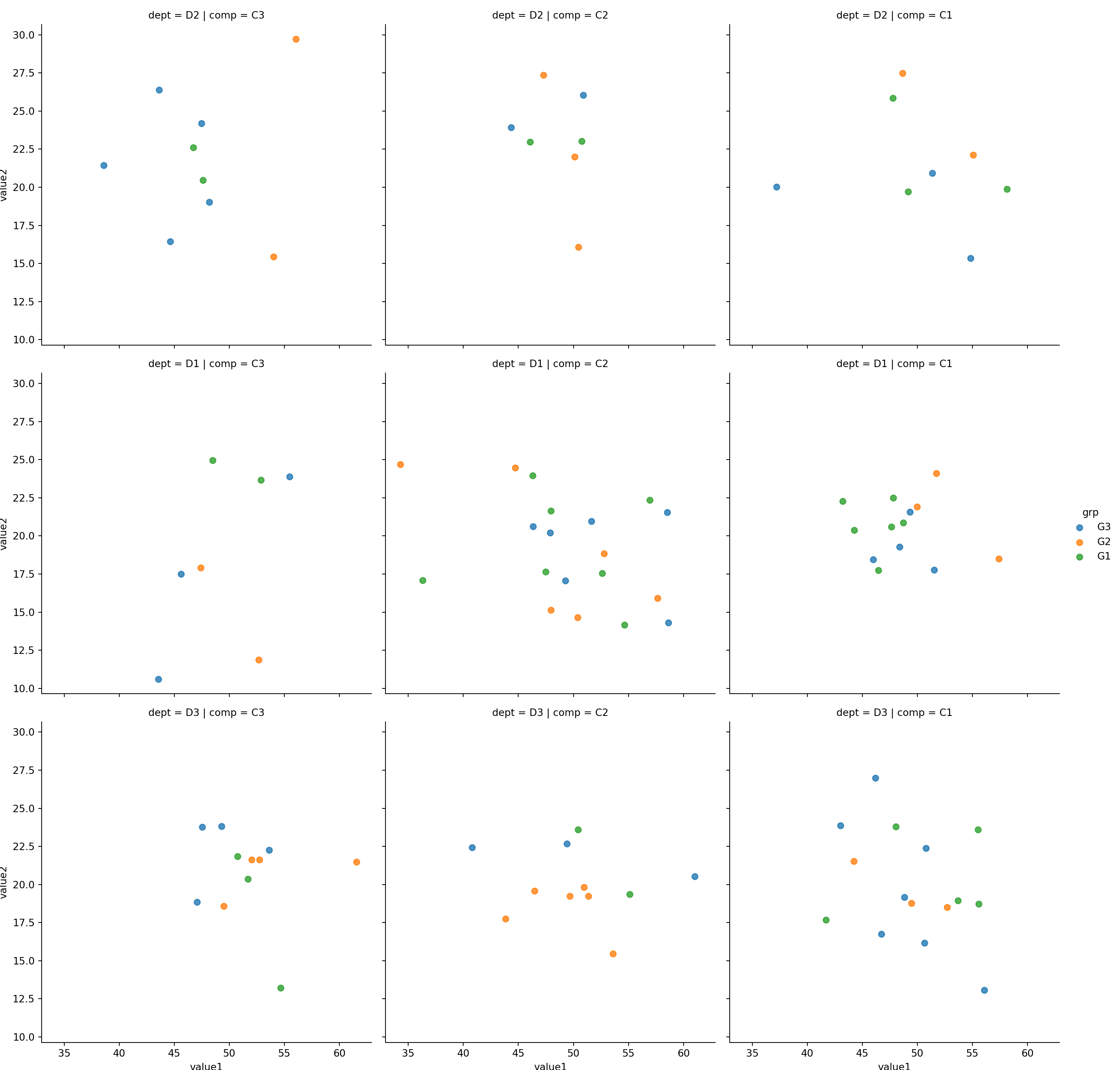
15.3.5 Customization
15.3.5.1 size
size: height in inch for each facet
sns.lmplot(x='value1', y='value2', col='comp',hue='grp', size=3,fit_reg=False, data=mydf)plt.show()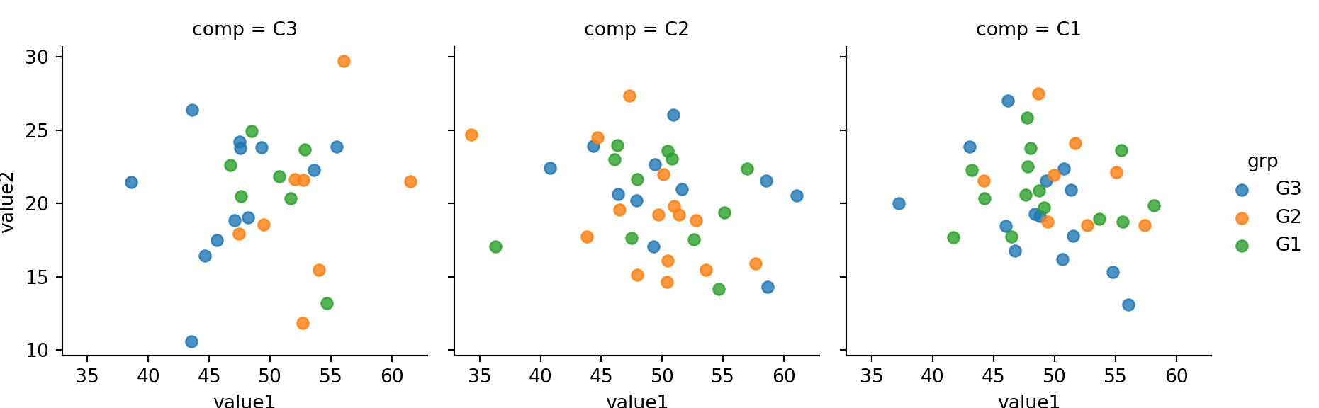
Observe that even size is very large, lmplot will fit (shrink) everything into one row by deafult. See example below.
sns.lmplot(x='value1', y='value2', col='comp',hue='grp', size=5,fit_reg=False, data=mydf)plt.show()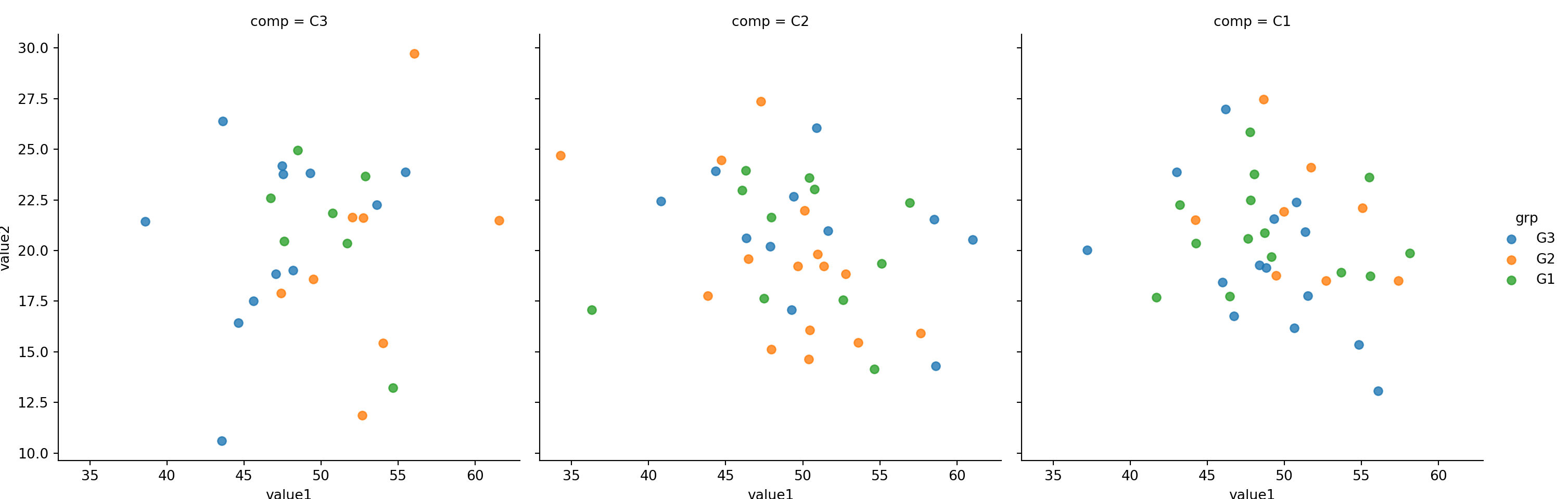
15.3.5.2 col_wrap
To avoid lmplot from shrinking the chart, we use col_wrap=<col_number to wrap the output.
Compare the size (height of each facet) with the above without col_wrap. Below chart is larger.
sns.lmplot(x='value1', y='value2', col='comp',hue='grp', size=5, col_wrap=2, fit_reg=False, data=mydf)plt.show()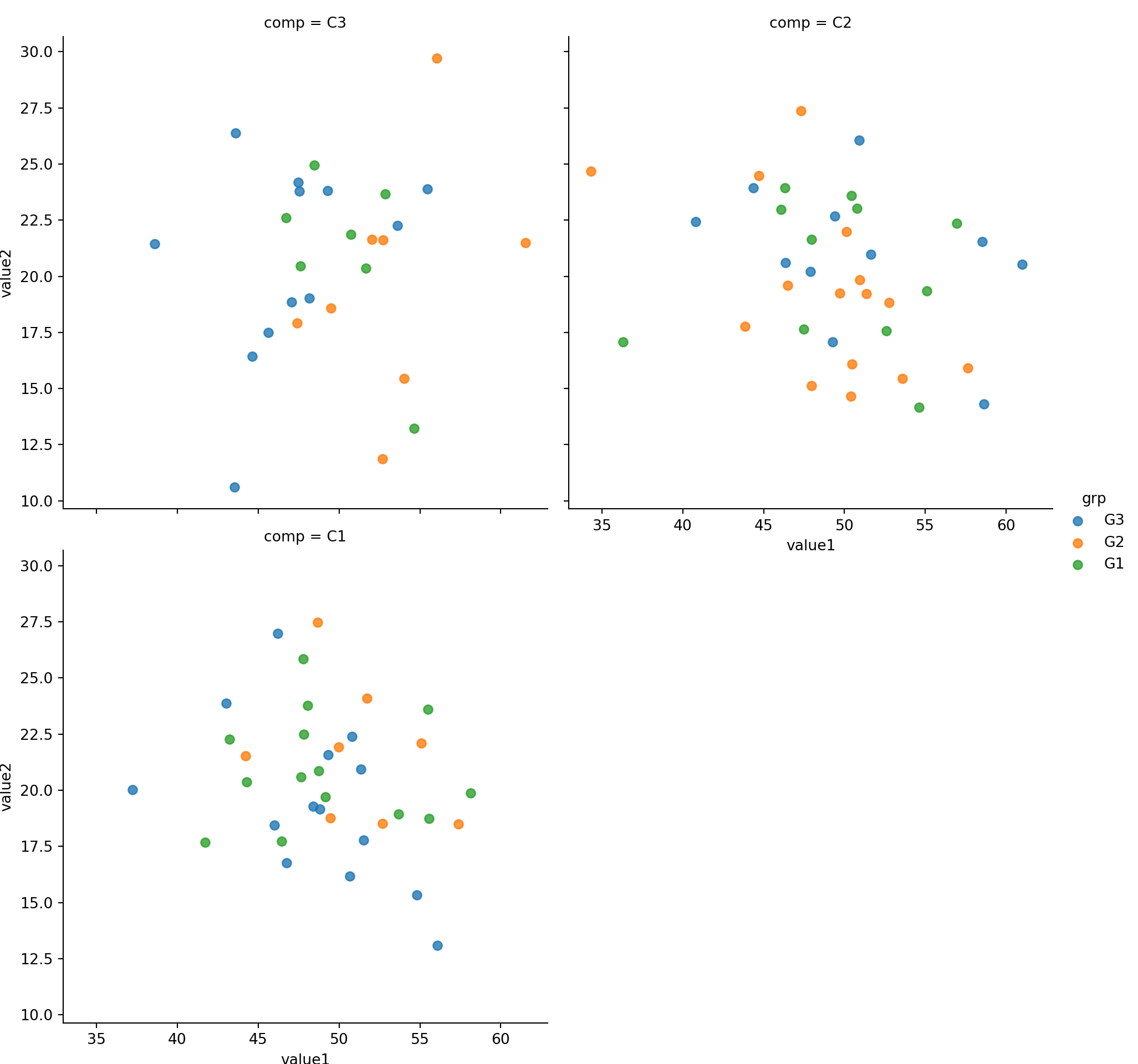
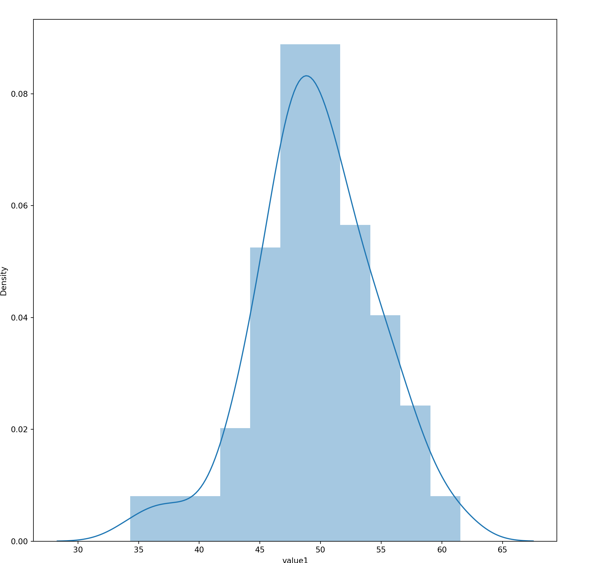
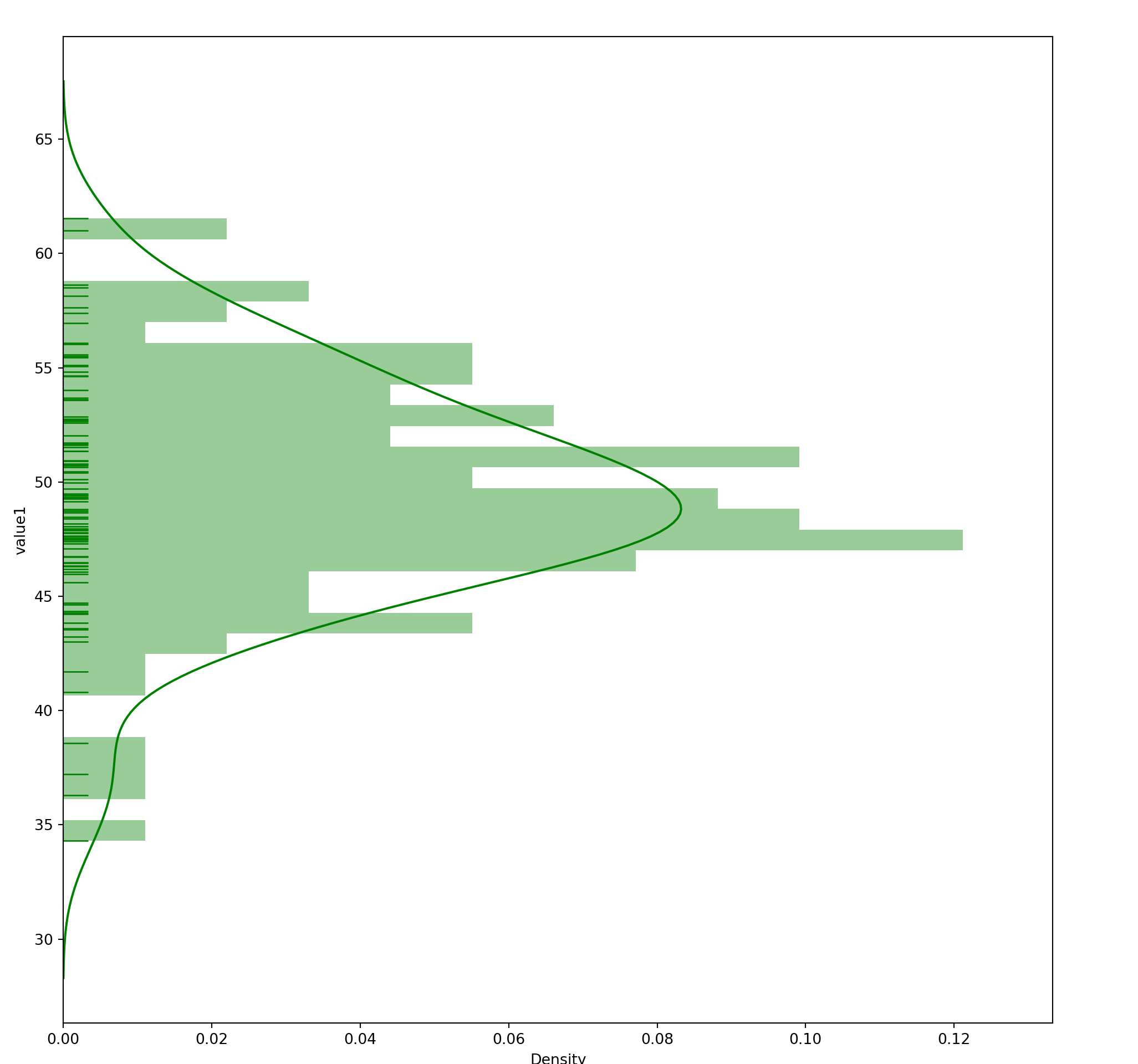
15.4 Histogram
seaborn.distplot(
  a,               # Series, 1D Array or List
  bins=None,
  hist=True,
  rug = False,
  vertical=False
)
15.5 Bar Chart
com_grp = mydf.groupby('comp')
grpdf = com_grp['value1'].sum().reset_index()
grpdf
#:> comp value1
#:> 0 C1 1777.794043
#:> 1 C2 1834.860416
#:> 2 C3 1343.194018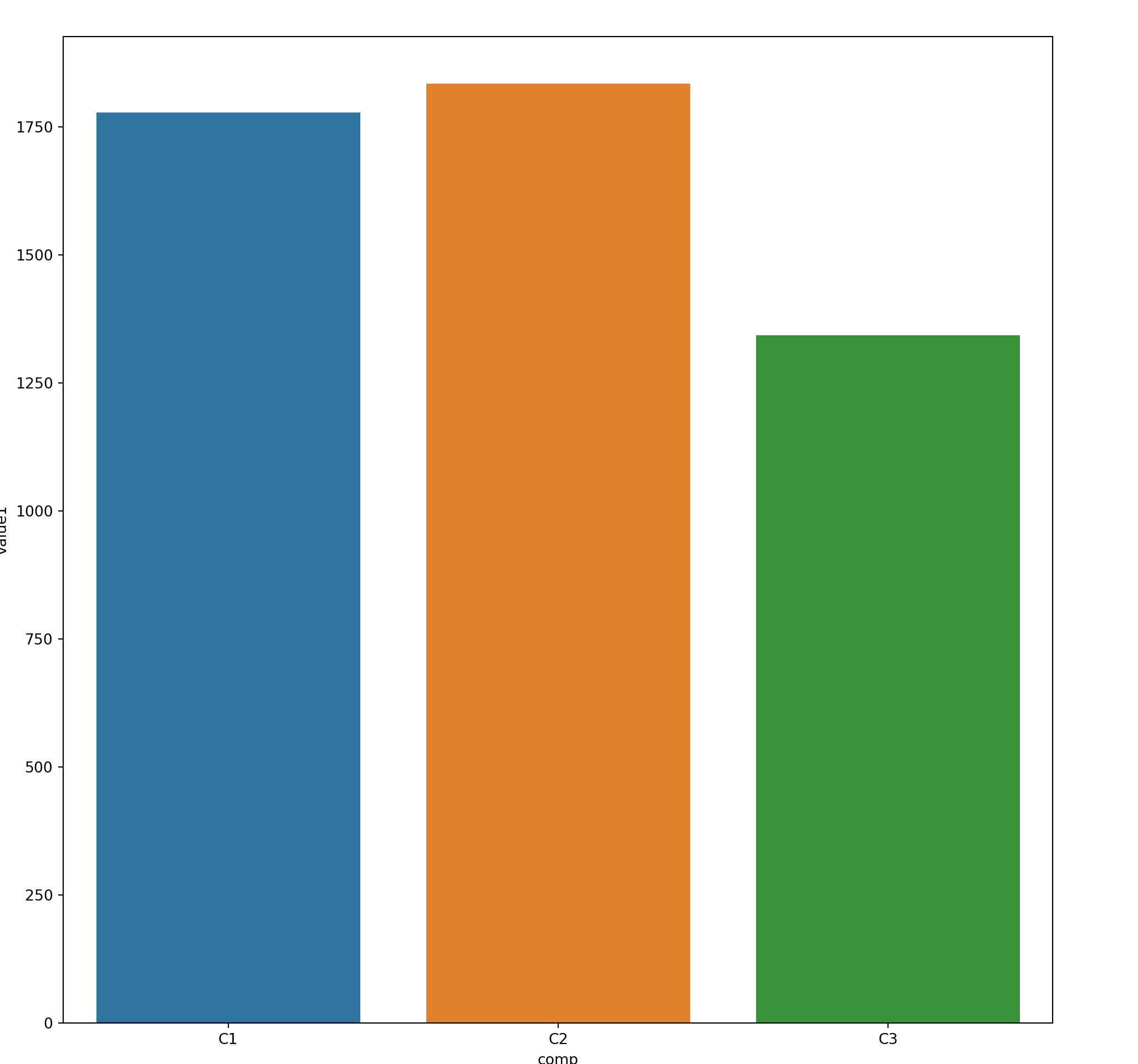
15.6 Faceting
Faceting in Seaborn is a generic function that works with matplotlib various plot utility.
It support matplotlib as well as seaborn plotting utility.