12 Visualizing associations among two or more quantitative variables
Many datasets contain two or more quantitative variables, and we may be interested in how these variables relate to each other. For example, we may have a dataset of quantitative measurements of different animals, such as the animals’ height, weight, length, and daily energy demands. To plot the relationship of just two such variables, e.g. the height and weight, we will normally use a scatter plot. If we want to show more than two variables at once, we may opt for a bubble chart, a scatter plot matrix, or a correlogram. Finally, for very high-dimensional datasets, it may be useful to perform dimension reduction, for example in the form of principal components analysis.
12.1 Scatter plots
I will demonstrate the basic scatter plot and several variations thereof using a dataset of measurements performed on 123 blue jay birds. The dataset contains information such as the head length (measured from the tip of the bill to the back of the head), the skull size (head length minus bill length), and the body mass of each bird. We expect that there are relationships between these variables. For example, birds with longer bills would be expected to have larger skull sizes, and birds with higher body mass should have larger bills and skulls than birds with lower body mass.
To explore these relationships, I begin with a plot of head length against body mass (Figure 12.1). In this plot, head length is shown along the y axis, body mass along the x axis, and each bird is represented by one dot. (Note the terminology: We say that we plot the variable shown along the y axis against the variable shown along the x axis.) The dots form a dispersed cloud (hence the term scatter plot), yet undoubtedly there is a trend for birds with higher body mass to have longer heads. The bird with the longest head falls close to the maximum body mass observed, and the bird with the shortest head falls close to the minimum body mass observed.
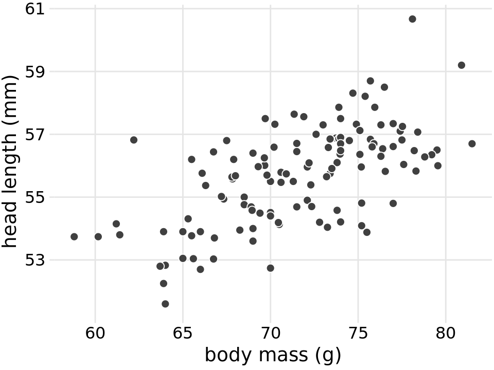
Figure 12.1: Head length (measured from the tip of the bill to the back of the head, in mm) versus body mass (in gram), for 123 blue jays. Each dot corresponds to one bird. There is a moderate tendency for heavier birds to have longer heads. Data source: Keith Tarvin, Oberlin College
The blue jay dataset contains both male and female birds, and we may want to know whether the overall relationship between head length and body mass holds up separately for each sex. To address this question, we can color the points in the scatter plot by the sex of the bird (Figure 12.2). This figure reveals that the overall trend in head length and body mass is at least in part driven by the sex of the birds. At the same body mass, females tend to have shorter heads than males. At the same time, females tend to be lighter than males on average.
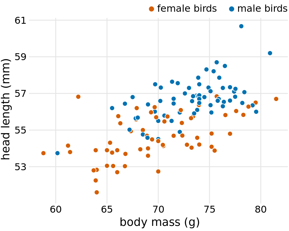
Figure 12.2: Head length versus body mass for 123 blue jays. The birds’ sex is indicated by color. At the same body mass, male birds tend to have longer heads (and specifically, longer bills) than female birds. Data source: Keith Tarvin, Oberlin College
Because the head length is defined as the distance from the tip of the bill to the back of the head, a larger head length could imply a longer bill, a larger skull, or both. We can disentangle bill length and skull size by looking at another variable in the dataset, the skull size, which is similar to the head length but excludes the bill. As we are already using the x position for body mass, the y position for head length, and the dot color for bird sex, we need another aesthetic to which we can map skull size. One option is to use the size of the dots, resulting in a visualization called a bubble chart (Figure 12.3).
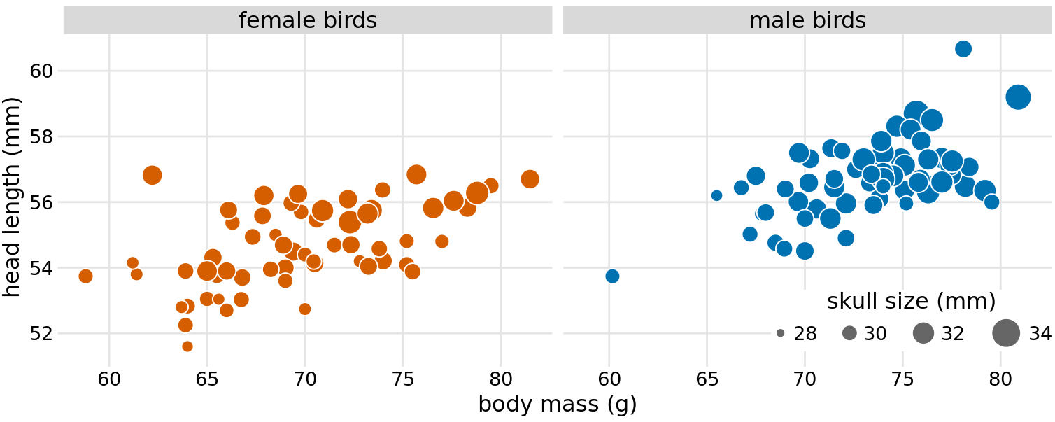
Figure 12.3: Head length versus body mass for 123 blue jays. The birds’ sex is indicated by color, and the birds’ skull size by symbol size. Head-length measurements include the length of the bill while skull-size measurements do not. Head length and skull size tend to be correlated, but there are some birds with unusually long or short bills given their skull size. Data source: Keith Tarvin, Oberlin College
Bubble charts have the disadvantage that they show the same types of variables, quantitative variables, with two different types of scales, position and size. This makes it difficult to visually ascertain the strengths of associations between the various variables. Moreover, differences between data values encoded as bubble size are harder to perceive than differences between data values encoded as position. Because even the largest bubbles need to be somewhat small compared to the total figure size, the size differences between even the largest and the smallest bubbles are necessarily small. Consequently, smaller differences in data values will correspond to very small size differences that can be virtually impossible to see. In Figure 12.3, I used a size mapping that visually amplified the difference between the smallest skulls (around 28mm) and the largest skulls (around 34mm), and yet it is difficult to determine what the relationship is between skull size and either body mass or head length.
As an alternative to a bubble chart, it may be preferable to show an all-against-all matrix of scatter plots, where each individual plot shows two data dimensions (Figure 12.4). This figure shows clearly that the relationship between skull size and body mass is comparable for female and male birds except that the female birds tend to be somewhat smaller. However, the same is not true for the relationship between head length and body mass. There is a clear separation by sex. Male birds tend to have longer bills than female birds, all else equal.
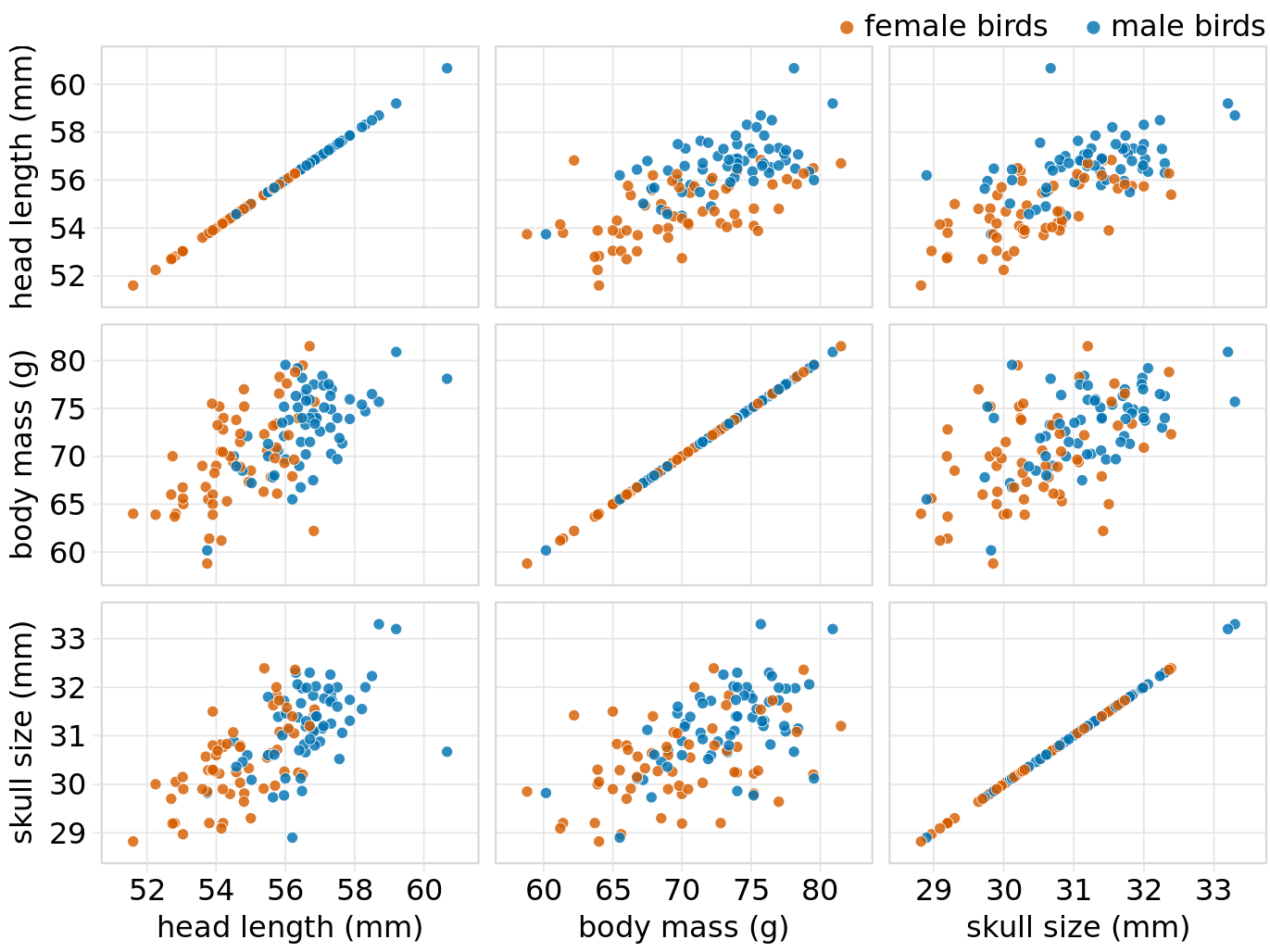
Figure 12.4: All-against-all scatter plot matrix of head length, body mass, and skull size, for 123 blue jays. This figure shows the exact same data as Figure 12.2. However, because we are better at judging position than symbol size, correlations between skull size and the other two variables are easier to perceive in the pairwise scatter plots than in Figure 12.2. Data source: Keith Tarvin, Oberlin College
12.2 Correlograms
When we have more than three to four quantitative variables, all-against-all scatter plot matrices quickly become unwieldy. In this case, it is more useful to quantify the amount of association between pairs of variables and visualize this quantity rather than the raw data. One common way to do this is to calculate correlation coefficients. The correlation coefficient r is a number between -1 and 1 that measures to what extent two variables covary. A value of r = 0 means there is no association whatsoever, and a value of either 1 or -1 indicates a perfect association. The sign of the correlation coefficient indicates whether the variables are correlated (larger values in one variable coincide with larger values in the other) or anticorrelated (larger values in one variable coincide with smaller values in the other). To provide visual examples of what different correlation strengths look like, in Figure 12.5 I show randomly generated sets of points that differ widely in the degree to which the x and y values are correlated.
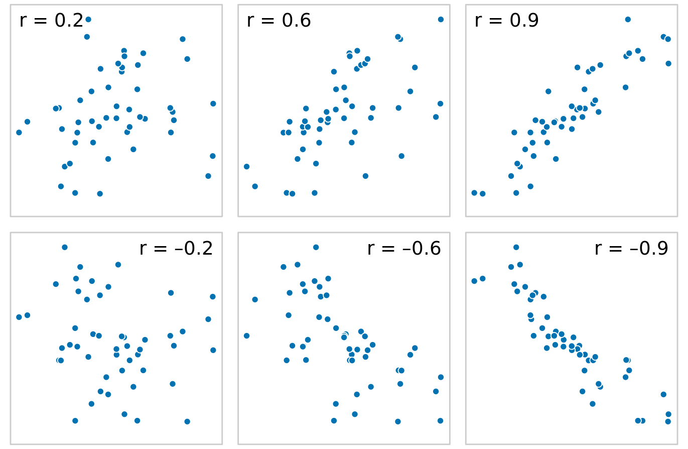
Figure 12.5: Examples of correlations of different magnitude and direction, with associated correlation coefficient r. In both rows, from left to right correlations go from weak to strong. In the top row the correlations are positive (larger values for one quantity are associated with larger values for the other) and in the bottom row they are negative (larger values for one quantity are associated with smaller values for the other). In all six panels, the sets of x and y values are identical, but the pairings between individual x and y values have been reshuffled to generate the specified correlation coefficients.
The correlation coefficient is defined as
\[ r = \frac{\sum_i (x_i - \bar x)(y_i - \bar y)}{\sqrt{\sum_i (x_i-\bar x)^2}\sqrt{\sum_i (y_i-\bar y)^2}}, \] where \(x_i\) and \(y_i\) are two sets of observations and \(\bar x\) and \(\bar y\) are the corresponding sample means. We can make a number of observations from this formula. First, the formula is symmetric in \(x_i\) and \(y_i\), so the correlation of x with y is the same as the correlation of y with x. Second, the individual values \(x_i\) and \(y_i\) only enter the formula in the context of differences to the respective sample mean, so if we shift an entire dataset by a constant amount, e.g. we replace \(x_i\) with \(x_i' = x_i + C\) for some constant \(C\), the correlation coefficient remains unchanged. Third, the correlation coefficient also remains unchanged if we rescale the data, \(x_i' = C x_i\), since the constant \(C\) will appear both in the numerator and the denominator of the formula and hence can be cancelled.
Visualizations of correlation coefficients are called correlograms. To illustrate the use of a correlogram, we will consider a data set of over 200 glass fragments obtained during forensic work. For each glass fragment, we have measurements about its composition, expressed as the percent in weight of various mineral oxides. There are seven different oxides for which we have measurements, yielding a total of 6 + 5 + 4 + 3 + 2 + 1 = 21 pairwise correlations. We can display these 21 correlations at once as a matrix of colored tiles, where each tile represents one correlation coefficient (Figure 12.6). This correlogram allows us to quickly grasp trends in the data, such as that magnesium is negatively correlated with nearly all other oxides, and that aluminum and barium have a strong positive correlation.
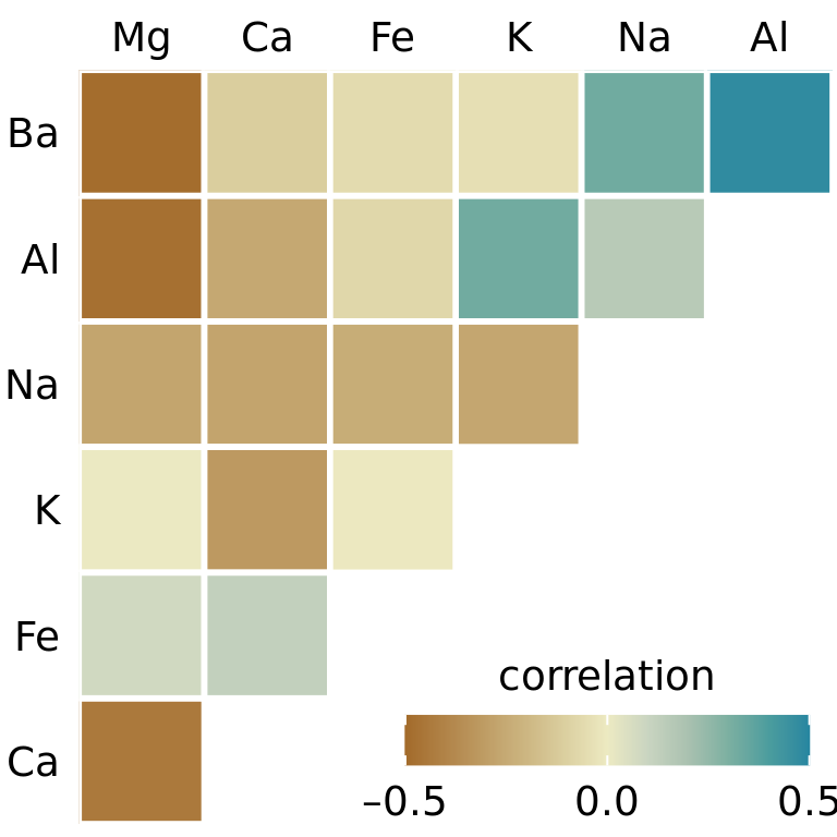
Figure 12.6: Correlations in mineral content for 214 samples of glass fragments obtained during forensic work. The dataset contains seven variables measuring the amounts of magnesium (Mg), calcium (Ca), iron (Fe), potassium (K), sodium (Na), aluminum (Al), and barium (Ba) found in each glass fragment. The colored tiles represents the correlations between pairs of these variables. Data source: B. German
One weakness of the correlogram of Figure 12.6 is that low correlations, i.e. correlations with absolute value near zero, are not as visually suppressed as they should be. For example, magnesium (Mg) and potassium (K) are not at all correlated but Figure 12.6 doesn’t immediately show this. To overcome this limitation, we can display the correlations as colored circles and scale the circle size with the absolute value of the correlation coefficient (Figure 12.6). In this way, low correlations are suppressed and high correlations stand out better.
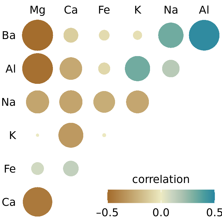
Figure 12.7: Correlations in mineral content for forensic glass samples. The color scale is identical to Figure 12.6. However, now the magnitude of each correlation is also encoded in the size of the colored circles. This choice visually deemphasizes cases with correlations near zero. Data source: B. German
All correlograms have one important drawback: They are fairly abstract. While they show us important patterns in the data, they also hide the underlying data points and may cause us to draw incorrect conclusions. It is always better to visualize the raw data rather than abstract, derived quantities that have been calculated from it. Fortunately, we can frequently find a middle ground between showing important patterns and showing the raw data by applying techniques of dimension reduction.
12.3 Dimension reduction
Dimension reduction relies on the key insight that most high-dimensional datasets consist of multiple correlated variables that convey overlapping information. Such datasets can be reduced to a smaller number of key dimensions without loss of much critical information. As a simple, intuitive example, consider a dataset of multiple physical traits of people, including quantities such as each person’s height and weight, the lengths of the arms and legs, the circumferences of waist, hip, and chest, etc. We can understand immediately that all these quantities will relate first and foremost to the overall size of each person. All else being equal, a larger person will be taller, weigh more, have longer arms and legs, and larger waist, hip, and chest circumferences. The next important dimension is going to be the person’s sex. Male and female measurements are substantially different for persons of comparable size. For example, a woman will tend to have higher hip circumference than a man, all else being equal.
There are many techniques for dimension reduction. I will discuss only one technique here, the most widely used one, called principal components analysis (PCA). PCA introduces a new set of variables (called principal components, PCs) by linear combination of the original variables in the data, standardized to zero mean and unit variance (see Figure 12.8 for a toy example in two dimensions). The PCs are chosen such that they are uncorrelated, and they are ordered such that the first component captures the largest possible amount of variation in the data, and subsequent components capture increasingly less. Usually, key features in the data can be seen from only the first two or three PCs.
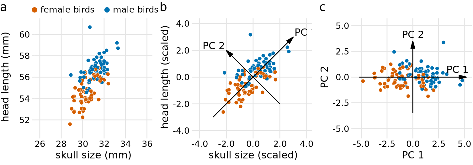
Figure 12.8: Example principal components (PC) analysis in two dimensions. (a) The original data. As example data, I am using the head-length and skull-size measurements from the blue jays dataset. Female and male birds are distinguished by color, but this distinction has no effect on the PC analysis. (b) As the first step in PCA, we scale the original data values to zero mean and unit variance. We then we define new variables (the principal components, PCs) along the directions of maximum variation in the data. (c) Finally, we project the data into the new coordinates. Mathematically, this projection is equivalent to a rotation of the data points around the origin. In the 2D example shown here, the data points are rotated clockwise by 45 degrees.
When we perform PCA, we are generally interested in two pieces of information: (i) the composition of the PCs and (ii) the location of the individual data points in the principal components space. Let’s look at these two pieces in a PC analysis of the forensic glass dataset.
First, we look at the component composition (Figure 12.9). Here, we only consider the first two components, PC 1 and PC 2. Because the PCs are linear combinations of the original variables (after standardization), we can represent the original variables as arrows indicating to what extent they contribute to the PCs. Here, we see that barium and sodium contribute primarily to PC 1 and not to PC 2, calcium and potassium contribute primarily to PC 2 and not to PC 1, and the other variables contribute in varying amounts to both components (Figure 12.9). The arrows are of varying lengths because there are more than two PCs. For example the arrow for iron is particularly short because it contributes primarily to higher-order PCs (not shown).
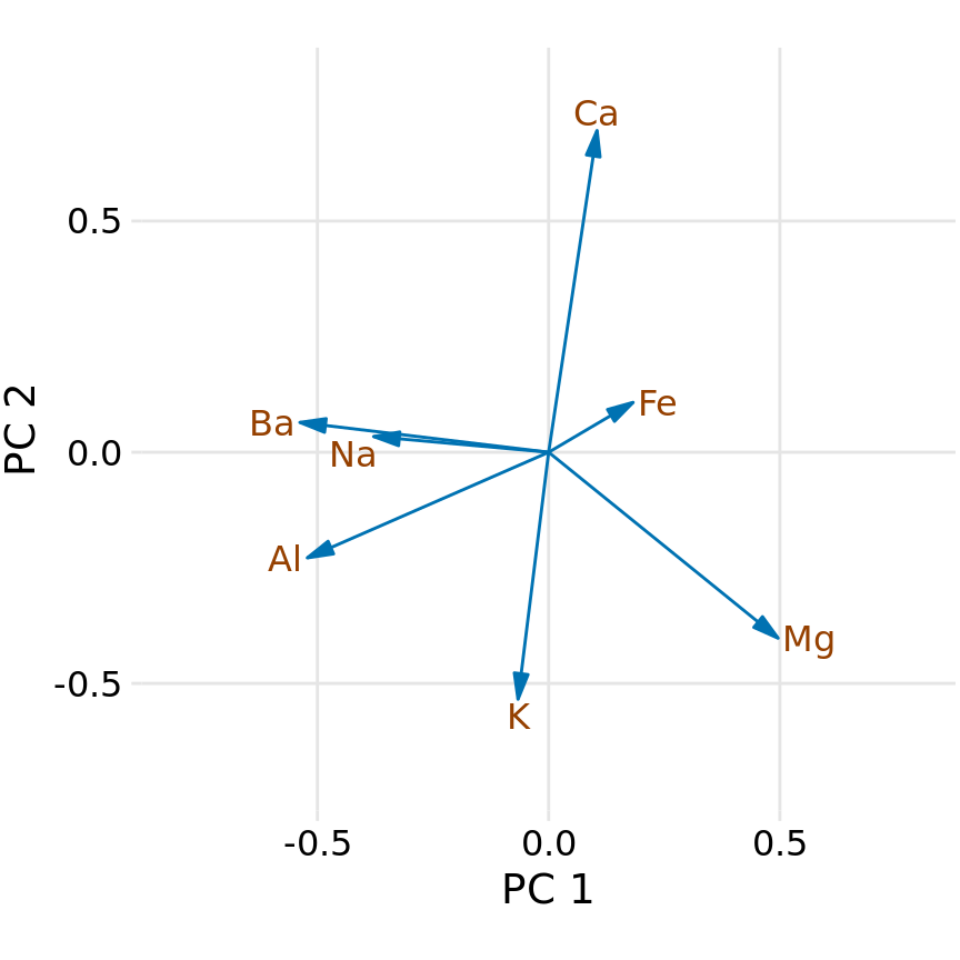
Figure 12.9: Composition of the first two components in a principal components analysis (PCA) of the forensic glass dataset. Component one (PC 1) measures primarily the amount of aluminum, barium, sodium, and magnesium contents in a glass fragment, whereas component two (PC 2) measures primarily the amount of calcium and potassium content, and to some extent the amount of aluminum and magnesium.
Next, we project the original data into the principal components space (Figure 12.10). We see a clear clustering of distinct types of glass fragments in this plot. Fragments from both headlamps and windows fall into clearly delineated regions in the PC plot, with few outliers. Fragments from tableware and from containers are a little more spread out, but nevertheless clearly distinct from both headlamp and window fragments. By comparing Figure 12.10 with Figure 12.9, we can conclude that window samples tend to have higher than average magnesium content and lower than average barium, aluminum, and sodium content, whereas the opposite is true for headlamp samples.
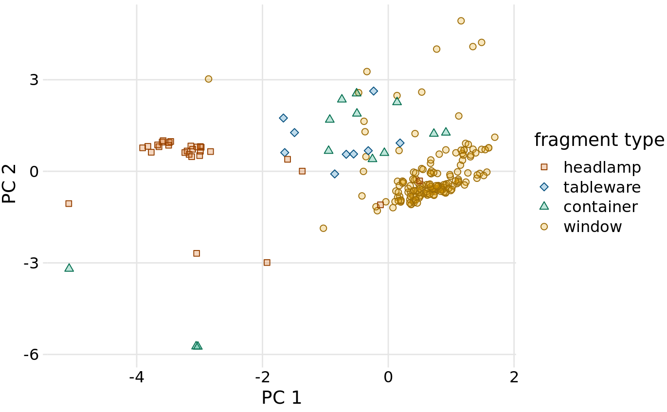
Figure 12.10: Composition of individual glass fragments visualized in the principal components space defined in Figure 12.9. We see that the different types of glass samples cluster at characteristic values of PC 1 and 2. In particular, headlamps are characterized by a negative PC 1 value whereas windows tend to have a positive PC 1 value. Tableware and containers have PC 1 values close to zero and tend to have positive PC 2 values. However, there are a few exceptions where container fragments have both a negative PC 1 value and a negative PC 2 value. These are fragments whose composition drastically differs from all other fragments analyzed.
12.4 Paired data
A special case of multivariate quantitative data is paired data: Data where there are two or more measurements of the same quantity under slightly different conditions. Examples include two comparable measurements on each subject (e.g., the length of the right and the left arm of a person), repeat measurements on the same subject at different time points (e.g., a person’s weight at two different times during the year), or measurements on two closely related subjects (e.g., the heights of two identical twins). For paired data, it is reasonable to assume that the two measurements belonging to a pair are more similar to each other than to the measurements belonging to other pairs. Two twins will be approximately of the same height but will differ in height from other twins. Therefore, for paired data, we need to choose visualizations that highlight any differences between the paired measurements.
An excellent choice in this case is a simple scatter plot on top of a diagonal line marking x = y. In such a plot, if the only difference between the two measurements of each pair is random noise, then all points in the sample will be scattered symmetrically around this line. Any systematic differences between the paired measurements, by contrast, will be visible in a systematic shift of the data points up or down relative to the diagonal. As an example, consider the carbon dioxide (CO2) emissions per person, measured for 166 countries both in 1970 and in 2010 (Figure 12.11). This example highlights two common features of paired data. First, most points are relatively close to the diagonal line. Even though CO2 emissions vary over nearly four orders of magnitude among countries, they are fairly consistent within each country over a 40-year time span. Second, the points are systematically shifted upwards relative to the diagonal line. The majority of countries has seen an increase in CO2 emissions over the 40 years considered.
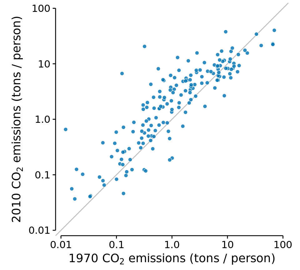
Figure 12.11: Carbon dioxide (CO2) emissions per person in 1970 and 2010, for 166 countries. Each dot represents one country. The diagonal line represents identical CO2 emissions in 1970 and 2010. The points are systematically shifted upwards relative to the diagonal line: In the majority of countries, emissions were higher in 2010 than in 1970. Data source: Carbon Dioxide Information Analysis Center
Scatter plots such as Figure 12.11 work well when we have a large number of data points and/or are interested in a systematic deviation of the entire data set from the null expectation. By contrast, if we have only a small number of observations and are primarily interested in the identity of each individual case, a slopegraph may be a better choice. In a slopegraph, we draw individual measurements as dots arranged into two columns and indicate pairings by connecting the paired dots with a line. The slope of each line highlights the magnitude and direction of change. Figure 12.12 uses this approach to show the ten countries with the largest difference in CO2 emissions per person from 2000 to 2010.
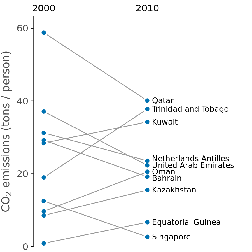
Figure 12.12: Carbon dioxide (CO2) emissions per person in 2000 and 2010, for the ten countries with the largest difference between these two years. Data source: Carbon Dioxide Information Analysis Center
Slopegraphs have one important advantage over scatter plots: They can be used to compare more than two measurements at a time. For example, we can modify Figure 12.12 to show CO2 emissions at three time points, here the years 2000, 2005, and 2010 (Figure 12.13). This choice highlights both countries with a large change in emissions over the entire decade as well as countries such as Qatar or Trinidad and Tobago for which there is a large difference in the trend seen for the first five-year interval and the second one.
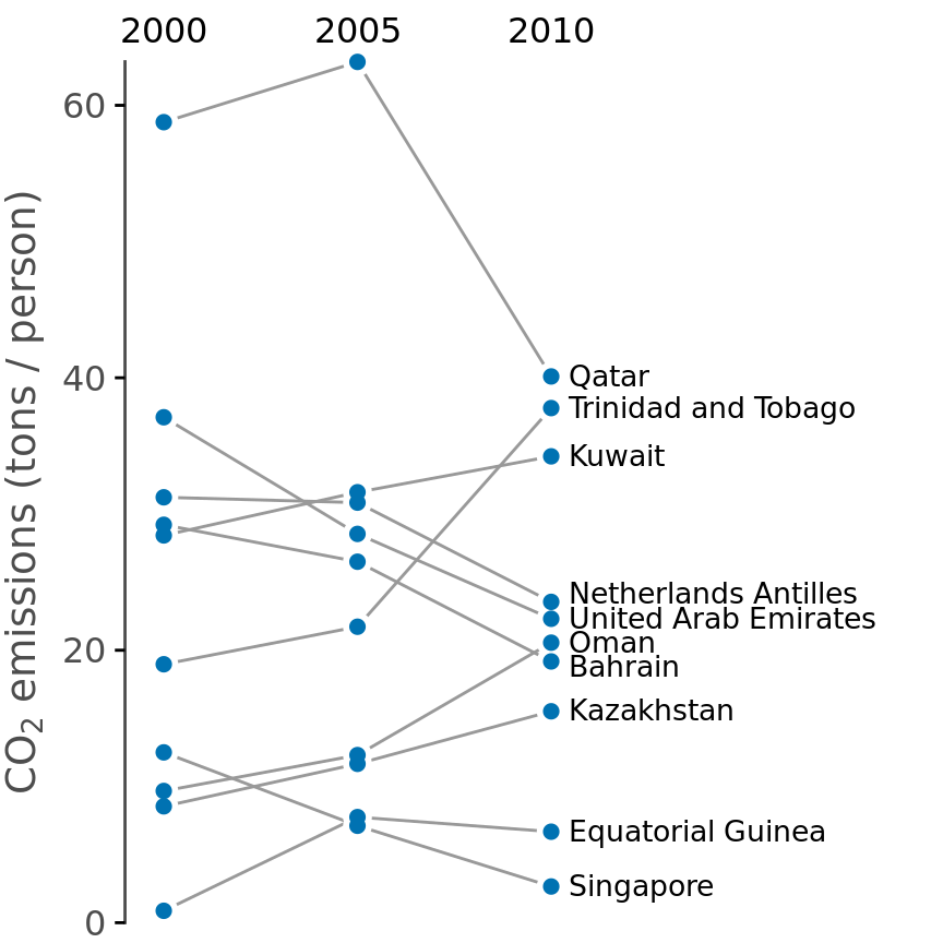
Figure 12.13: CO2 emissions per person in 2000, 2005, and 2010, for the ten countries with the largest difference between the years 2000 and 2010. Data source: Carbon Dioxide Information Analysis Center