28 Choosing the right visualization software
Throughout this book, I have purposefully avoided one critical question of data visualization: How do we actually generate our figures? What tools should we use? This question can generate heated discussions, as many people have strong emotional bonds to the specific tools they are familiar with. I have often seen people vigorously defend their own preferred tools instead of investing time to learn a new approach, even if the new approach has objective benefits. And I will say that sticking with the tools you know is not entirely unreasonable. Learning any new tool will require time and effort, and you will have to go through a painful transition period where getting things done with the new tool is much more difficult than it was with the old tool. Whether going through this period is worth the effort can usually only be evaluated in retrospect, after one has made the investment to learn the new tool. Therefore, regardless of the pros and cons of different tools and approaches, the overriding principle is that you need to pick a tool that works for you. If you can make the figures you want to make, without excessive effort, then that’s all that matters.
The best visualization software is the one that allows you to make the figures you need.
Having said this, I do think there are general principles we can use to assess the relative merits of different approaches to producing visualizations. These principles roughly break down by how reproducible the visualizations are, how easy it is to rapidly explore the data, and to what extent the visual appearance of the output can be tweaked.
28.1 Reproducibility and repeatability
In the context of scientific experiments, we refer to work as reproducible if the overarching scientific finding of the work will remain unchanged if a different research group performs the same type of study. For example, if one research group finds that a new pain medication reduces perceived headache pain significantly without causing noticeable side effects and a different group subsequently studies the same medication on a different patient group and has the same findings, then the work is reproducible. By contrast, work is repeatable if very similar or identical measurements can be obtained by the same person repeating the exact same measurement procedure on the same equipment. For example, if I weigh my dog and find she weighs 41 lbs and then I weigh her again on the same scales and find again that she weighs 41 lbs, then this measurement is repeatable.
With minor modifications, we can apply these concepts to data visualization. A visualization is reproducible if the plotted data are available and any data transformations that may have been applied are exactly specified. For example, if you make a figure and then send me the exact data that you plotted, then I can prepare a figure that looks substantially similar. We may be using slightly different fonts or colors or point sizes to display the same data, so the two figures may not be exactly identical, but your figure and mine convey the same message and therefore are reproductions of each other. A visualization is repeatable, on the other hand, if it is possible to recreate the exact same visual appearance, down to the last pixel, from the raw data. Strictly speaking, repeatability requires that even if there are random elements in the figure, such as jitter (Chapter 18), those elements were specified in a repeatable way and can be regenerated at a future date. For random data, repeatability generally requires that we specify a particular random number generator for which we set and record a seed.
Throughout this book, we have seen many examples of figures that reproduce but don’t repeat other figures. For example, Chapter 25 shows several sets of figures where all figures in each set show the same data but each figure in each set looks somewhat different. Similarly, Figure 28.1a is a repeat of Figure 9.7, down to the random jitter that was applied to each data point, whereas Figure 28.1b is only a reproduction of that figure. Figure 28.1b has different jitter than Figure 9.7, and it also uses a sufficiently different visual design that the two figures look quite distinct, even if they clearly convey the same information about the data.
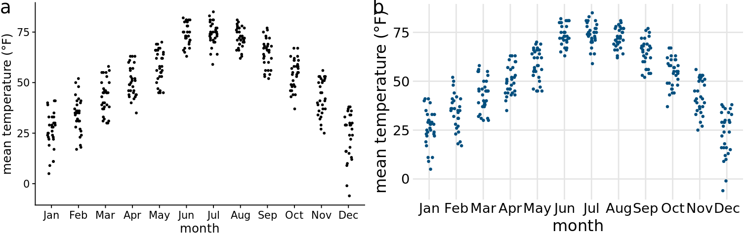
Figure 28.1: Repeat and reproduction of a figure. Part (a) is a repeat of Figure 9.7. The two figures are identical down to the random jitter that was applied to each point. By contrast, part (b) is a reproduction but not a repeat. In particular, the jitter in part (b) differs from the jitter in part (a) or in Figure 9.7.
Both reproducibility and repeatability can be difficult to achieve when we’re working with interactive plotting software. Many interactive programs allow you to transform or otherwise manipulate the data but don’t keep track of every individual data transformation you perform, only of the final product. If you make a figure using this kind of a program, and then somebody asks you to reproduce the figure or create similar one with a different data set, you might have difficulty to do so. During my years as a postdoc and a young assistant professor, I used an interactive program for all my scientific visualizations, and this exact issue happened to me several times. For example, I had made several figures for a scientific manuscript. When I wanted to revise the manuscript a few months later and needed to reproduce a slightly altered version of one of the figures, I realized that I wasn’t quite sure anymore how I had made the original figure in the first place. This experience has taught me to stay away from interactive programs as much as possible. I now make figures programmatically, by writing code (scripts) that generates the figures from the raw data. Programmatically generated figures will generally be repeatable by anybody who has access to the generating scripts and the programming language and specific libraries used.
28.2 Data exploration versus data presentation
There are two distinct phases of data visualization, and they have very different requirements. The first is data exploration. Whenever you start working with a new dataset, you need to look at it from different angles and try various ways of visualizing it, just to develop an understanding of the dataset’s key features. In this phase, speed and efficiency are of the essence. You need to try different types of visualizations, different data transformations, and different subsets of the data. The faster you can iterate through different ways of looking at the data, the more you will explore, and the higher the likelihood that you will notice an important feature in the data that you might otherwise have overlooked. The second phase is data presentation. You enter it once you understand your dataset and know what aspects of it you want to show to your audience. The key objective in this phase is to prepare a high-quality, publication-ready figure that can be printed in an article or book, included in a presentation, or posted on the internet.
In the exploration stage, whether the figures you make look appealing is secondary. It’s fine if the axis labels are missing, the legend is messed up, or the symbols are too small, as long as you can evaluate the various patterns in the data. What is critical, however, is how easy it is for you to change how the data are shown. To truly explore the data, you should be able to rapidly move from a scatter plot to overlapping density distribution plots to boxplots to a heatmap. In Chapter 2, we have discussed how all visualizations consist of mappings from data onto aesthetics. A well-designed data exploration tool will allow you to easily change which variables are mapped onto which aesthetics, and it will provide a wide range of different visualization options within a single coherent framework. In my experience, however, many visualization tools (and in particular libraries for programmatic figure generation) are not set up in this way. Instead, they are organized by plot type, where each different type of plot requires somewhat different input data and has its own idiosyncratic interface. Such tools can get in the way of efficient data exploration, because it’s difficult to remember how all the different plot types work. I encourage you to carefully evaluate whether your visualization software allows for rapid data exploration or whether it tends to get in the way. If it more frequently tends to get in the way, you may benefit from exploring alternative visualization options.
Once we have determined how exactly we want to visualize our data, what data transformations we want to make, and what type of plot to use, we will commonly want to prepare a high-quality figure for publication. At this point, we have several different avenues we can pursue. First, we can finalize the figure using same software platform we used for initial exploration. Second, we can switch platform to one that provides us finer control over the final product, even if that platform makes it harder to explore. Third, we can produce a draft figure with a visualization software and then manually post-process with an image manipulation or illustration program such as Photoshop or Illustrator. Fourth, we can manually redraw the entire figure from scratch, either with pen and paper or using an illustration program.
All these avenues are reasonable. However, I would like to caution against manually sprucing up figures in routine data analysis pipelines or for scientific publications. Manual steps in the figure preparation pipeline make repeating or reproducing a figure inherently difficult and time-consuming. And in my experience from working in the natural sciences, we rarely make a figure just once. Over the course of a study, we may redo experiments, expand the original dataset, or repeat an experiment several times with slightly altered conditions. I’ve seen it many times that late in the publication process, when we think everything is done and finalized, we end up introducing a small modification to how we analyze our data, and consequently all figures have to be redrawn. And I’ve also seen, in similar situations, that a decision is made not to redo the analysis or not to redraw the figures, either due to the effort involved or because the people who had made the original figure have moved on and aren’t available anymore. In all these scenarios, an unnecessarily complicated and non-reproducible data visualization pipeline interferes with producing the best possible science.
Having said this, I have no principled concern about hand-drawn figures or figures that have been manually post-processed, for example to change axis labels, add annotations, or modify colors. These approaches can yield beautiful and unique figures that couldn’t easily be made in any other way. In fact, as sophisticated and polished computer-generated visualizations are becoming increasingly commonplace, I observe that manually drawn figures are making somewhat of a resurgence (see Figure 28.2 for an example). I think this is the case because such figures represent a unique and personalized take on what might otherwise be a somewhat sterile and routine presentation of data.
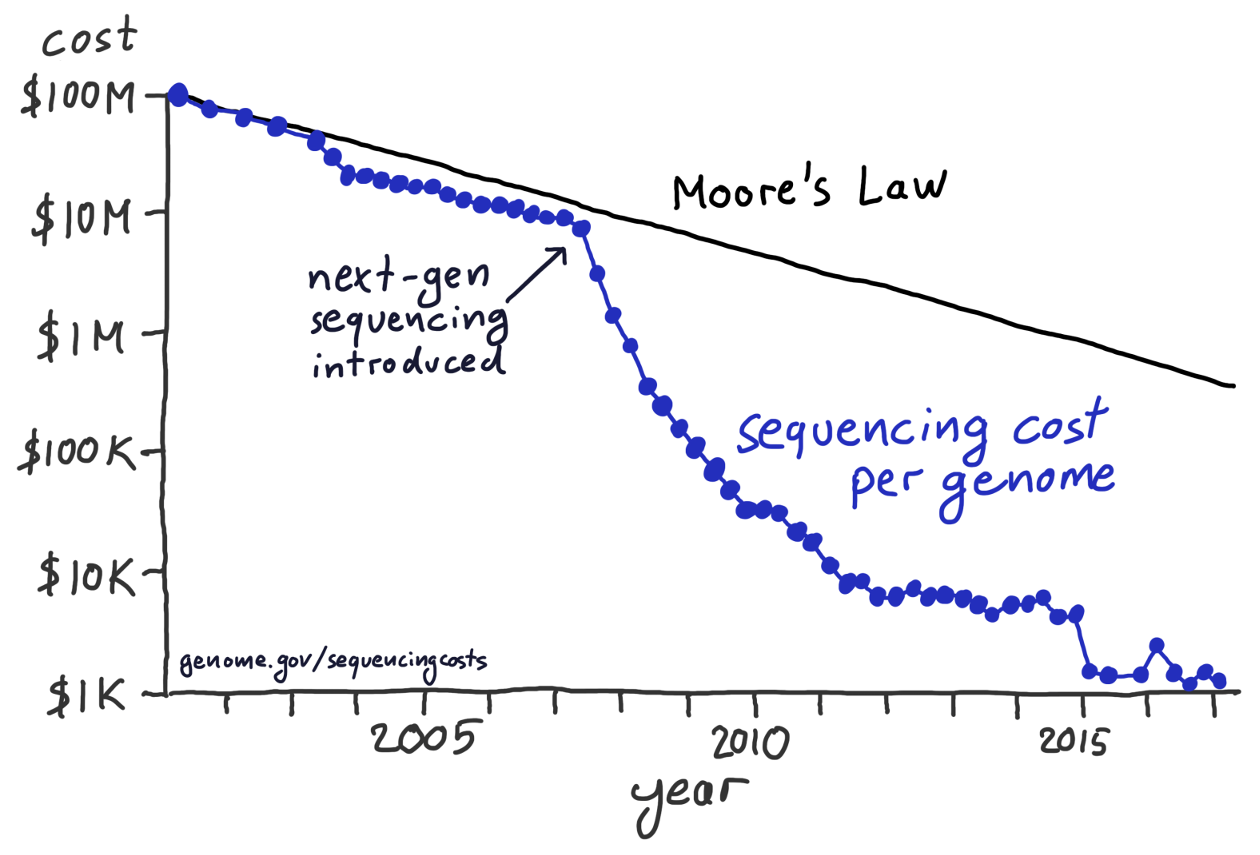
Figure 28.2: After the introduction of next-gen sequencing methods, the sequencing cost per genome has declined much more rapidly than predicted by Moore’s law. This hand-drawn figure reproduces a widely publicized visualization prepared by the National Institutes of Health. Data source: National Human Genome Research Institute
28.3 Separation of content and design
A good visualization software should allow you to think separately about the content and the design of your figures. By content, I refer to the specific data set shown, the data transformations applied (if any), the specific mappings from data onto aesthetics, the scales, the axis ranges, and the type of plot (scatter plot, line plot, bar plot, boxplot, etc.). Design, on the other hand, describes features such as the foreground and background colors, font specifications (e.g. font size, face, and family), symbol shapes and sizes, the placement of legends, axis ticks, axis titles, and plot titles, and whether or not the figure has a background grid. When I work on a new visualization, I usually determine first what the contents should be, using the kind of rapid exploration described in the previous subsection. Once the contents is set, I may tweak the design, or more likely I will apply a pre-defined design that I like and/or that gives the figure a consistent look in the context of a larger body of work.
In the software I have used for this book, ggplot2, separation of content and design is achieved via themes. A theme specifies the visual appearance of a figure, and it is easy to take an existing figure and apply different themes to it (Figure 28.3). Themes can be written by third parties and distributed as R packages. Through this mechanism, a thriving ecosystem of add-on themes has developed around ggplot2, and it covers a wide range of different styles and application scenarios. If you’re making figures with ggplot2, you can almost certainly find an existing theme that satisfies your design needs.
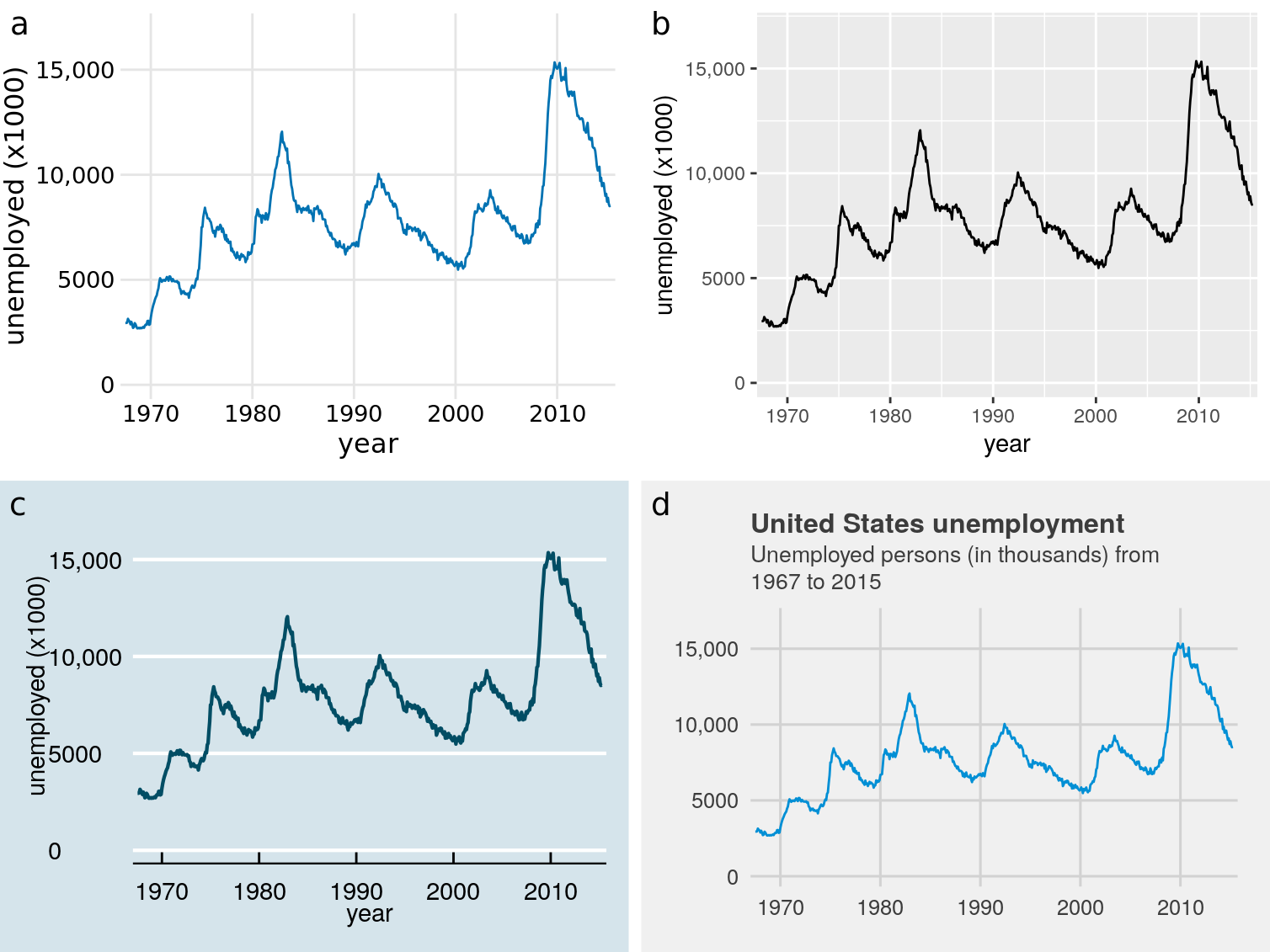
Figure 28.3: Number of unemployed persons in the U.S. from 1970 to 2015. The same figure is displayed using four different ggplot2 themes: (a) the default theme for this book; (b) the default theme of ggplot2, the plotting software I have used to make all figures in this book; (c) a theme that mimics visualizations shown in the Economist; (d) a theme that mimics visualizations shown by FiveThirtyEight. FiveThirtyEight often forgoes axis labels in favor of plot titles and subtitles, and therefore I have adjusted the figure accordingly. Data source: U.S. Bureau of Labor Statistics
Separation of content and design allows data scientists and designers to each focus on what they do best. Most data scientists are not designers, and therefore their primary concern should be the data, not the design of a visualization. Likewise, most designers are not data scientists, and they should be able provide a unique and appealing visual language for figures without having to worry about specific data, appropriate transformations, and so on. The same principle of separating content and design has long been followed in the publishing world of books, magazines, newspapers, and websites, where writers provide content but not layout or design. Layout and design are created by a separate group of people who specialize in this area and who ensure that the publication appears in a visually consistent and appealing style. This principle is logical and useful, but it is not yet that widespread in the data visualization world.
In summary, when choosing your visualization software, think about how easily you can reproduce figures and redo them with updated or otherwise changed datasets, whether you can rapidly explore different visualizations of the same data, and to what extent you can tweak the visual design separately from generating the figure content. Depending on your skill level and comfort with programming, it may be beneficial to use different visualization tools at the data exploration and the data presentation stages, and you may prefer to do the final visual tweaking interactively or by hand. If you have to make figures interactively, in particular with a software that does not keep track of all data transformations and visual tweaks you have applied, consider taking careful notes on how you make each figure, so that all your work remains reproducible.