10 Visualizing proportions
We often want to show how some group, entity, or amount breaks down into individual pieces that each represent a proportion of the whole. Common examples include the proportions of men and women in a group of people, the percentages of people voting for different political parties in an election, or the market shares of companies. The archetypal such visualization is the pie chart, omnipresent in any business presentation and much maligned among data scientists. As we will see, visualizing proportions can be challenging, in particular when the whole is broken into many different pieces or when we want to see changes in proportions over time or across conditions. There is no single ideal visualization that always works. To illustrate this issue, I discuss a few different scenarios that each call for a different type of visualization.
Remember: You always need to pick the visualization that best fits your specific dataset and that highlights the key data features you want to show.
10.1 A case for pie charts
From 1961 to 1983, the German parliament (called the Bundestag) was composed of members of three different parties, CDU/CSU, SPD, and FDP. During most of this time, CDU/CSU and SPD had approximately comparable numbers of seats, while the FDP typically held only a small fraction of seats. For example, in the 8th Bundestag, from 1976–1980, the CDU/CSU held 243 seats, SPD 214, and FDP 39, for a total of 496. Such parliamentary data is most commonly visualized as a pie chart (Figure 10.1).
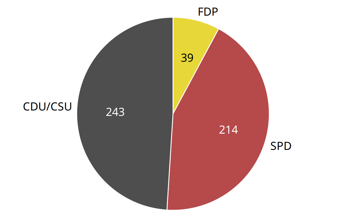
Figure 10.1: Party composition of the 8th German Bundestag, 1976–1980, visualized as a pie chart. This visualization shows clearly that the ruling coalition of SPD and FDP had a small majority over the opposition CDU/CSU.
A pie chart breaks a circle into slices such that the area of each slice is proportional to the fraction of the total it represents. The same procedure can be performed on a rectangle, and the result is a stacked bar chart (Figure 10.2). Depending on whether we slice the bar vertically or horizontally, we obtain vertically stacked bars (Figure 10.2a) or horizontally stacked bars (Figure 10.2b).
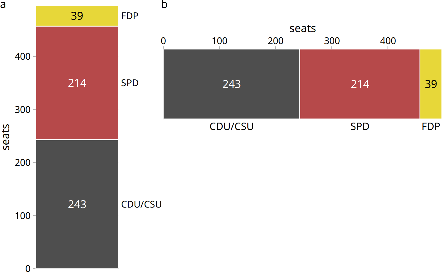
Figure 10.2: Party composition of the 8th German Bundestag, 1976–1980, visualized as stacked bars. (a) Bars stacked vertically. (b) Bars stacked horizontally. It is not immediately obvious that SPD and FDP jointly had more seats than CDU/CSU.
We can also take the bars from Figure 10.2a and place them side-by-side rather than stacking them on top of each other. This visualization makes it easier to perform a direct comparison of the three groups, though it obscures other aspects of the data (Figure 10.3). Most importantly, in a side-by-side bar plot the relationship of each bar to the total is not visually obvious.
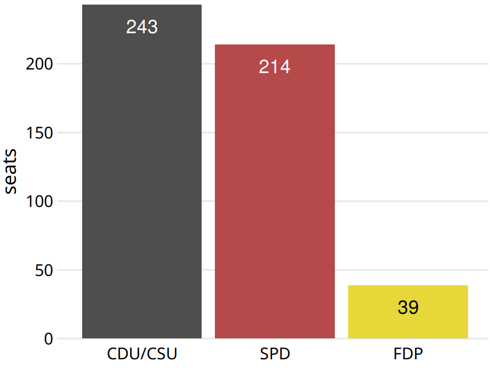
Figure 10.3: Party composition of the 8th German Bundestag, 1976–1980, visualized as side-by-side bars. As in Figure 10.2, it is not immediately obvious that SPD and FDP jointly had more seats than CDU/CSU.
Many authors categorically reject pie charts and argue in favor of side-by-side or stacked bars. Others defend the use of pie charts in some applications. My own opinion is that none of these visualizations is consistently superior over any other. Depending on the features of the dataset and the specific story you want to tell, you may want to favor one or the other approach. In the case of the 8th German Bundestag, I think that a pie chart is the best option. It shows clearly that the ruling coalition of SPD and FDP jointly had a small majority over the CDU/CSU (Figure 10.1). This fact is not visually obvious in any of the other plots (Figures 10.2 and 10.3).
In general, pie charts work well when the goal is to emphasize simple fractions, such as one-half, one-third, or one-quarter. They also work well when we have very small datasets. A single pie chart, as in Figure 10.1, looks just fine, but a single column of stacked bars, as in Figure 10.2a, looks awkward. Stacked bars, on the other hand, can work for side-by-side comparisons of multiple conditions or in a time series, and side-by-side bars are preferred when we want to directly compare the individual fractions to each other. A summary of the various pros and cons of pie charts, stacked bars, and side-by-side bars is provided in Table 10.1.
| Pie chart | Stacked bars | Side-by-side bars | |
|---|---|---|---|
| Clearly visualizes the data as proportions of a whole | ✔ | ✔ | ✖ |
| Allows easy visual comparison of the relative proportions | ✖ | ✖ | ✔ |
| Visually emphasizes simple fractions, such as 1/2, 1/3, 1/4 | ✔ | ✖ | ✖ |
| Looks visually appealing even for very small datasets | ✔ | ✖ | ✔ |
| Works well when the whole is broken into many pieces | ✖ | ✖ | ✔ |
| Works well for the visualization of many sets of proportions or time series of proportions | ✖ | ✔ | ✖ |
10.2 A case for side-by-side bars
I will now demonstrate a case where pie charts fail. This example is modeled after a critique of pie charts originally posted on Wikipedia (Wikipedia 2007). Consider the hypothetical scenario of five companies, A, B, C, D, and E, who all have roughly comparable market share of approximately 20%. Our hypothetical dataset lists the market share of each company for three consecutive years. When we visualize this dataset with pie charts, it is difficult to see what exactly is going on (Figure 10.4). It appears that the market share of company A is growing and the one of company E is shrinking, but beyond this one observation we can’t tell what’s going on. In particular, it is unclear how exactly the market shares of the different companies compare within each year.
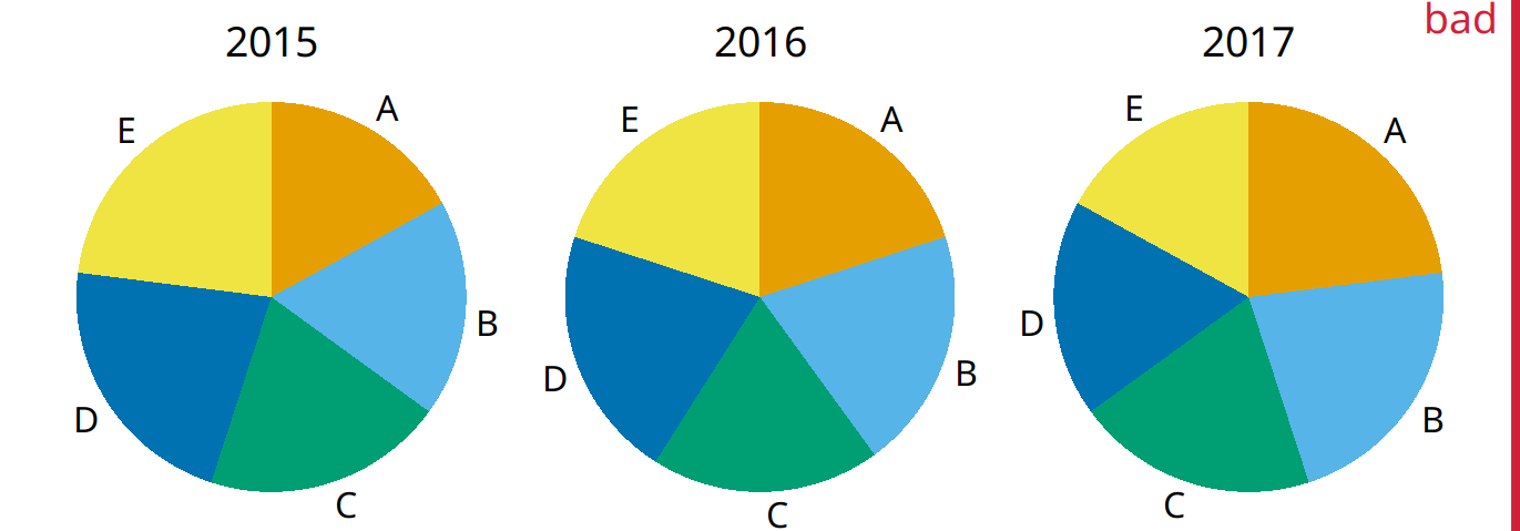
Figure 10.4: Market share of five hypothetical companies, A–E, for the years 2015–2017, visualized as pie charts. This visualization has two major problems: 1. A comparison of relative market share within years is nearly impossible. 2. Changes in market share across years are difficult to see.
The picture becomes a little clearer when we switch to stacked bars (Figure 10.5). Now the trends of a growing market share for company A and a shrinking market share for company E are clearly visible. However, the relative market shares of the five companies within each year are still hard to compare. And it is difficult to compare the market shares of companies B, C, and D across years, because the bars are shifted relative to each other across years. This is a general problem of stacked-bar plots, and the main reason why I normally do not recommend this type of visualization.
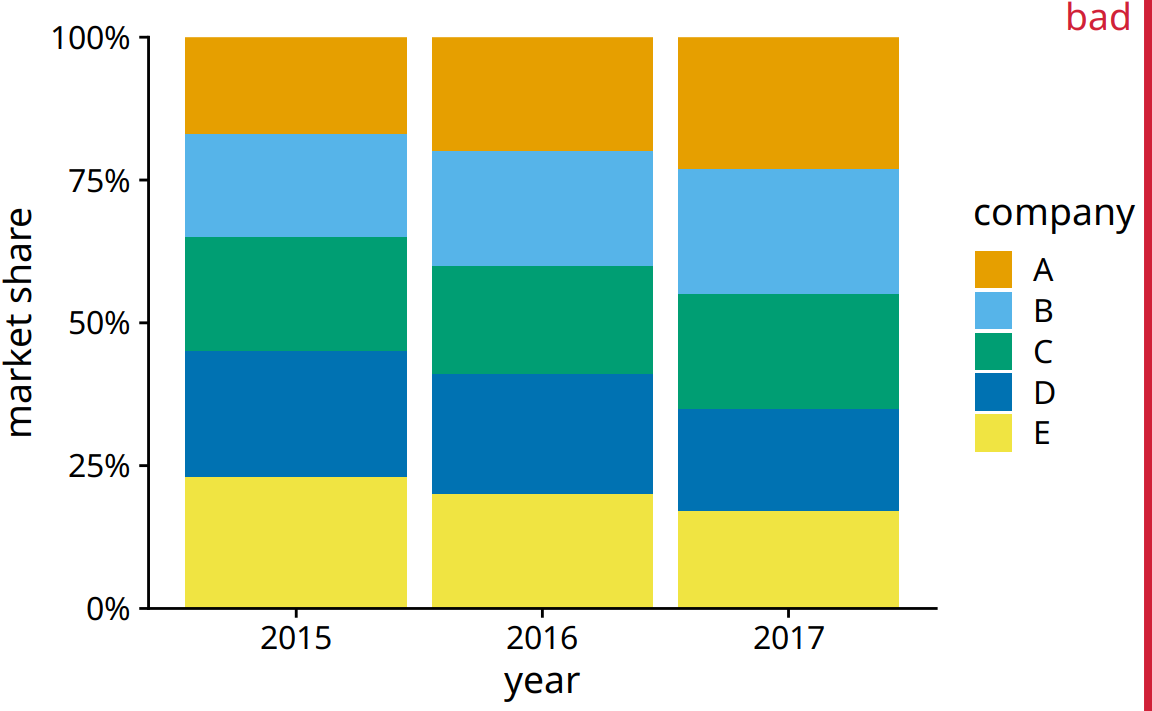
Figure 10.5: Market share of five hypothetical companies for the years 2015–2017, visualized as stacked bars. This visualization has two major problems: 1. A comparison of relative market shares within years is difficult. 2. Changes in market share across years are difficult to see for the middle companies B, C, and D, because the location of the bars changes across years.
For this hypothetical data set, side-by-side bars are the best choice (Figure 10.6). This visualization highlights that both companies A and B have increased their market share from 2015 to 2017 while both companies D and E have reduced theirs. It also shows that market shares increase sequentially from company A to E in 2015 and similarly decrease in 2017.
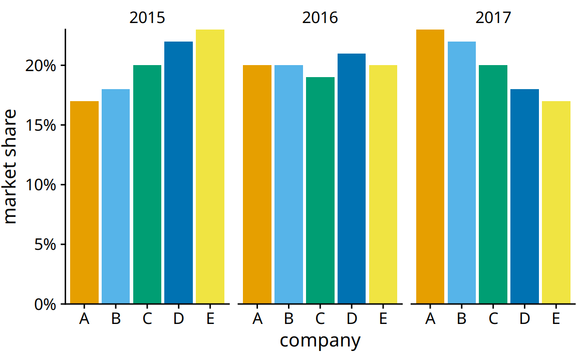
Figure 10.6: Market share of five hypothetical companies for the years 2015–2017, visualized as side-by-side bars.
10.3 A case for stacked bars and stacked densities
In Section 10.2, I wrote that I don’t normally recommend sequences of stacked bars, because the location of the internal bars shifts along the sequence. However, the problem of shifting internal bars disappears if there are only two bars in each stack, and in those cases the resulting visualization can be quite clear. As an example, consider the proportion of women in a country’s national parliament. We will specifically look at the African country Rwanda, which as of 2016 tops the list of countries with the highest proportion of female parliament members. Rwanda has had a majority female parliament since 2008, and since 2013 nearly two-thirds of its members of parliament are female. To visualize how the proportion of women in the Rwandan parliament has changed over time, we can draw a sequence of stacked bar graphs (Figure 10.7). This figure provides an immediate visual representation of the changing proportions over time. To help the reader see exactly when the majority turned female, I have added a dashed horizontal line at 50%. Without this line, it would be near impossible to determine whether from 2003 to 2007 the majority was male or female. I have not added similar lines at 25% and 75%, to avoid making the figure too cluttered.
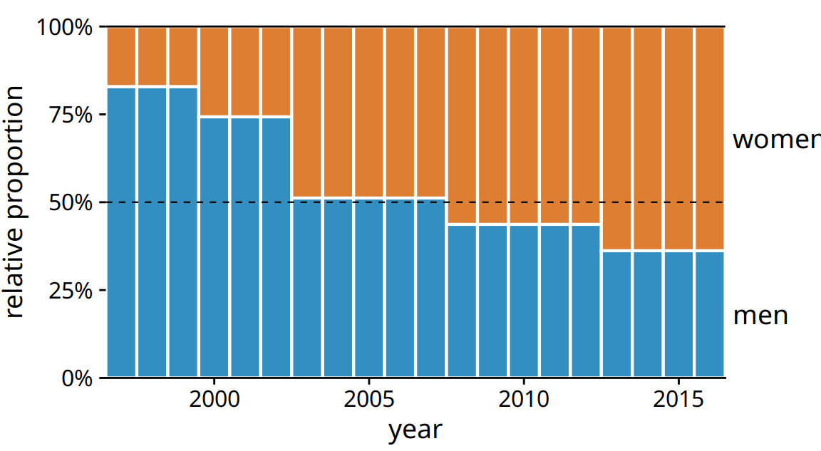
Figure 10.7: Change in the gender composition of the Rwandan parliament over time, 1997 to 2016. Data source: Inter-Parliamentary Union (IPU), ipu.org.
If we want to visualize how proportions change in response to a continuous variable, we can switch from stacked bars to stacked densities. Stacked densities can be thought of as the limiting case of infinitely many infinitely small stacked bars arranged side-by-side. The densities in stacked-density plots are typically obtained from kernel density estimation, as described in Chapter 7, and I refer you to that chapter for a general discussion of the strengths and weaknesses of this method.
To give an example where stacked densities may be appropriate, consider the health status of people as a function of age. Age can be considered a continuous variable, and visualizing the data in this way works reasonably well (Figure 10.8). Even though we have four health categories here, and I’m generally not a fan of stacking multiple conditions, as discussed above, I think in this case the figure is acceptable. We can see clearly that overall health declines as people age, and we can also see that despite this trend, over half of the population remain in good or excellent health until very old age.
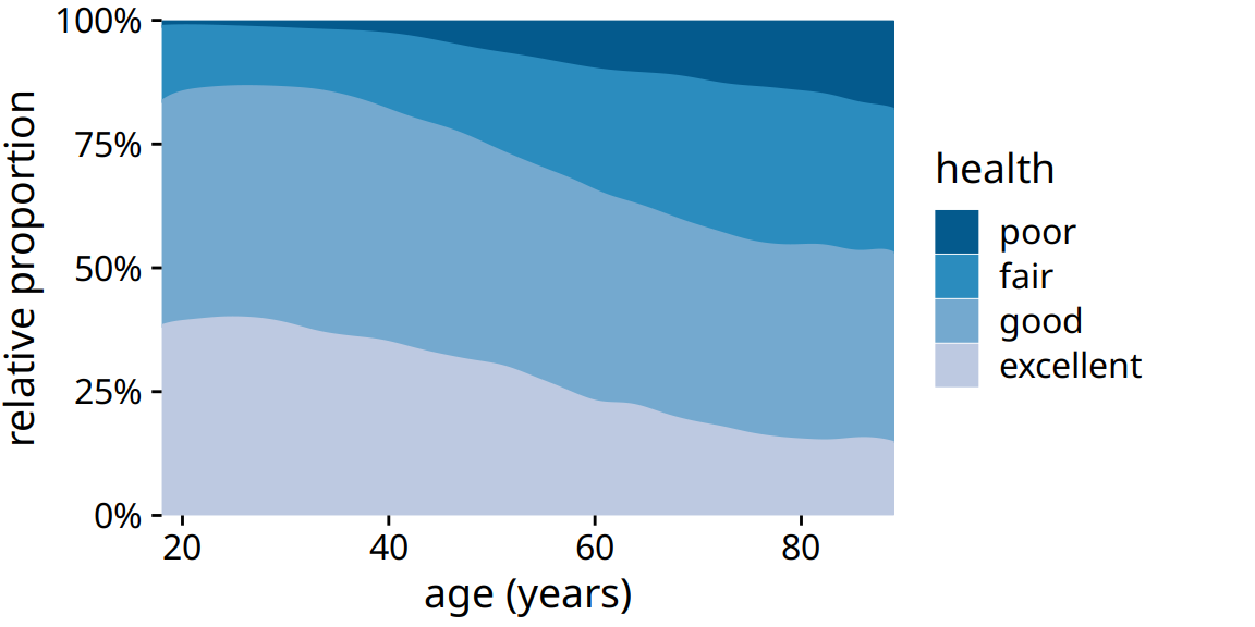
Figure 10.8: Health status by age, as reported by the general social survey (GSS).
Nevertheless, this figure has a major limitation: By visualizing the proportions of the four health conditions as percent of the total, the figure obscures that there are many more young people than old people in the dataset. Thus, even though the percentage of people reporting to be in good health remains approximately unchanged across ages spanning seven decades, the absolute number of people in good health declines as the total number of people at a given age declines. I will present a potential solution to this problem in the next section.
10.4 Visualizing proportions separately as parts of the total
Side-by-side bars have the problem that they don’t clearly visualize the size of the individual parts relative to the whole and stacked bars have the problem that the different bars cannot be compared easily because they have different baselines. We can resolve these two issues by making a separate plot for each part and in each plot showing the respective part relative to the whole. For the health dataset of Figure 10.8, this procedure results in Figure 10.9. The overall age distribution in the dataset is shown as the shaded gray areas, and the age distributions for each health status are shown in blue. This figure highlights that in absolute terms, the number people with excellent or good health declines past ages 30–40, while the number of people with fair health remains approximately constant across all ages.
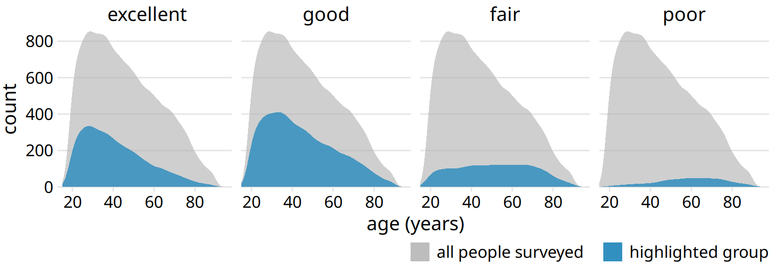
Figure 10.9: Health status by age, shown as proportion of the total number of people in the survey. The colored areas show the density estimates of the ages of people with the respective health status and the gray areas show the overall age distribution.
To provide a second example, let’s consider a different variable from the same survey: marital status. Marital status changes much more drastically with age than does health status, and a stacked densities plot of marital status vs age is not very illuminating (Figure 10.10).
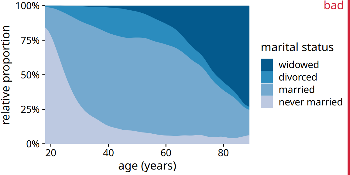
Figure 10.10: Marital status by age, as reported by the general social survey (GSS). To simplify the figure, I have removed a small number of cases that report as separated. I have labeled this figure as “bad” because the frequency of people who have never been married or are widowed changes so drastically with age that the age distributions of married and divorced people are highly distorted and difficult to interpret.
The same dataset visualized as partial densities is much clearer (Figure 10.11). In particular, we see that the proportion of married people peaks around the late 30s, the proportion of divorced people peaks around the early 40s, and the proportion of widowed people peaks around the mid 70s.
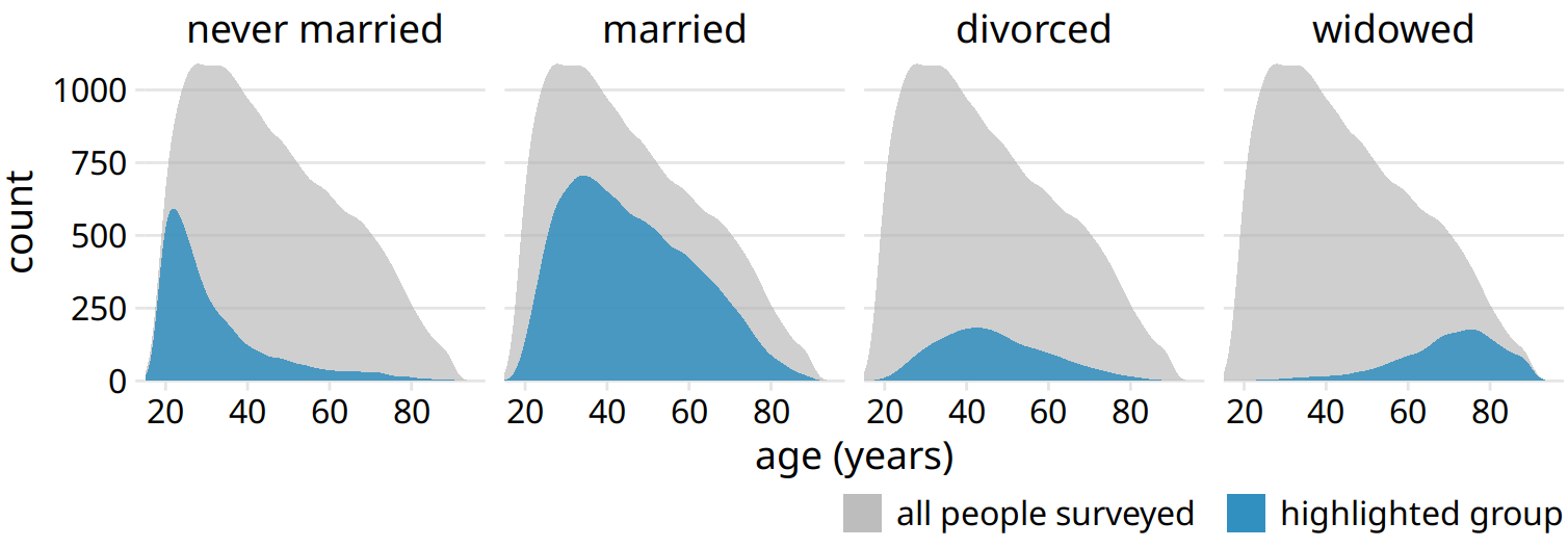
Figure 10.11: Marital status by age, shown as proportion of the total number of people in the survey. The colored areas show the density estimates of the ages of people with the respective marital status, and the gray areas show the overall age distribution.
However, one downside of Figure 10.11 is that this representation doesn’t make it easy to determine relative proportions at any given point in time. For example, if we wanted to know at what age more than 50% of all people surveyed are married, we could not easily tell from Figure 10.11. To answer this question, we can instead use the same type of display but show relative proportions instead of absolute counts along the y axis (Figure 10.12). Now we see that married people are in the majority starting in their late 20s, and widowed people are in the majority starting in their mid 70s.
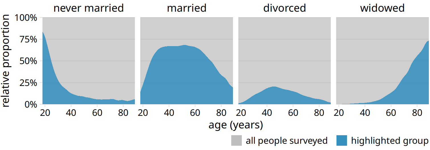
Figure 10.12: Marital status by age, shown as proportion of the total number of people in the survey. The areas colored in blue show the percent of people at the given age with the respective status, and the areas colored in gray show the percent of people with all other marital statuses.
References
Wikipedia, User:Schutz. 2007. “File:Piecharts.svg.” https://en.wikipedia.org/wiki/File:Piecharts.svg.