18 Handling overlapping points
When we want to visualize large or very large datasets, we often experience the challenge that simple x–y scatter plots do not work very well because many points lie on top of each other and partially or fully overlap. And similar problems can arise even in small datasets if data values were recorded with low precision or rounded, such that multiple observations have exactly the same numeric values. The technical term commonly used to describe this situation is “overplotting”, i.e., plotting many points on top of each other. Here I describe several strategies you can pursue when encountering this challenge.
18.1 Partial transparency and jittering
We first consider a scenario with only a moderate number of data points but with extensive rounding. Our dataset contains fuel economy during city driving and engine displacement for 234 popular car models released between 1999 and 2008 (Figure 18.1). In this dataset, fuel economy is measured in miles per gallon (mpg) and is rounded to the nearest integer value. Engine displacement is measured in liters and is rounded to the nearest deciliter. Due to this rounding, many car models have exactly identical values. For example, there are 21 cars total with 2.0 liter engine displacement, and as a group they have only four different fuel economy values, 19, 20, 21, or 22 mpg. Therefore, in Figure 18.1 these 21 cars are represented by only four distinct points, so that 2.0 liter engines appear much less popular than they actually are. Moreover, the dataset contains two four-wheel drive cars with 2.0 liter engines, which are represented by black dots. However, these black dots are fully occluded by yellow dots, so that it looks like there are no four-wheel drive cars with a 2.0 liter engine.
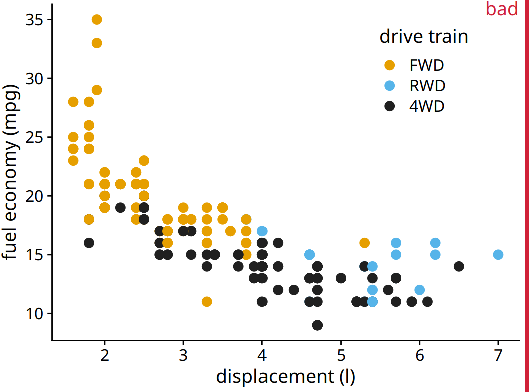
Figure 18.1: City fuel economy versus engine displacement, for popular cars released between 1999 and 2008. Each point represents one car. The point color encodes the drive train: front-wheel drive (FWD), rear-wheel drive (RWD), or four-wheel drive (4WD). The figure is labeled “bad” because many points are plotted on top of others and obscure them.
One way to ameliorate this problem is to use partial transparency. If we make individual points partially transparent, then overplotted points appear as darker points and thus the shade of the points reflects the density of points in that location of the graph (Figure 18.2).
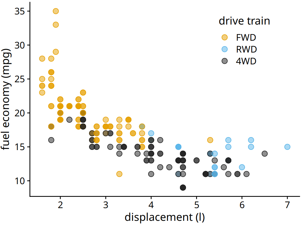
Figure 18.2: City fuel economy versus engine displacement. Because points have been made partially transparent, points that lie on top of other points can now be identified by their darker shade.
However, making points partially transparent is not always sufficient to solve the issue of overplotting. For example, even though we can see in Figure 18.2 that some points have a darker shade than others, it is difficult to estimate how many points were plotted on top of each other in each location. In addition, while the differences in shading are clearly visible, they are not self-explanatory. A reader who sees this figure for the first time will likely wonder why some points are darker than others and will not realize that those points are in fact multiple points stacked on top of each other. A simple trick that helps in this situation is to apply a small amount of jitter to the points, i.e., to displace each point randomly by a small amount in either the x or the y direction or both. With jitter, it is immediately apparent that the darker areas arise from points that are plotted on top of each other (Figure 18.3). Also, now, for the first time the black dots representing four-wheel drive cars with 2.0 liter engines are clearly visible.
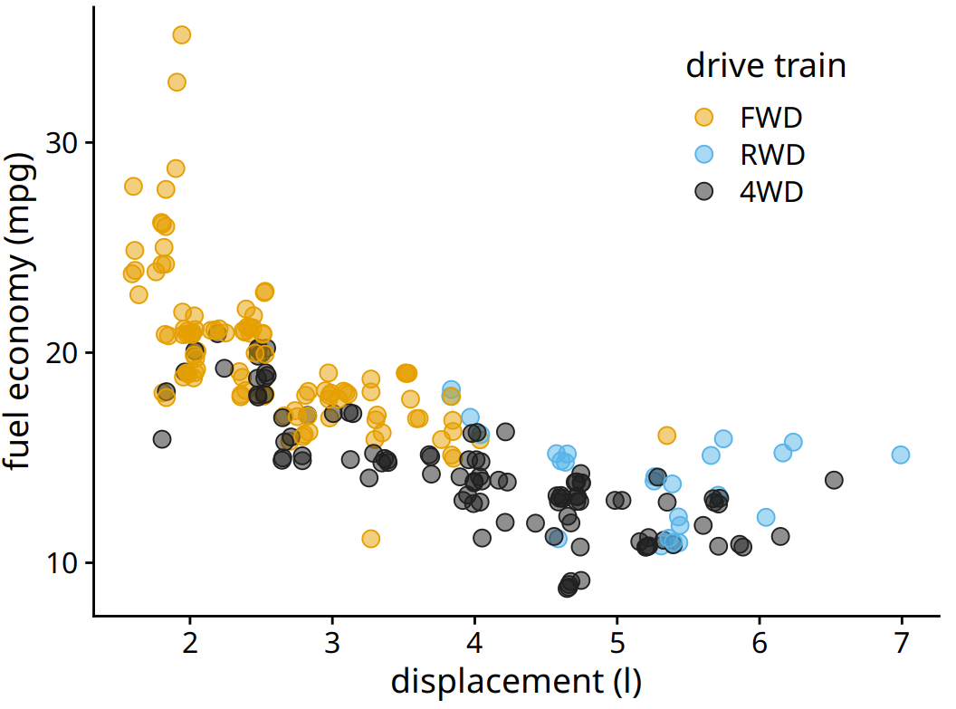
Figure 18.3: City fuel economy versus engine displacement. By adding a small amount of jitter to each point, we can make the overplotted points more clearly visible without substantially distorting the message of the plot.
One downside of jittering is that it does change the data and therefore has to be performed with care. If we jitter too much, we end up placing points in locations that are not representative of the underlying dataset. The result is a misleading visualization of the data. See Figure 18.4 as an example.
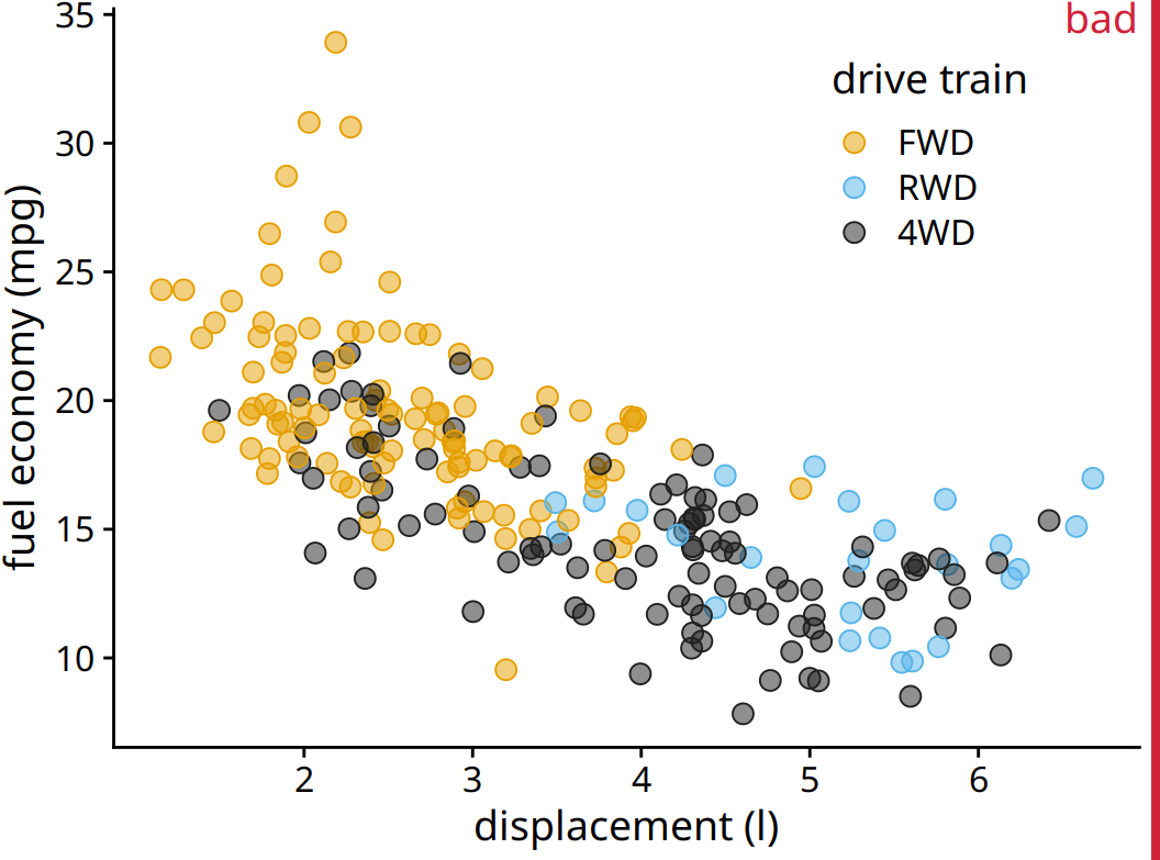
Figure 18.4: City fuel economy versus engine displacement. By adding too much jitter to the points, we have created a visualization that does not accurately reflect the underlying dataset.
18.2 2D histograms
When the number of individual points gets very large, partial transparency (with or without jittering) will not be sufficient to resolve the overplotting issue. What will typically happen is that areas with high point density will appear as uniform blobs of dark color while in areas with low point density the individual points are barely visible (Figure 18.5). And changing the transparency level of individual points will either ameliorate one or the other of these problems while worsening the other; no transparency setting can address both at the same time.
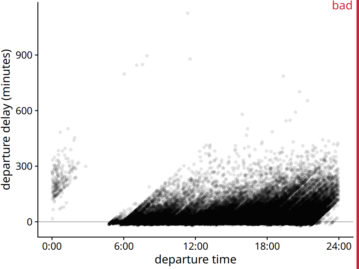
Figure 18.5: Departure delay in minutes versus the flight departure time, for all flights departing Newark airport (EWR) in 2013. Each dot represents one departure.
Figure 18.5 shows departure delays for over 100,000 individual flights, with each dot representing one flight departure. Even though we have made the individual dots fairly transparent, the majority of them just forms a black band between 0 and 300 minutes departure delay. This band obscures whether most flights depart approximately on time or with substantial delay (say 50 minutes or more). At the same time, the most delayed flights (with delays of 400 minutes or more) are barely visible due to the transparency of the dots.
In such cases, instead of plotting individual points, we can make a 2D histogram. A 2D histogram is conceptually similar to a 1D histogram as discussed in Chapter 7, but now we bin the data in two dimensions. We subdivide the entire x–y plane into small rectangles, count how many observations fall into each one, and then color the rectangles by that count. Figure 18.6 shows the result of this approach for the departure-delay data. This visualization clearly highlights several important features of the flight-departure data. First, the vast majority of departures during the day (6am to about 9pm) actually depart without delay or even early (negative delay). However, a modest number of departures has a substantial delay. Moreover, the later a plane departs in the day the more of a delay it can have. Importantly, the departure time is the actual time of departure, not the scheduled time of departure. So this figure does not necessarily tell us that planes scheduled to depart early never experience delay. What it does tell us, though, is that if a plane departs early it either has little delay or, in very rare cases, a delay of around 900 minutes.
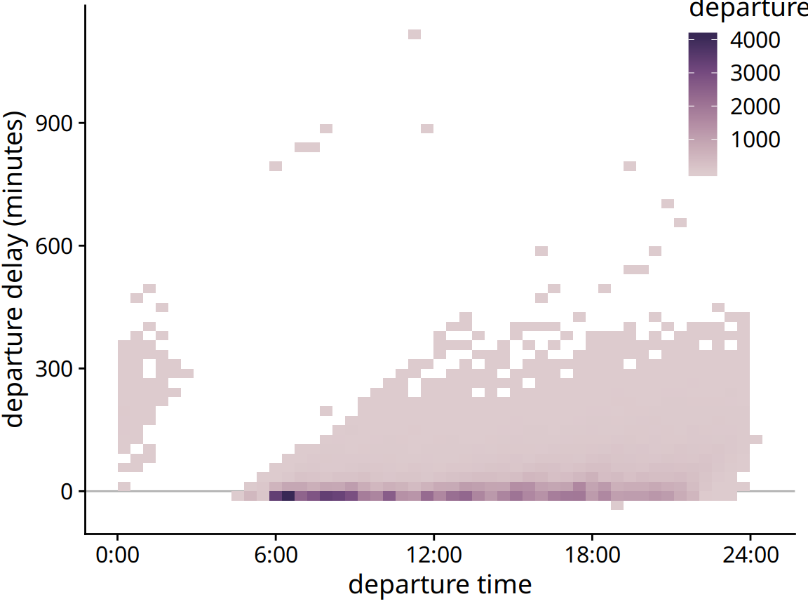
Figure 18.6: Departure delay in minutes versus the flight departure time. Each colored rectangle represents all flights departing at that time with that departure delay. Coloring represents the number of flights represented by that rectangle.
As an alternative to binning the data into rectangle, we can also bin into hexagons. This approach, first proposed by Carr et al. (1987), has the advantage that the points in a hexagon are, on average, closer to the hexagon center than the points in an equal-area square are to the center of the square. Therefore, the colored hexagon represents the data slightly more accurately than the colored rectangle does. Figure 18.7 shows the flight departure data with hexagon binning rather than rectangular binning.
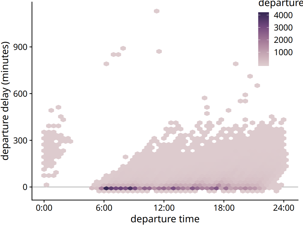
Figure 18.7: Departure delay in minutes versus the flight departure time. Each colored hexagon represents all flights departing at that time with that departure delay. Coloring represents the number of flights represented by that hexagon.
18.3 Contour lines
Instead of binning data points into rectangles or hexagons, we can also estimate the point density across the plot area and indicate regions of different point densities with contour lines. This technique works well when the point density changes slowly across both the x and the y dimensions.
As an example for this approach, we return to the blue jays dataset from Chapter 12. Figure 12.1 showed the relationship between head length and body mass for 123 blue jays, and there was some amount of overlap among the points. We can highlight the distribution of points more clearly by making the points smaller and partially transparent and plotting them on top of contour lines that delineate regions of similar point density (Figure 18.8). We can further enhance the perception of changes in the point density by shading the regions enclosed by the contour lines, using darker colors for regions representing higher point densities (Figure 18.9).
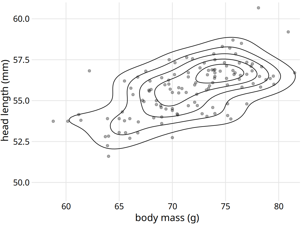
Figure 18.8: Head length versus body mass for 123 blue jays, as in Figure 12.1. Each dot corresponds to one bird, and the lines indicate regions of similar point density. The point density increases towards the center of the plot, near a body mass of 75g and a head length between 55mm and 57.5mm. Data source: Keith Tarvin, Oberlin College
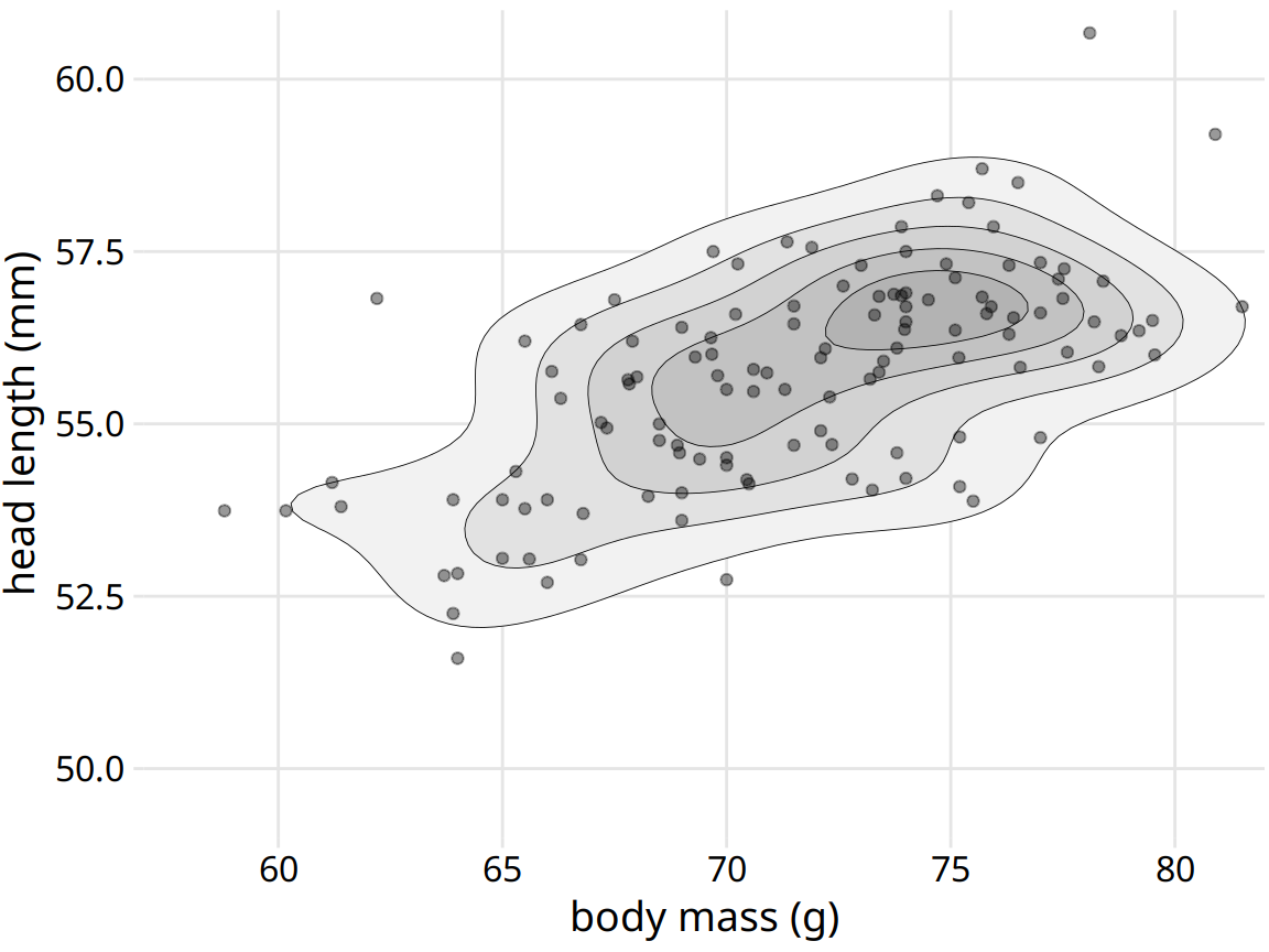
Figure 18.9: Head length versus body mass for 123 blue jays. This figure is nearly identical to Figure 12.1, but now the areas enclosed by the contour lines are shaded with increasingly darker shades of gray. This shading creates a stronger visual impression of increasing point density towards the center of the point cloud. Data source: Keith Tarvin, Oberlin College
In Chapter 12, we also looked at the relationship between head length and body mass separately for male and female birds (Figure 12.2). We can do the same with contour lines, by drawing separately colored contour lines for male and female birds (Figure 18.10).
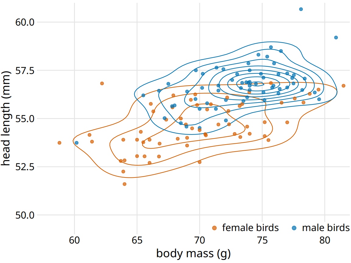
Figure 18.10: Head length versus body mass for 123 blue jays. As in Figure 12.2, we can also indicate the birds’ sex by color when drawing contour lines. This figure highlights how the point distribution is different for male and female birds. In particular, male birds are more densely clustered in one region of the plot area whereas female birds are more spread out. Data source: Keith Tarvin, Oberlin College
Drawing multiple sets of contour lines in different colors can be a powerful strategy for showing the distributions of several point clouds at once. However, this technique needs to be employed with care. It only works when the number of groups with distinct colors is small (two to three) and the groups are clearly separated. Otherwise, we may end up with a hairball of differently colored lines all crisscrossing each other and not showing any particular pattern at all.
To illustrate this potential problem, I will employ the diamonds dataset, which contains information for 53,940 diamonds, including their price, weight (carat), and cut. Figure 18.11 shows this dataset as a scatter plot. We see clear problems with overplotting. There are so many different-colored points on top of one another that it is impossible to discern anything beyond the overall broad outline of where diamonds fall on the price–carat spectrum.
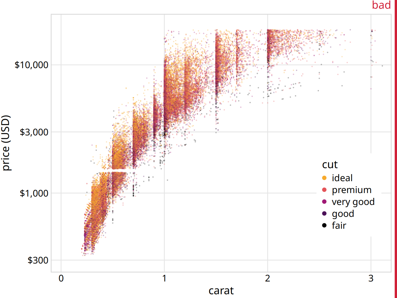
Figure 18.11: Price of diamonds versus their carat value, for 53,940 individual diamonds. Each diamond’s cut is indicated by color. The plot is labeled as “bad” because the extensive overplotting makes it impossible to discern any patterns among the different diamond cuts. Data source: Hadley Wickham, ggplot2
We could try to draw colored contour lines for the different qualities of cut, as in Figure 18.10. However, in the diamonds dataset, we have five distinct colors and the groups strongly overlap. Therefore, the contour plot (Figure 18.12) is not much better than the original scatter plot (Figure 18.11).
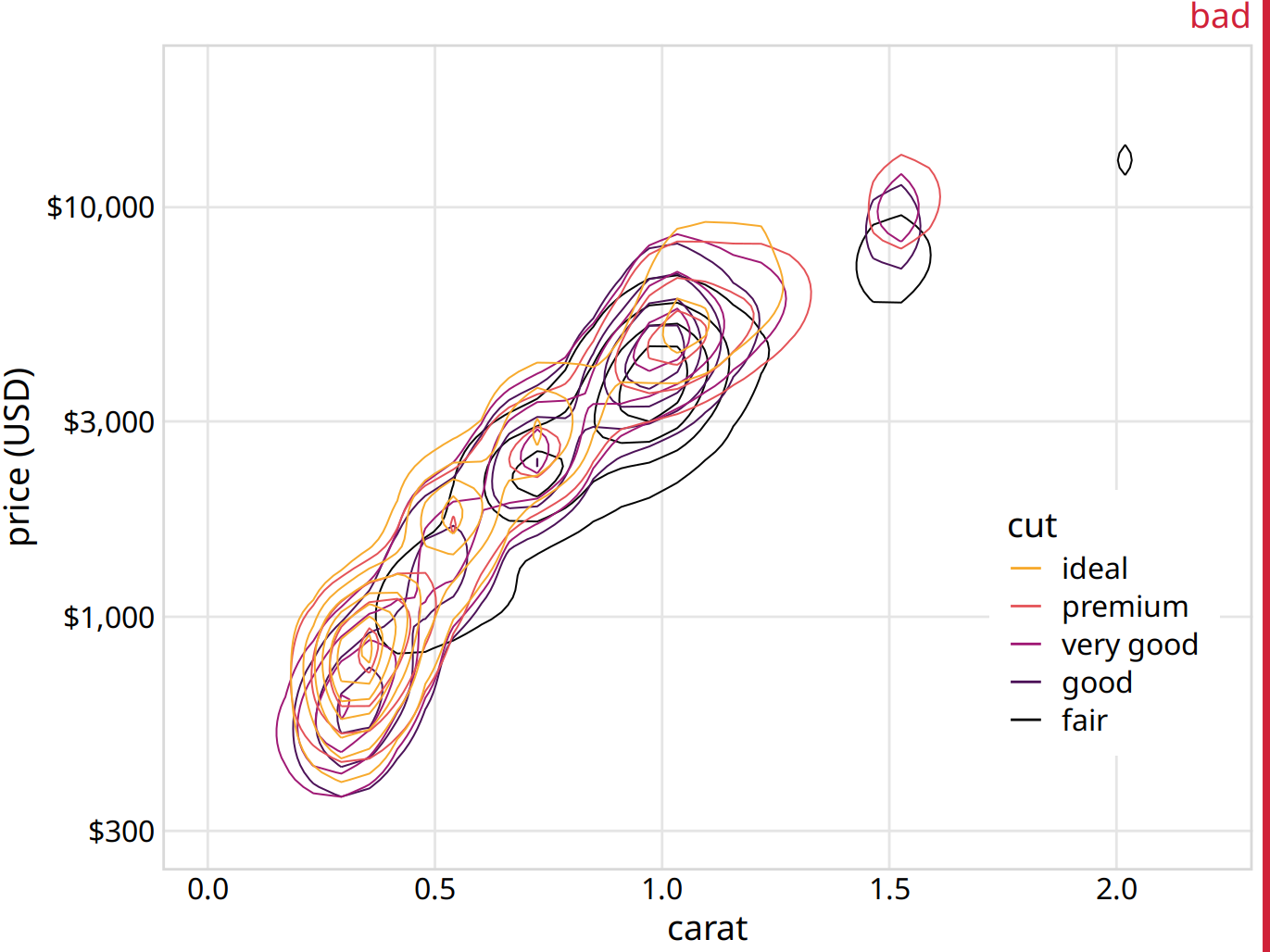
Figure 18.12: Price of diamonds versus their carat value. As Figure 18.11, but now individual points have been replaced by contour lines. The resulting plot is still labeled “bad”, because the contour lines all lie on top of each other. Neither the point distribution for individual cuts nor the overall point distribution can be discerned. Data source: Hadley Wickham, ggplot2
What helps here is to draw the contour lines for each cut quality in its own plot panel (Figure 18.13). The purpose of drawing them all in one panel might be to enable visual comparison between the groups, but Figure 18.12 is so busy that a comparison isn’t possible. Instead, in Figure 18.13, the background grid enables us to make comparisons across cut qualities, by paying attention to where exactly the contour lines fall relative to the grid lines. (A similar effect could have been achieved by plotting partially transparent individual points instead of contour lines in each panel.)
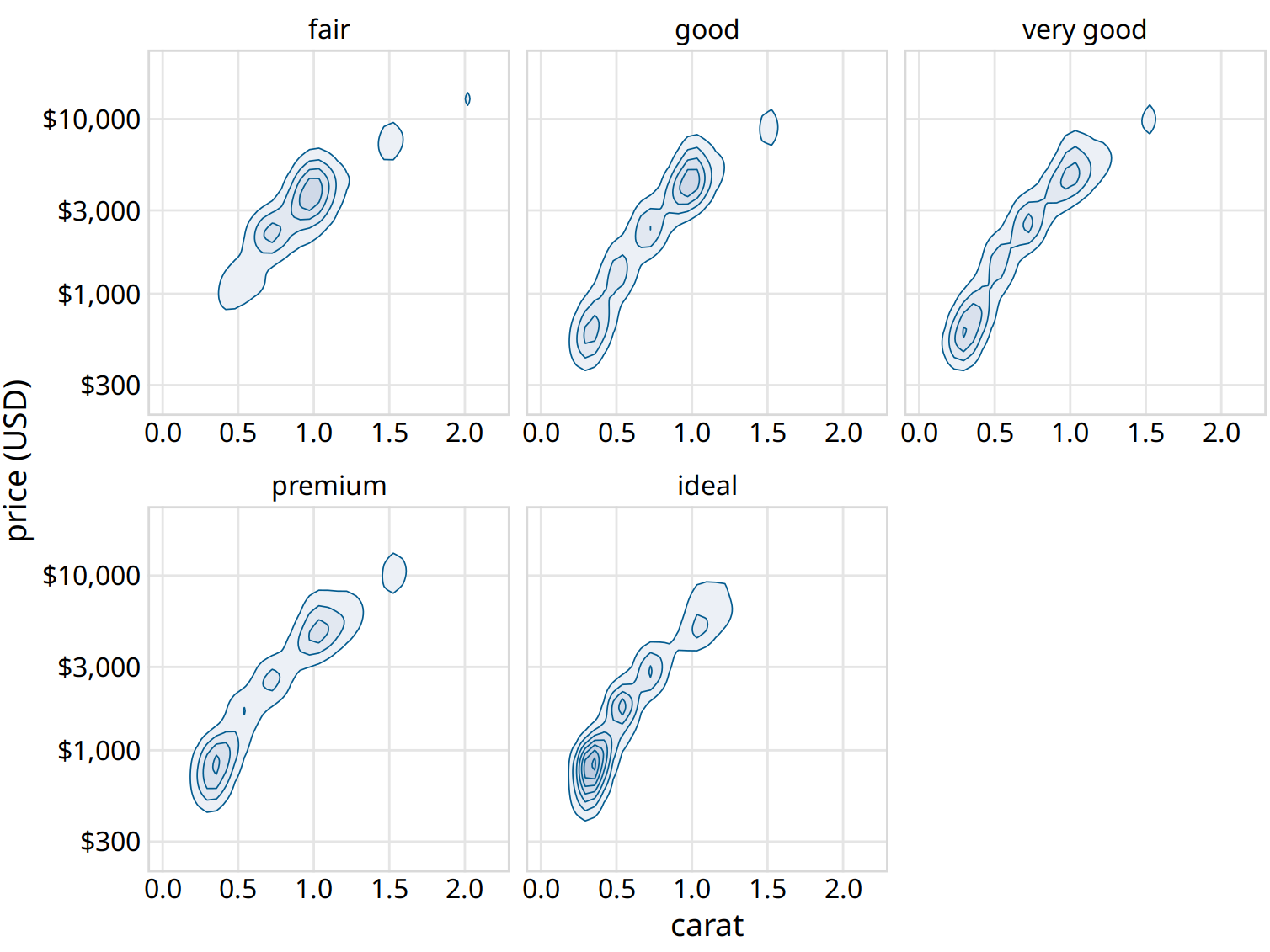
Figure 18.13: Price of diamonds versus their carat value. Here, we have taken the density contours from Figure 18.12 and drawn them separately for each cut. We can now see that better cuts (very good, premium, ideal) tend to have lower carat values than the poorer cuts (fair, good) but command a higher price per carat. Data source: Hadley Wickham, ggplot2
We can make out two main trends. First, the better cuts (very good, premium, ideal) tend to have lower carat values than the poorer cuts (fair, good). Recall that carat is a measure of diamond weight (1 carat = 0.2 gram). Better cuts tend to result (on average) in lighter diamonds because more material needs to be removed to create them. Second, at the same carat value, better cuts tend to command higher prices. To see this pattern, look for example at the price distribution for 0.5 carat. The distribution is shifted upwards for better cuts, and in particular it is substantially higher for diamonds with ideal cut than for diamonds with fair or good cut.
References
Carr, D. B., R. J. Littlefield, W. L. Nicholson, and J. S. Littlefield. 1987. “Scatterplot Matrix Techniques for Large N.” J. Am. Stat. Assoc. 82: 424–36.