26 Don’t go 3D
3D plots are quite popular, in particular in business presentations but also among academics. They are also almost always inappropriately used. It is rare that I see a 3D plot that couldn’t be improved by turning it into a regular 2D figure. In this chapter, I will explain why 3D plots have problems, why they generally are not needed, and in what limited circumstances 3D plots may be appropriate.
26.1 Avoid gratuitous 3D
Many visualization softwares enable you to spruce up your plots by turning the plots’ graphical elements into three-dimensional objects. Most commonly, we see pie charts turned into disks rotated in space, bar plots turned into columns, and line plots turned into bands. Notably, in none of these cases does the third dimension convey any actual data. 3D is used simply to decorate and adorn the plot. I consider this use of 3D as gratuitous. It is unequivocally bad and should be erased from the visual vocabulary of data scientists.
The problem with gratuitous 3D is that the projection of 3D objects into two dimensions for printing or display on a monitor distorts the data. The human visual system tries to correct for this distortion as it maps the 2D projection of a 3D image back into a 3D space. However, this correction can only ever be partial. As an example, let’s take a simple pie chart with two slices, one representing 25% of the data and one 75%, and rotate this pie in space (Figure 26.1). As we change the angle at which we’re looking at the pie, the size of the slices seems to change as well. In particular, the 25% slice, which is located in the front of the pie, looks much bigger than 25% when we look at the pie from a flat angle (Figure 26.1a).
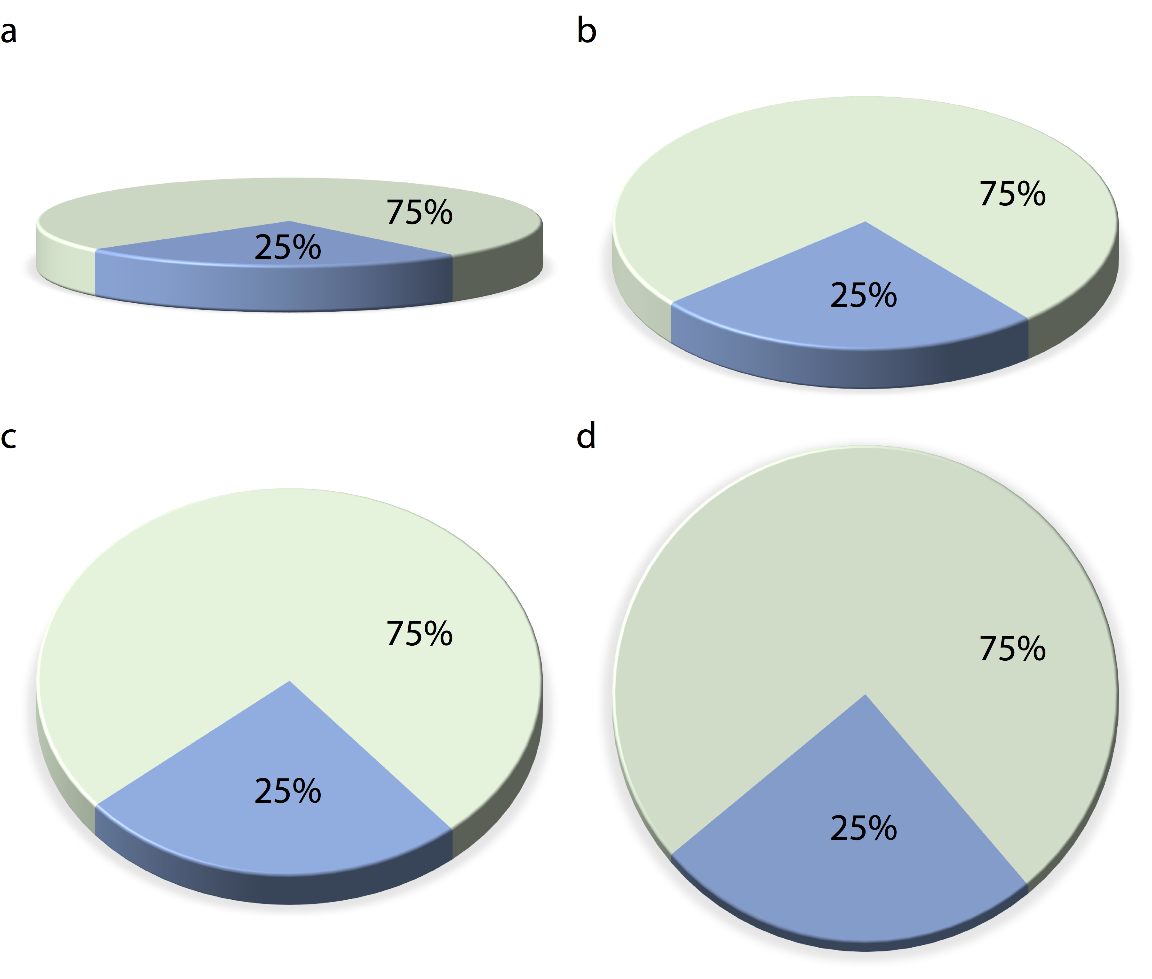
Figure 26.1: The same 3D pie chart shown from four different angles. Rotating a pie into the third dimension makes pie slices in the front appear larger than they really are and pie slices in the back appear smaller. Here, in parts (a), (b), and (c), the blue slice corresponding to 25% of the data visually occupies more than 25% of the area representing the pie. Only part (d) is an accurate representation of the data.
Similar problems arise for other types of 3D plot. Figure 26.2 shows the breakdown of Titanic passengers by class and gender using 3D bars. Because of the way the bars are arranged relative to the axes, the bars all look shorter than they actually are. For example, there were 322 passengers total traveling in 1st class, yet Figure 26.2 suggests that the number was less than 300. This illusion arises because the columns representing the data are located at a distance from the two back surfaces on which the gray horizontal lines are drawn. To see this effect, consider extending any of the bottom edges of one of the columns until it hits the lowest gray line, which represents 0. Then, imagine doing the same to any of the top edges, and you’ll see that all columns are taller than they appear at first glance. (See Figure 6.10 in Chapter 6 for a more reasonable 2D version of this figure.)
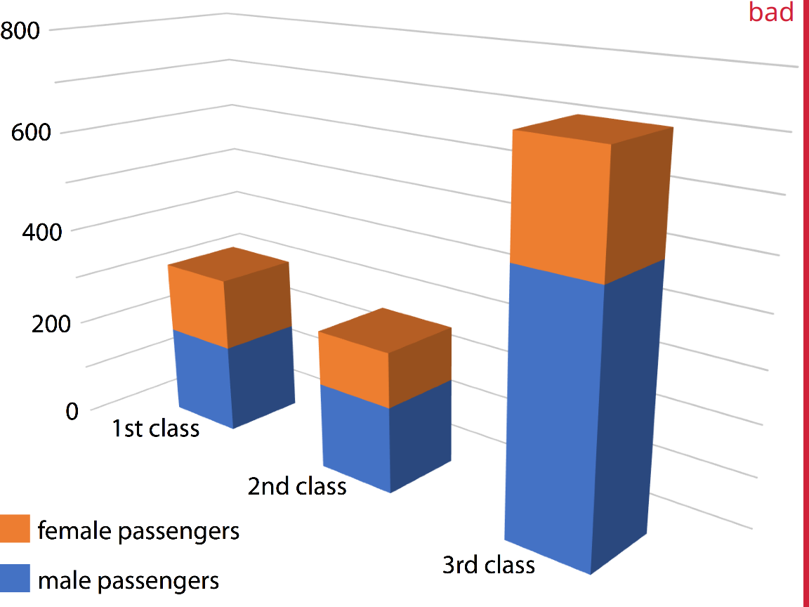
Figure 26.2: Numbers of female and male passengers on the Titanic traveling in 1st, 2nd, and 3rd class, shown as a 3D stacked bar plot. The total numbers of passengers in 1st, 2nd, and 3rd class are 322, 279, and 711, respectively (see Figure 6.10). Yet in this plot, the 1st class bar appears to represent fewer than 300 passengers, the 3rd class bar appears to represent fewer than 700 passengers, and the 2nd class bar seems to be closer to 210–220 passengers than the actual 279 passengers. Furthermore, the 3rd class bar visually dominates the figure and makes the number of passengers in 3rd class appear larger than it actually is.
26.2 Avoid 3D position scales
While visualizations with gratuitous 3D can easily be dismissed as bad, it is less clear what to think of visualizations using three genuine position scales (x, y, and z) to represent data. In this case, the use of the third dimension serves an actual purpose. Nevertheless, the resulting plots are frequently difficult to interpret, and in my mind they should be avoided.
Consider a 3D scatter plot of fuel efficiency versus displacement and power for 32 cars. We have seen this dataset previously in Chapter 2, Figure 2.5. Here, we plot displacement along the x axis, power along the y axis, and fuel efficiency along the z axis, and we represent each car with a dot (Figure 26.3). Even though this 3D visualization is shown from four different perspectives, it is difficult to envision how exactly the points are distributed in space. I find part (d) of Figure 26.3 particularly confusing. It almost seems to show a different dataset, even though nothing has changed other than the angle from which we look at the dots.
Figure 26.3: Fuel efficiency versus displacement and power for 32 cars (1973–74 models). Each dot represents one car, and the dot color represents the number of cylinders of the car. The four panels (a)–(d) show exactly the same data but use different perspectives. Data source: Motor Trend, 1974.
The fundamental problem with such 3D visualizations is that they require two separate, successive data transformations. The first transformation maps the data from the data space into the 3D visualization space, as discussed in Chapters 2 and 3 in the context of position scales. The second one maps the data from the 3D visualization space into the 2D space of the final figure. (This second transformation obviously does not occur for visualizations shown in a true 3D environment, such as when shown as physical sculptures or 3D-printed objects. My primary objection here is to 3D visualizations shown on 2D displays.) The second transformation is non-invertible, because each point on the 2D display corresponds to a line of points in the 3D visualization space. Therefore, we cannot uniquely determine where in 3D space any particular data point lies.
Our visual system nevertheless attempts to invert the 3D to 2D transformation. However, this process is unreliable, fraught with error, and highly dependent on appropriate cues in the image that convey some sense of three-dimensionality. When we remove these cues the inversion becomes entirely impossible. This can be seen in Figure 26.4, which is identical to Figure 26.3 except all depth cues have been removed. The result is four random arrangements of points that we cannot interpret at all and that aren’t even easily relatable to each other. Could you tell which points in part (a) correspond to which points in part (b)? I certainly cannot.

Figure 26.4: Fuel efficiency versus displacement and power for 32 cars (1973–74 models). The four panels (a)–(d) correspond to the same panels in Figure 26.3, only that all grid lines providing depth cues have been removed. Data source: Motor Trend, 1974.
Instead of applying two separate data transformations, one of which is non-invertible, I think it is generally better to just apply one appropriate, invertible transformation and map the data directly into 2D space. It is rarely necessary to add a third dimension as a position scale, since variables can also be mapped onto color, size, or shape scales. For example, in Chapter 2, I plotted five variables of the fuel-efficency dataset at once yet used only two position scales (Figure 2.5).
Here, I want to show two alternative ways of plotting exactly the variables used in Figure 26.3. First, if we primarily care about fuel efficiency as the response variable, we can plot it twice, once against displacement and once against power (Figure 26.5). Second, if we are more interested in how displacement and power relate to each other, with fuel efficiency as a secondary variable of interest, we can plot power versus displacement and map fuel efficiency onto the size of the dots (Figure 26.6). Both figures are more useful and less confusing than Figure 26.3.
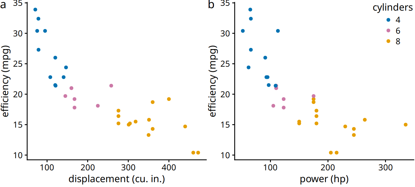
Figure 26.5: Fuel efficiency versus displacement (a) and power (b). Data source: Motor Trend, 1974.
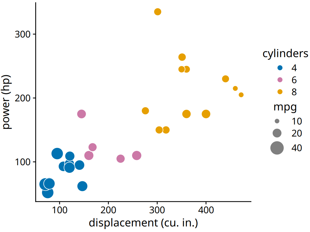
Figure 26.6: Power versus displacement for 32 cars, with fuel efficiency represented by dot size. Data source: Motor Trend, 1974.
You may wonder whether the problem with 3D scatter plots is that the actual data representation, the dots, do not themselves convey any 3D information. What happens, for example, if we use 3D bars instead? Figure 26.7 shows a typical dataset that one might visualize with 3D bars, the mortality rates in 1940 Virginia stratified by age group and by gender and housing location. We can see that indeed the 3D bars help us interpret the plot. It is unlikely that one might mistake a bar in the foreground for one in the background or vise versa. Nevertheless, the problems discussed in the context of Figure 26.2 exist here as well. It is difficult to judge exactly how tall the individual bars are, and it is also difficult to make direct comparisons. For example, was the mortality rate of urban females in the 65–69 age group higher or lower than that of urban males in the 60–64 age group?
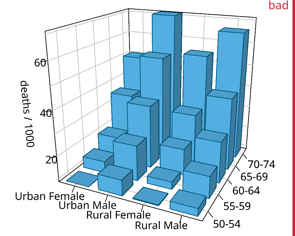
Figure 26.7: Mortality rates in Virginia in 1940, visualized as a 3D bar plot. Mortality rates are shown for four groups of people (urban and rural females and males) and five age categories (50–54, 55–59, 60–64, 65–69, 70–74), and they are reported in units of deaths per 1000 persons. This figure is labeled as “bad” because the 3D perspective makes the plot difficult to read. Data source: Molyneaux, Gilliam, and Florant (1947)
In general, it is better to use Trellis plots (Chapter 21) instead of 3D visualizations. The Virginia mortality dataset requires only four panels when shown as Trellis plot (Figure 26.8). I consider this figure clear and easy to interpret. It is immediately obvious that mortality rates were higher among men than among women, and also that urban males seem to have had higher mortality rates than rural males whereas no such trend is apparent for urban and rural females.
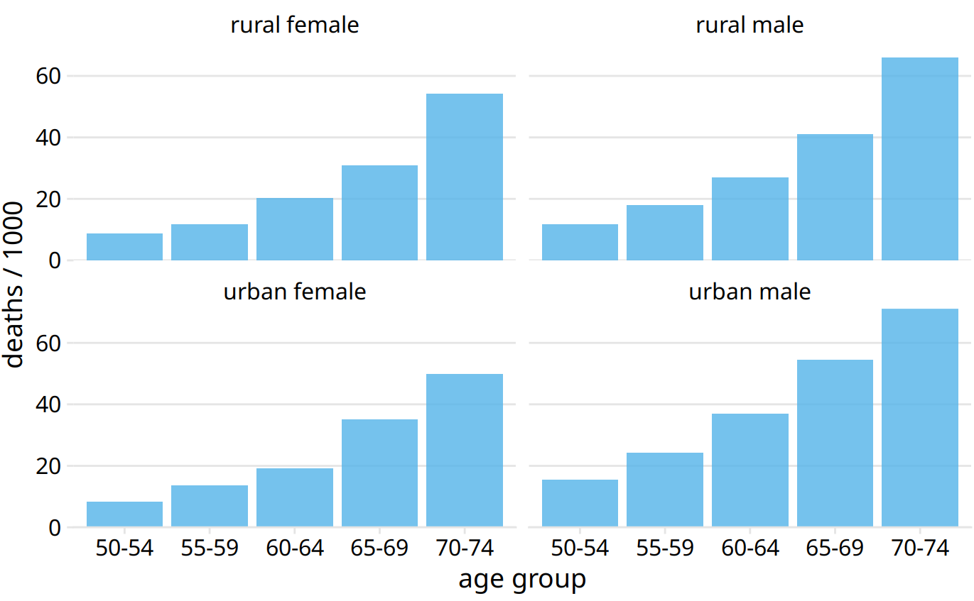
Figure 26.8: Mortality rates in Virginia in 1940, visualized as a Trellis plot. Mortality rates are shown for four groups of people (urban and rural females and males) and five age categories (50–54, 55–59, 60–64, 65–69, 70–74), and they are reported in units of deaths per 1000 persons. Data source: Molyneaux, Gilliam, and Florant (1947)
26.3 Appropriate use of 3D visualizations
Visualizations using 3D position scales can sometimes be appropriate, however. First, the issues described in the preceding section are of lesser concern if the visualization is interactive and can be rotated by the viewer, or alternatively, if it is shown in a VR or augmented reality environment where it can be inspected from multiple angles. Second, even if the visualization isn’t interactive, showing it slowly rotating, rather than as a static image from one perspective, will allow the viewer to discern where in 3D space different graphical elements reside. The human brain is very good at reconstructing a 3D scene from a series of images taken from different angles, and the slow rotation of the graphic provides exactly these images.
Finally, it makes sense to use 3D visualizations when we want to show actual 3D objects and/or data mapped onto them. For example, showing the topographic relief of a mountainous island is a reasonable choice (Figure 26.9). Similarly, if we want to visualize the evolutionary sequence conservation of a protein mapped onto its structure, it makes sense to show the structure as a 3D object (Figure 26.10). In either case, however, these visualizations would still be easier to interpret if they were shown as rotating animations. While this is not possible in traditional print publications, it can be done easily when posting figures on the web or when giving presentations.
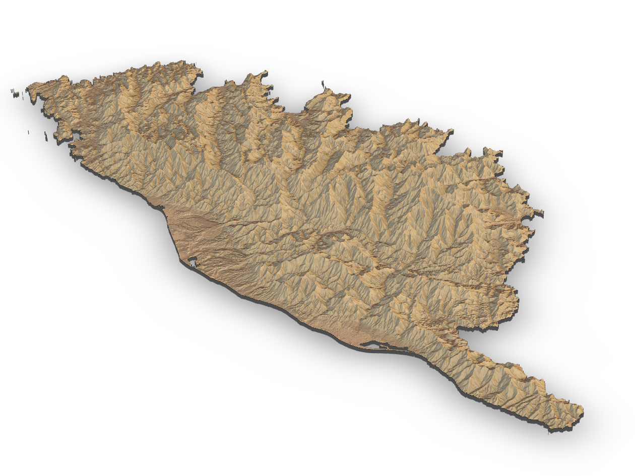
Figure 26.9: Relief of the Island of Corsica in the Mediterranean Sea. Data source: Copernicus Land Monitoring Service
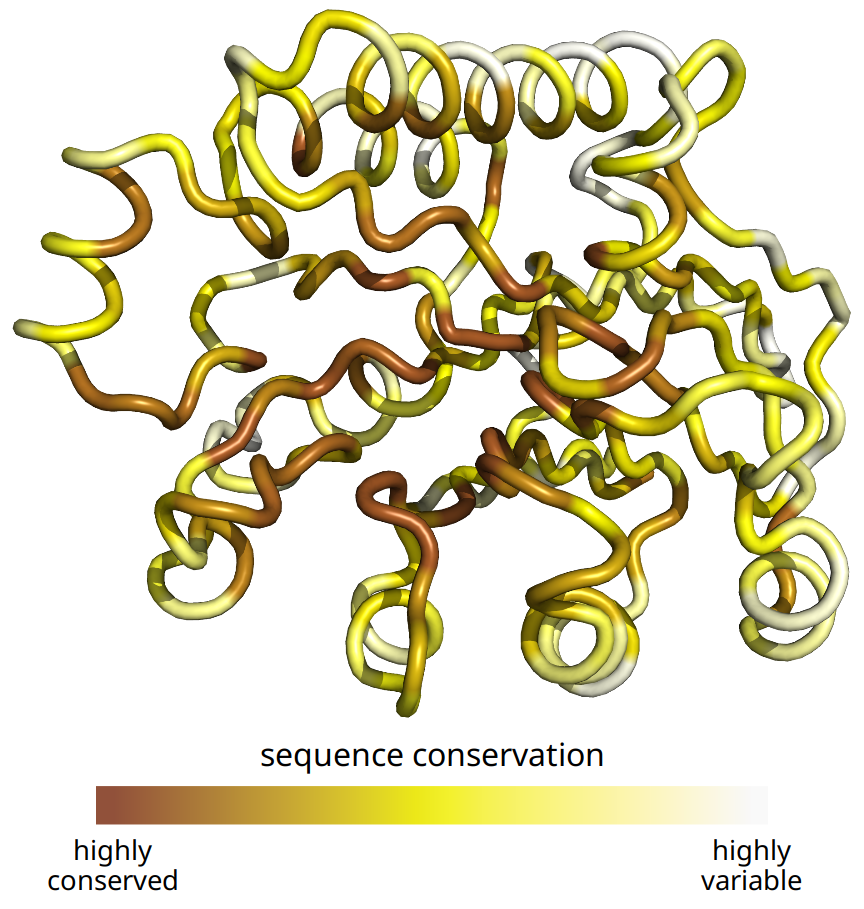
Figure 26.10: Patterns of evolutionary variation in a protein. The colored tube represents the backbone of the protein Exonuclease III from the bacterium Escherichia coli (Protein Data Bank identifier: 1AKO). The coloring indicates the evolutionary conservation of the individual sites in this protein, with dark coloring indicating conserved amino acids and light coloring indicating variable amino acids. Data source: Marcos and Echave (2015)
References
Marcos, M. L., and J. Echave. 2015. “Too Packed to Change: Side-Chain Packing and Site-Specific Substitution Rates in Protein Evolution.” PeerJ 3: e911.
Molyneaux, L., S. K. Gilliam, and L. C. Florant. 1947. “Differences in Virginia Death Rates by Color, Sex, Age, and Rural or Urban Residence.” American Sociological Review 12: 525–35.